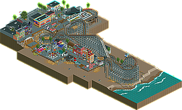
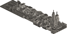
Park / Comet
-
 24-April 10
- Views 8,769
- Downloads 1,270
- Fans 4
- Comments 24
-

-
 79.23%(required: 65%) Design
Kumba 95% Steve 95% chapelz 90% CedarPoint6 85% 5dave 80% Sey 80% Six Frags 80% SSSammy 80% ][ntamin22 80% geewhzz 75% Liampie 75% posix 75% turbin3 70% inVersed 65% K0NG 65% 79.23% -
4 fans Fans of this park
-
Full-Size Map
-
Download Park
1,270
-
Objects
246
-
Tags
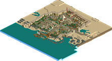
![park_4114 [H2H8 R3] Forum Caeleste](https://www.nedesigns.com/uploads/parks/4114/aerialt3853.png)
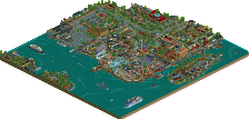
![park_2390 [H2H6] R2 - The Replacements - Tivoli Gardens](https://www.nedesigns.com/uploads/parks/2390/aerialt2133.png)
well done robbie!
- Phatage's comment. Stone buildings like these on the beach seems unlogical.
- The peepjam and stream of peeps really distracted me
- I think you cut off the map too early. I think more beach, whether empty or not, would have given this a whole different atmosphere. I think it would be great if you moved the 'stone buildings on the beach' to the 'beach-parallel-boardwalk'. With a beach setting I'd emphasize the parallel stuff (shoreline, boardwalk, dunes or whatever runs along the horizon infinitely) instead of perpendicular stuff like you did. There's too little sea for a beach setting, in my opinion. I didn't feel the sea. This is quite complex to explain, I hope you get my point.
Looking back I maybe should've scored it 16 instead of 15, but 15 is a great score nonetheless and a 15,85 score is something you should be very proud of. Congratulations on a very good design.
Now finish something bigger!
edit: I just heard that there were some minor problems with my vote. Understandable considering a discussion in the accolade panel forum. My first reply was:
But just for the record, the small errors as listed above didn't affect my vote. I assumed they would be fixed anyway!