Park / Ra - God of Sun

Park_2790 Ra - God of Sun

27 Comments

  • Comment System%s's Photo
  • Steve%s's Photo
    I surprised by some of these votes, to be honest. Admittedly, the design is small, but this quality is absolutely worth an accolade. I'd be really upset to hear this didn't win simply because it was a "quantity-over-quality" thing. Obviously I thought this was worth a win, but it shocks me a bit to see Pac, turbin3, Coupon, etc turn it down since it seems pretty up their alley.

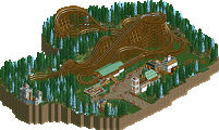
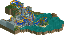
    Regardless, great work, Mav. I thought the coaster was striking to the point where it was the focal point of the map but not so overbearing to takeover the entire thing, which is exactly what a design should be. Really solid layout for a compact B&M I thought. I liked the colors too, but one change I would have made would be to have the supports a different color, since they blend too well with the already tanned surroundings. Not a big deal though, as it still works. Architecture was really pulled off well, also, and I liked the setting/colors for the drop tower.
  • Xeccah%s's Photo
    i agree pretty much with steve and really suprised by justin's vote
    not trying to play the redundant "got robbed" tune, but i'm curious of some of the lower votes on this
  • Pacificoaster%s's Photo
    I really enjoyed the central urban bit under then first drop of the coaster. And the coaster layout itself was well done. However it was the way this filtered out into the arid landscape that let me down the most. The ruin rock usage wasn't bad but the color choice blended into the support color too much and I thought that was really mediocre. The queue had some great interaction but the way you lined it with kumba's fence object and thin art deco trim was not well done. There were no vertical posts on the fences which made it appear to be floating. Furthermore the queue coverings were so plain and lifeless. The foliage wasn't bad by the turnaround after the immelman but it was the transition into it that bothered me. If the quality of the urban setting were translated through the entire design I would have voted much higher. I agree my vote may be a bit low but I truly did not believe that this deserved an accolade. Everyone knows I love Maverix (Jimmy) but I am not going to vote this for an accolade just because he and I are friends.
  • Steve%s's Photo
    I do agree Justin that the queue needed some work. Despite it's great interaction with the ride, it came off a bit amateur compared to the rest of the map. I also didn't like how there was no real "path" under the queue, but at the same time I don't think it's worth enough to knock a good portion of points off this.
  • Pacificoaster%s's Photo
    I feel that with a design this small, there is more room for error as the slightest thing could detract from the overall composition quite significantly. Perhaps I could have voted a 60 but again, I would not have given this design.
  • Xeccah%s's Photo
    ah i can see your reasoning quite well pac, the landscape is really half-assed it seems
    i see this as a really low design but i see where it cannot be
  • disneylandian192%s's Photo
    I think this deserved a 65, no higher, no lower. It is all very visually pleasing, but I do agree with the reservations of the size/quality ratio. I really enjoyed it though, but damn it was a tiny map.
  • BelgianGuy%s's Photo
    Honest to say I'm a little dissapointed, it's a pity instead of expanding on the micro, you should've taken the given concept to a new map really, bigger layout with more flow and more space to make it all come together...

    you had all the ideas there though and the quality is indeed there but again it feels rushed, I'd say take your time and try to revise this concept again because it deserves to have a more extensive map with what is displayed here but didn't come to full fruition. you're close but just not quite there yet it seems here and I hope you can hit that magic point really soon...
  • Milo%s's Photo
    Posted Image
  • BelgianGuy%s's Photo
    love those gordon ramsey jokes!

    I do agree to an extent, it's weird, your great releases are often surrounded by rushed and sometimes simply mediocre submuissions
  • ScOtLaNdS_FiNeSt%s's Photo
    lmao ramsey is a legend.
  • robbie92%s's Photo
    I love how people are saying this is mediocre because it's small. IMO, this far outstrips the quality of every winning accolade you've received, and I feel it was just the size that fucked it over. I don't see it as any less content as something like, say, Tomahawk, but ah well...

    Shame to see people focusing on quantity so heavily over quality now.
  • Twiggy%s's Photo

    I don't see it as any less content as something like, say, Tomahawk, but ah well...

    Well, imo this was a presentation of a stronger theme than Tomahawk. Both Tomahawk and this were quaint, and excellent, but due the size of this, the theme didn't have the room to breathe that the theme of Tomahawk didn't need. The desert theme needs some more size to really draw out the desolate, solitude of the desert. Now, I do not know if Mav was going for such an in-depth theme such as the one I stated, but I do think in some sense this is true for all designs/parks. They need room to breathe. The theme determines how much quantity is needed in some sense. Of course this isn't always true with people who like to build their own way, and I'm not saying that need to build exactly as I stated, but none the less that's just my opinion. Feel free to disagree, I now people will. That's what makes a community a community.

    Other than that, I thought the quality was there but the quantity was not. Have a good day everybody.
  • Xeccah%s's Photo
    i dont think size is why this lost,rob
    and i will agree with you that the town part and layout were great and design worthy
    but the queue and landscaping really let it down
  • Cocoa%s's Photo
    jesus maverix you have a ton of design attempts. you are insanely productive
  • Louis!%s's Photo

    Everyone knows I love Maverix (Jimmy) but I am not going to vote this for an accolade just because he and I are friends.


    Sounds to me as if Jimmy needs to get a new friend ;)
  • turbin3%s's Photo
    Theming-wise this was great, but the layout was a let down imo. Sorry!
  • Xeccah%s's Photo

    jesus maverix you have a ton of design attempts. you are insanely productive

    i think if he'd slow down a bit though his work would be exponentially better and consistent
  • Croustibapt%s's Photo
    OzIris @ Parc Asterix, anyone ?