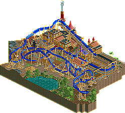
Park / Ra - God of Sun
-
 15-May 13
- Views 3,798
- Downloads 497
- Fans 0
- Comments 27
-
 63.08%(required: 65%)
Design Submission
63.08%(required: 65%)
Design Submission
Airtime 85% Louis! 75% Phatage 75% CedarPoint6 70% Kumba 70% prodigy 70% Wanted 65% wheres_walto 65% AvanineCommuter 60% Liampie 60% Coupon 55% zburns999 55% Pacificoaster 50% turbin3 50% tyandor 50% 63.08% -
No fans of this park
-
Download Park
497
-
Objects
216
-
Tags
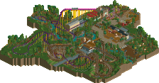
Solid work though Mav, idk If it was design worthy myself, but either way it was really good work. Get the best layouts and themes you can and put something together that will really score high.
As was said above, the section under the lift was awesome. I wanted to see more of that. Overall, certainly not bad, but it just feels like a bit of a let-down after Nyoka, which I loved.
The layout wasn't too good either, I think you could have made it much nicer if you'd freed up a little bit more map space whilst still keeping this relatively micro.
Airtime Offline
I loved the layout how it hugged the ground, diving into trenches and wrapping around the queue. The queue was perfect. So what if it was straight near the loop, it works great.
The whole colours used on the architecture, the coaster and the drop tower were perfect. I don't think you could of got them any better. The general square buildings were perfect for the theme as well as the little pots, rubble and other little building details. I find you miss things like that on your work.
I also love mini drop towers so much more than large ones, good job.
Damn it, just seen a few cross beams on the supports where they shouldn't be. Take a 5% off for me
TBH each and every submission seems to miss something to make it work for me and I really wish you will find this missing link some day so you can surpass these borderline accolade works. I think you are capable of great stuff as there is something there in every submission so far that shows promise, but imo it doesn't deliver yet. Wondering what your next thing shall be, but you might want to consider slowing your rate a little and focus more on quality. I prefer one 80-90% design over 10 barely 65% designs if you catch my drift. Just keep at it and I believe you will succeed