Park / Knight
-
 16-July 11
- Views 2,730
- Downloads 527
- Fans 0
- Comments 18
-
 60.00%(required: 65%)
 Design Submission

nin 80% Kumba 70% That Guy 70% geewhzz 65% Liampie 65% robbie92 65% Casimir 60% K0NG 60% Maverix 60% wheres_walto 60% JDP 55% prodigy 55% Roomie 50% posix 45% turbin3 45% 60.00% -
 No fans of this park
-
 Full-Size Map
-
 Download Park
527
-
 Objects
219
-
 Tags
Tags
![park_2434 [H2H6] R5 - The Replacements - New Fantasyland](https://www.nedesigns.com/uploads/parks/2434/aerialt2181.png)
![park_2097 [NEDC] Schwarzwald - #2/9](https://www.nedesigns.com/uploads/parks/2097/aerialt1887.png)
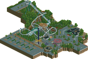
What held this back for me was the queue line and the foliage. I also wasn't a huge fan of the color scheme overall it just all felt a bit rushed.
what's wasted?
inVersed Offline
I think it would have been better with a little bit more of a surrounding
Pros:
- I really liked the layout
- I really liked the size but...
Neuts:
- The theming is OK, not more or less...
Cons:
- The foliage is really bad
- The back of the houses at the edge... at a design of this size you should go for the devil in the detail, everything else would be rushed
The two things I didn't really like were the main bulk of the queue and the fact that it lacked interaction. Like geewhzz said this reminds me of rides like Black Mamba and Dæmonen but unlike those this ride was so far removed from a midway
Overall I would have given it a 67
that transfer was too small as well really making it hard for me to score this higher then what i did. either way, it was still quality work.
-JDP
Also that island with the turn around probably would of looked a lot cooler with a cobra roll!
The coaster layout was solid, but it was the crampedness and intense theming that really won me over. Definately my kind of thing. I loved the wingover over the lift hill, and that vertical loop was absolutely awesome. Wasn't a fan of the turnaround on the island, seemed a bit forced and only really looked good from one angle. The zero-g roll going over the brake run was great, and a really enjoyed the bit going under the transfer tracks at the end. Basically, your framing of key coaster elements was top notch, and gave some great moments for both the viewer and the guests. Very well done.
What I think pulled this back from being a design is there just wasn't much to it. I felt you could have expanded a bit upon it, maybe added a supporting ride of some sort, or at least have a small part of the map that wasn't just the coaster. You seemed to cut off every corner that wasn't literally next to the coaster, where I would have liked to see a bit more of a bigger picture. I didn't really like the waterfall by the drop, it didn't seem likely that water would come from there, and it also didn't seem to have anywhere to go. I think it would have been fine without it. I also really disliked the queue line. The positioning of it was fine, but using that queue texture plus lack of fences or coverings or anything really damaged this entry for me.
Anyway, I somehow missed the voting on this one, but I would probably have given it around 70%. A worthy design winner in my eyes.
All I really wanted to see was more. I thought it was design-worthy, but barely. Kaboom felt more full than this, or at least more vibrant, as you worked to get some context in. Here, it just felt plopped down.
Other designs have a themed area with other less important flat rides around the main attraction, but all this had was... well Knight. Like robbie said... It was too small, you could have expanded the map & used the empty land to your advantage as well.
edit: btw, great job though, i really liked the layout and interaction with the buildings.
Oh well. This is the disneylhand I love, brilliant surroundings backed up by a brilliant coaster.