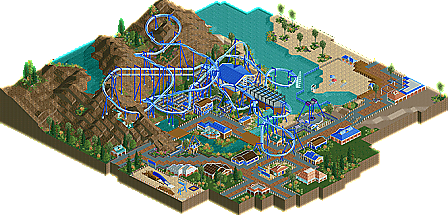
Park / Hammerhead
-
 23-August 09
- Views 3,920
- Downloads 515
- Fans 0
- Comments 20
-

-
 65.00%(required: 65%) Design
posix 75% Casimir 70% Katapultable 70% Xcoaster 70% 5dave 65% CedarPoint6 65% chapelz 65% Fr3ak 65% Kumba 65% nin 65% Ride6 65% Evil WME 60% geewhzz 60% SSSammy 60% zodiac 55% 65.00% -
No fans of this park
-
Full-Size Map
-
Download Park
515
-
Tags
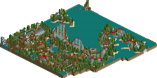
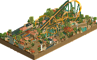
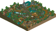
After the long period of stunning parks produced in Head-2-Head 5 we now have chance to get back to the normal system and let some of the lesser known guys get their recognition. Maverix is indeed a new face to the community and with two Honorary Mentions under his belt, FATE and Mount Fury, it’s now apparent he has stepped up his game by securing his very first Design Hammerhead! Read On...
well done anyway. one more NE Desin than me, youre the better man i suppose.
i actually much preferred FATE from you. alot more atmospheric.
no no no.
there has been things where arguably things should have been design along the line, its just personal oppinion of the panel.
Also wishing you a happy birthday!
I love the layout, but I neither like your theming nor the landscaping that much.
The architecture wasn't the best...foliage was okay.
I'd have given it a 11.
Yannik
Just work a bit on your park composition, as now it is just a bit like coaster here-building there-long ways of pathing with nothing next to it but fences-another lonely building.. It just does not have much flow. And as cp6 and gir said, work a bit on your architecture skills.. For example use some real life buildings on google image search to copy them in your rct park. It really works!
Good luck and looking forward to your next work,
SF
Yeah the coaster was pretty nice, but the atmosphere was dead. You had a bunch of tiny ass little buildings seeming randomly placed, and none of them appeared to have an practical use besides a filler.
Sure it's not bad, but I agree with Sammy, FATE was much more enjoyable than this.
There should be one of those percent things for making design, like how there is for spotlight.
You accolade panelists need to be harsher or move the point level up. Anyway, the old description for design was on the level of spotlight, but just one ride.
Edited by Cocoa, 23 August 2009 - 04:07 PM.
i dont think people understand how hard it is to get a happy medium with voting.
next thing you know you guys will be complaining that there were a million honary mentions that should have been designs.
inVersed Offline
however, imo this was better then eggs.
-JDP
Exactly, the CORE aspect is the layout. But, if not for the surroundings, the accolade would be called "Layout". It's not. To me, a 'design' should encompass not only the actual layout of a coaster but, how the surroundings look, interact and add to the overall enjoyment of the ride itself.
No RL park is going to add a new attraction to it's arsenal unless all the bases are covered. Save for the occasional "layout" that is just SO tits....that it doesn't matter what surrounds it. This layout doesn't do that. I mean..it's nice, parts of it are fantastic but...overall, I'm not sure that if I were on the panel that it would have received any more than an 11 because of the fact that I don't know that that layout was strong enough to overcome the weak surroundings.
I do, however...disagree with the landscaping replies. I actually like how it has a certain flow and keeps it through every angle you switch to. Not overwhelming but....if you really look at it...it's simple, understated (which I believe was the intention) and while not the best I've seen...it certainly sufficed.
The architecture here, to me, was what would have kept it down around an 11/11.5 to me.
of course, that's just my opinion....I could be wrong.