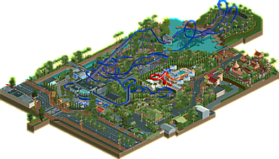
Park / Great White
-
 29-November 18
- Views 3,385
- Downloads 705
- Fans 2
- Comments 11
-
 75.50%(required: 65%) Design
posix 80% robbie92 80% Scoop 80% bigshootergill 75% CedarPoint6 75% chorkiel 75% Cocoa 75% G Force 75% Poke 75% saxman1089 75% Ling 70% RWE 70% 75.50% -
Description
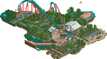
The area is based on Marion Holiday Park, a place located in my hometown of Adelaide, Australia. I really liked the atmosphere and foliage of the area in real life, so decided to try and recreate it in RCT. Expanding the area to include some themepark rides resulted in this design.
[huge thanks to SpaceK for the bus object] -
2 fans Fans of this park
-
Full-Size Map
-
Download Park
705
-
Objects
415
-
Tags
![park_6119 [NEDC6] Hydrocelestis - The Ocean of the Stars](https://www.nedesigns.com/uploads/parks/6119/aerialt6365.png)
![park_6140 [NEDC6] The Cartographer](https://www.nedesigns.com/uploads/parks/6140/aerialt6372.png)
Review Time!
+Really liked the layout. Good mixture of B&M typical stuff and your own ideas
+The street area is strong
+The fence and planters around the Cobra Roll look great
+Shark
+The kiddie coaster is nicely themed
+overall good atmosphere
-Wasn't the biggest fan of the station for the main coaster
-It feels like there isn't much content in a weird way
Summary: All in all a really solid design submission. I'd give it 70%.
Greetings.
There is no doubt that the area chosen for your project must be attractive. The vegetation is lush, containing many different species of trees, shrubs and other vegetation. I like the row of poplars growing next to each other, as well as palm trees on the edge of the map.
Rollercoaster "Great White" is great. I like the area around the cobra bend very much. The shark's head is first class. The motif used on the winch animates this attraction. A very stylish station with a well-placed exit.
Good area with slides, although I would add tables to the tables under the big umbrellas in addition to the drinks store on the other side of the street - some stall / restaurant with food.
Little RCT does not appeal to me - it looks modern, a leitmotif not known to my culture.
The rest of the game: some technique must be.
Good job - high rating. (85%)
I have no doubt this will clinch Design. The atmosphere is very well-realized and I actually love the foliage even though it is very unconventional looking (plus Steve trees). Architecture in the back half of the park was excellently messy; I particularly loved the dodgems building. I actually did like the station building for Great White as well.
I'm not familiar with the reference park though I did look at some maps and photos. It seems like a very odd choice to have you park entrance basically instantly slam you up against the grey wall of the station rather than, say, a large inversion or something else... instead, the meat of the layout is virtually hidden from the street and people outside the park. The park layout is this weird wiggly question mark shape that I really do not like.
The coaster layout is ultimately the weakest part of this to me. The giant shark head is hilarious, and I know from an ultra realistic perspective that would probably be all a real park would do, but somehow the surroundings are missing something to make this massive, shark-themed coaster belong in this quaint little water park. I'm thinking a small aquarium or a wildlife center or a harbor for the park to sit on. The little island is cool but I wonder if extra context there might have helped.
70% from me, though I suspect I will be on the low end.
Great solid design here Stoksy. Love the layout, waterpark and mini coaster are both solid as well. 75 from me.
you always love to just absolutely fill your maps with extra stuff. You could easily have a huge spotlight park if you just strung all your designs together!
Nice work. While I don't understand the realistic context of this park, theres a lot to like. I think the shark is goofy in a cute way. The layout is pretty solid although maybe a bit stretched down the middle. The outskirts are very recognizably australian and the foliage is superb. Really lovely vibes, if a confusing assortment of rides. That main entrance area is so solid in atmosphere, god I love lush foliage. Also, the great white station is weird but reminds me a bit of a building at the melbourne raceground. go figure
This is a nice solid design. The layout is cool and fun to watch, the overall atmosphere works well and the technical level is pretty high up. I also actually do like the shark, although it looks dumb and stupid, but that kind of exactly is what makes it good for me. Also i need to mention that kiddie coaster that works perfectly over there and almost steals the show of the great B&M coaster this is about.
Going more in detail i of course also have seen some things i didn't really liked that much, for example the amount of clipping scenery around the coaster and the feeling, that everything felt a bit too densely thrown together here and there. I had difficulties to spot a guiding thread in this, while stuff felt awesome for itself seeing it all together it was kind of weird sometimes.
All in all still a great release though and i enjoyed it very much!
Even the comments I like to appreciate.
I love to appreciate the details, colors, objects used, the design of the park, paths, houses, buildings, rides, the imagination that is in the head and becomes something real in a program to build parks and for me it is very real, our imagination goes to 1,000.
Hard to say I liked this or that, everything was beautiful and very pleasant to look at, we get involved in another world, it is very cool.
Congratulations, and especially I loved the bottom of the park where the roller coaster makes the turn with several palm trees and the black fence, stayed 10.
You had so much fun.
Lovely layout and colours. There's a lot of good stuff on this map, but as a whole it doesn't really come together because it's so unconventional and hard to read. Some notes:
- The stacked palm trees on the road look great, but they're also super glitchy. Just create a new custom object to get around this?
- I liked the canal/storm drain
- The shark. It's horrible and I love it. Hardly visible from anywhere though. I wish there were any sight lines in this park, like, at all
- Foliage is hit or miss for me. Sometimes you place a lot of palms close together and because they're the same height it looks very fake and awkward. Sometimes you have a cluster of those white giant wild flowers and they look great.
- Are power line supports really made of brick in Australia? Curious!
- Stacked mine train and junior coaster track looks great
In my mind you're one of the best realism builders in the community, and it's interesting that your claim to a parkmaker spot was a design three years ago and you somehow haven't broken 80% since. Just keep doing what you're doing. You've been in your prime for years now, and you just need the right release to solidify your position as a top tier parkmaker.
Congrats on the design. I thought it deserved better than it scored, but nonetheless a convincing win.
Congrats on the design!
Really cool to see this completed. It was nice to see some of the early progress. I absolutely loved the first drop into the shark's mouth and the archy throughout the park. Dragon's Keep was amazing.
Congrats with the design. Overall it was a very lovely and enjoyable piece. The coaster lay-out is really good, I wish B&M made more of this style of coasters instead of pushing their wings and dive coasters. Color combo for the coaster is also great! The choice for a slide as a tunnel on the lift is a bit unfortunate. The upper side of the train glitches through it, a tunnel mode of objects would've been better.
The shark is awesome! It kinda looks funny but it's a great job of sculpting and the placement of it is awesome. I think I agree with V1 if he says the station of the coaster is a bit a downside, not that it is bad but in general the buildings in this map are better. A coaster like this deserves a bit more.
The street side is very well done, very atmospheric. I like those entrance gates a lot. At first I didn't understand traffic riding in the park but I googled the park you said it was based on and now I get it. They ride to their holiday houses. Would've been cool if you added a few houses. The kiddie coaster looks fun and really well themed! You nailed the rock work and the color scheme is great too. Really immersive.
That demolition derby is probably my fav thing on the map. I also really like how dense the foliage is, something we don't see that often, sadly.