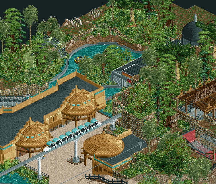
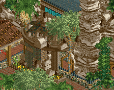
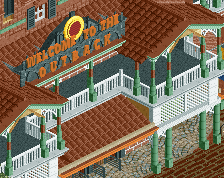
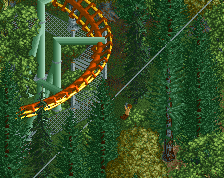
Screenshot / Hadrosaur Cove
-
 22-February 15
-
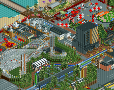
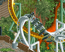
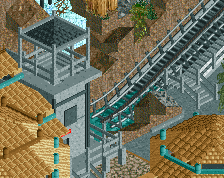
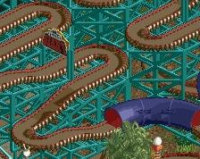
B&M Invert - Extinction
-
7 of 9
- Views 2,727
- Fans 1
- Comments 11
-
Description
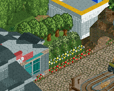
The station is basically nin + trackitecture [I know that and may, time permitting, go back later to 'personalise' the station a little more] I'm super happy with how the zipline turned out though. Basically my final "pick me" screen haha.
Last screen for a while with this project. With H2H and uni coming up this will 'likely' go on the backburner for a while. Still have one more week of holidays in which a lot could get done but don't hold your breath for additional screens. -
Full-Size
-
1 fan Fans of this screenshot
-
Tags
Mad props for the Hadrosaur Cove inclusion, but the rest just seems oddly familiar...
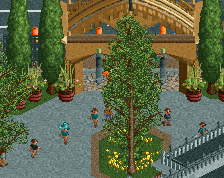
Not too keen on all of these rock fence walls and the top of the screens seems to miss some life. I can't really put my finger on something that would add to it though. The buildings look really nice. Make sure to add benches and I think peeps will really enhance this park and bring it back from extinction.
Awesome as always.
I think you need too many objects to get your theme and desired style across. It looks forced and inelegant as a result.
On the foliage however I think it is nice to have such dense objects. it creates a lush and beautiful appeal, slightly reminiscent of RRP for me.
So my advice would be the same I tend to give to most of today's players: refine and unclutter your style, enable yoursekf to build with less of that rigid conviction telling you to fill everything with small objects. It always has to be a balance and you're missing it. You usually get there with experience and improved confidence in your parkmaking. But developing that with such extreme detail level is a long and demanding road to go, and I'm not sure you will have the necessary motivation to reach the end.
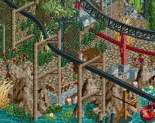
It looks great but I wish the station wasn't indoors. I feel like you could get a much better feel using an open air station using those "hut" style roofs and some nice pole work, etc. I'd also change the grey monorails in the rapids to brown. Nice work man!
This is much better than your last screen. Great stuff!
Impressive work. You're quickly becoming one of my favorite guys.
Ohhhhh Hadrosaur Cove.. I totally thought it was Hadron Collider cut off but that wouldn't make sense. Lovely work, I really am looking forward to your H2H parks
Posix: The reason for building in this way, at least at this point, is my inability to appreciate my own attempts at a more minimalistic style. I look at sparser parks with less detailed architecture and foliage and fully immerse myself in them. However, when it comes to my own work I can't quite get the 'big picture' in my head. Instead, I look at areas that I'm working on and see this large expanse of bare land and think "this area is so boring, best to add something here" without necessarily taking into account that this is an almost irrelevant area looking at the big picture. The same can be applied to architecture, I look at a bare wall or facade and think "look at this building, it looks so bland" again failing to realise that it's one building in the entire park that isn't quite perfect.
I believe that improvement is being made, considering that Ethereal had a tree on almost every single tile, whilst this park features much more in the way of breathing room and clumped foliage. As well as a better understanding of texture and how to implement it on buildings.
It's very much a personal thing that I am aware of, but am unfortunately yet to move past at this point. I appreciate and understand the feedback, but it will probably take me a while to comfortably apply it to future work.
Thanks to everyone, actually really great idea about the open station. I tried to implement features of that with the open area by the station but a more open station would help defeat a bit of the claustrophobic atmosphere that I've got with the mountain so close by. Path features and peeps will come in due course
PBJ Offline
Lovely!
maybe some airduct on the roof of the station?