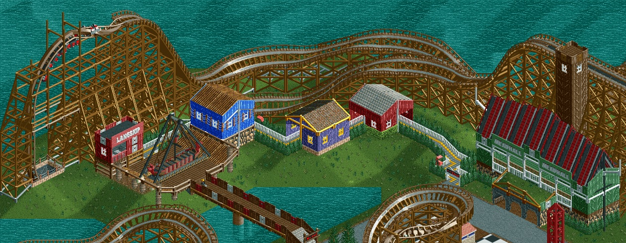
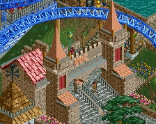
I think the queue is a little bit to long. It feels really stretched out, it feels like it is just placed on that spot without thinking about how it adds to the ambience.
I sort of agree about the queue being a little long, but I think the only other thing you could do is bridge the gap, and make the buildings over in front of the diagonal section of the woodie decorative only. Play around with that some more.
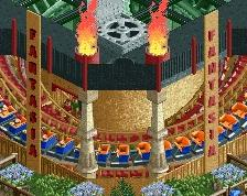
the queue is too long and the 2x2 buildings look bad as well. they're not badly done but shouldn't be placed there. consider not using hedges in your architecture anymore, and changing that black trim off of the mead hall roof.
 02-March 15
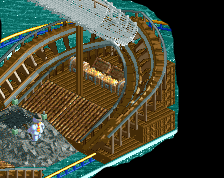
I think the queue is a little bit to long. It feels really stretched out, it feels like it is just placed on that spot without thinking about how it adds to the ambience.
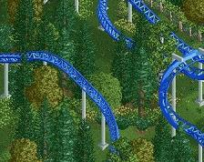
That woody layout is nuts so far. Can't wait to see the rest.
I sort of agree about the queue being a little long, but I think the only other thing you could do is bridge the gap, and make the buildings over in front of the diagonal section of the woodie decorative only. Play around with that some more.
BigB Offline
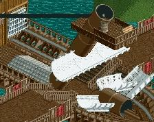
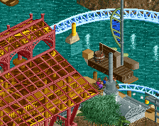
alternatively you could make the ship stand on an island. just put water underneath the q between the red house and the meadhall
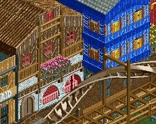
you should devently build more "Pfosten" or posts on the diveloop.
-under the roll
-under the half loop
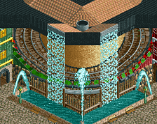
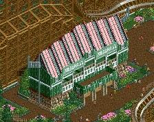
so its a nice screen. All fits together and the architecture is also nice.
Maybe the q is a bit too long and my personal prob of the q are the two house. i think its not good to have the q straight in the house.
i think its better on the side with nice balkons and interactions , but now its "lame" , not bad.
the rest is sick and i want see that finsihed.
the queue is too long and the 2x2 buildings look bad as well. they're not badly done but shouldn't be placed there. consider not using hedges in your architecture anymore, and changing that black trim off of the mead hall roof.
The actual ship is quite well done, the architecture doesn't really fit very well with everything else though.
I agree with Shogo though, the hedges are becoming your new red and yellow flowers.