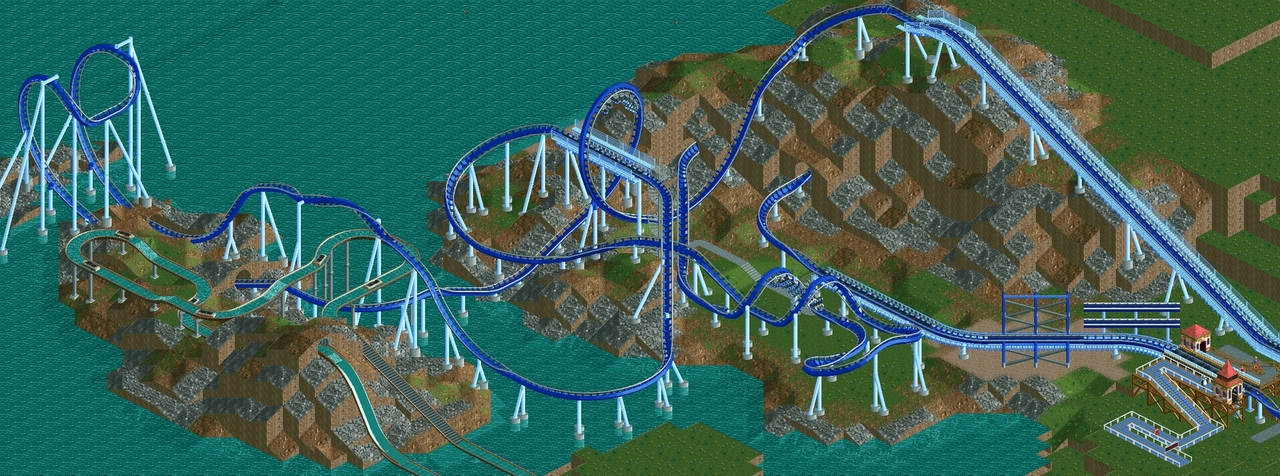
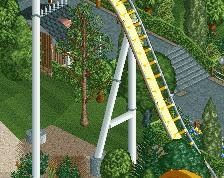
Layout looks great, supports as well (except for the inversions). I'd suggest looking at the real life counterparts and try to translate those in game.
Terrain feels a bit forced, but maybe finished it will come together better.
Layout looks great, supports as well (except for the inversions). I'd suggest looking at the real life counterparts and try to translate those in game.
Terrain feels a bit forced, but maybe finished it will come together better.
Thanks! Yeah, I've already fixed up the supports a bit on the cobra roll since posting this, and it looks better on the corkscrews from another angle... the hardest for me has been the vertical loop as I can't get anything to line up properly with the track >.<
the ideas are right, i just feel they're not as well executed as they can be.
the coaster has to be a bit slow through the first big inversions... right? ahh, fuck it. it's a game. maybe you want it that way. don't listen to me. or anybody else here.
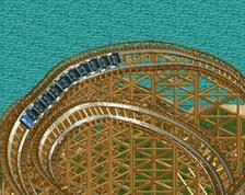
You can try doing the loop supports like I did here:
I've found that the diagonal support lines up perfectly with the track.
IMO, the cobra roll supports are quite cluttered, but other than that, nice layout and supports.
Unfortunately I can't do the diagonals because it would hit other bits of track :/. I also felt that the cobra roll was cluttered, I think I've made it better.
the ideas are right, i just feel they're not as well executed as they can be.
the coaster has to be a bit slow through the first big inversions... right? ahh, fuck it. it's a game. maybe you want it that way. don't listen to me. or anybody else here.
cheers.
I'm still unsure what speeds coasters should be going through elements. I originally had the first drop a bit higher, but I thought it might've been too fast. I ended up matching it to the floorless in Starpointe... kind of arbitrary I guess, but it goes through the elements at the same speed as that coaster.
the coaster has to be a bit slow through the first big inversions... right? ahh, fuck it. it's a game. maybe you want it that way. don't listen to me. or anybody else here.
Very cool layout, and I also love the landscape. It all reminds me a lot of the designs we had in the 2006-2008 era, like Faceman's and zodiac's stuff. The loop supports are a bit unfortunate but I wouldn't have noticed probably if other's didn't point it out. Cobra roll looks fine to me.
Looking forward to seeing what you can do with the foliage and theming. Please don't turn this into a forgettable generic coaster because I think it has the potential to be more.
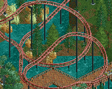
Only part I think is weird is the turn after the vertical loop. Feels like it's just cutting across. Could a dive loop work there? Might get it to interact a little better with the flume too. Rest is stellar.
I like this layout, it has a great flow. The only thing that strikes me as a bit odd is the MCBR through the loop. Definitely try to slap on some more supports o n the loop if you can.
Thanks for all the feedback, getting comments from people whose work has been inspiring is awesome! Going to try to take my time on this and hopefully end up with something to be proud of.
I improved the supports on the loop - they're not ideal because the track doesn't line up in the same place from every angle, but it's the best I could come up with in the space constraints. I also made the first drop a bit higher which I think helped the pacing through the first half.
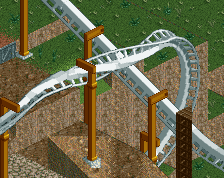
In an effort to make the supports more like a real B&M on the cobra roll, I made the tall lateral supports go inward instead of outward.
As you can see they look fine from the front, but from the rear they glitch through the track.
I messed around in the tile inspector trying to fix it, but nothing worked. Is it acceptable to leave it like this or should I put them how they were before?
Don't get too worked up about the supports. I hardly ever look at them when voting. What you have is nice, but the real task to theme, or otherwise embed the park into a natural setting, is still waiting, and more important.
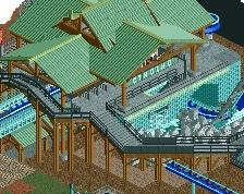
A nice start, I'd change the trunk color of hte birch tree to grey though. Also, look at some H2H7 or the recent Parkmenistan release to see how to use ruins and different object in foliage. Right now its just trees and grass, some more variety and full-ness would help a lot.
I think there's got to be a better way of doing the turn in between the corks though, looks a bit of a mess as is. Look at the way some others have done them.
I think the lush green trees look really nice, they complement the coaster well. The mustard brown trees do not, and the birches stand out horribly because of the snow white trunks. Change the mustard brown trees to something else that is green, and fix the trunks.
Oh, and lastly, I'd lose the 1k ruins altogether. Especially in the way you used them either the rock land texture looks fake or the ruins look fake. I don't think they're adding anything, so I'd just get rid of them.
But all in all it's definitely good stuff. Most talented newcomer in a while
 18-August 16
Nifty layout
Layout looks great, supports as well (except for the inversions). I'd suggest looking at the real life counterparts and try to translate those in game.
Terrain feels a bit forced, but maybe finished it will come together better.
Thanks! Yeah, I've already fixed up the supports a bit on the cobra roll since posting this, and it looks better on the corkscrews from another angle... the hardest for me has been the vertical loop as I can't get anything to line up properly with the track >.<
You can try doing the loop supports like I did here:
I've found that the diagonal support lines up perfectly with the track.
IMO, the cobra roll supports are quite cluttered, but other than that, nice layout and supports.
RMM Offline
the ideas are right, i just feel they're not as well executed as they can be.
the coaster has to be a bit slow through the first big inversions... right? ahh, fuck it. it's a game. maybe you want it that way. don't listen to me. or anybody else here.
cheers.
Unfortunately I can't do the diagonals because it would hit other bits of track :/. I also felt that the cobra roll was cluttered, I think I've made it better.
I'm still unsure what speeds coasters should be going through elements. I originally had the first drop a bit higher, but I thought it might've been too fast. I ended up matching it to the floorless in Starpointe... kind of arbitrary I guess, but it goes through the elements at the same speed as that coaster.
Best advice ever 2k16.
Looking forward to seeing what you can do with the foliage and theming. Please don't turn this into a forgettable generic coaster because I think it has the potential to be more.
I like this layout, it has a great flow. The only thing that strikes me as a bit odd is the MCBR through the loop. Definitely try to slap on some more supports o n the loop if you can.
Very good. Landscaping is borderline too much, but exposes and lifts the ride nicely. Looking forward to how you'll be finishing it up.
Thanks for all the feedback, getting comments from people whose work has been inspiring is awesome! Going to try to take my time on this and hopefully end up with something to be proud of.
I improved the supports on the loop - they're not ideal because the track doesn't line up in the same place from every angle, but it's the best I could come up with in the space constraints. I also made the first drop a bit higher which I think helped the pacing through the first half.
In an effort to make the supports more like a real B&M on the cobra roll, I made the tall lateral supports go inward instead of outward.
As you can see they look fine from the front, but from the rear they glitch through the track.
I messed around in the tile inspector trying to fix it, but nothing worked. Is it acceptable to leave it like this or should I put them how they were before?
Don't get too worked up about the supports. I hardly ever look at them when voting. What you have is nice, but the real task to theme, or otherwise embed the park into a natural setting, is still waiting, and more important.
I'm not sold on the ending. Feels a bit forced.
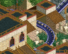
Today I attempted some foliage, etc. I really have no idea what I'm doing foliage wise so any advice is appreciated!
A nice start, I'd change the trunk color of hte birch tree to grey though. Also, look at some H2H7 or the recent Parkmenistan release to see how to use ruins and different object in foliage. Right now its just trees and grass, some more variety and full-ness would help a lot.
This has an old school charm to it, very cool.
I think there's got to be a better way of doing the turn in between the corks though, looks a bit of a mess as is. Look at the way some others have done them.
Oh, and lastly, I'd lose the 1k ruins altogether. Especially in the way you used them either the rock land texture looks fake or the ruins look fake. I don't think they're adding anything, so I'd just get rid of them.
But all in all it's definitely good stuff. Most talented newcomer in a while