Nice, especially if this is your first ever project.
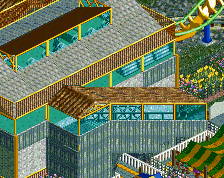
A good layout, and some landscaping. Otherwise there are no features. The layout is what it is. The landscaping is decent, but if you want to give so much role to it for entertaining the viewer, which in principle I applaud, it needs to be more refined. Look at slob's Thrillmatic. It's unfinished, but this type of landscaping he was able to do with a standalone magic no one has since come close to.
What I notice:
- the transition from rock to grass texture is too smooth. There needs to be a bump or drop in the terrain level to justify this better.
- the bright green grass object isn't working. It's too bright.
- I always find it awkward when people through in flowers like that. It's something that should only be near paths.
- Overall it's just too much of a mix: dark greens, bright greens, large and small trees, rock objects in grey and brown, and textures of sand, grass, rock and jungle, next to water. The spectrum of all these is too wide. Narrow it down and refine. And leave more areas bare. Not everything has to be cluttered.
 18-August 16
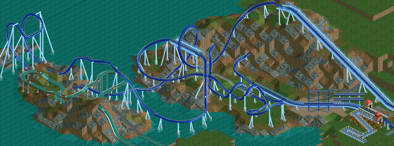
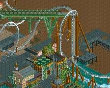
Slight improvement I think. Need to figure out what to do with the ruins, either integrate them better or remove.
Will also mess around w the turn between the corks. I had copied the one in Zippos I think, I'll see if I can find a better solution.
If I manage to get in some nice archy and themeing, do yall think this would be a decent candidate for my first design submission?
Good improvement! Keep doing this and you'll be raking in accolades in no time.
Thanks! beginning this one small project has given me so much respect for the amount of work that goes into parks on here, like your WoF.
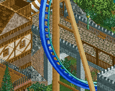
Damn, this is really a very nice layout.
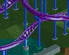
This is nice. Feels sort of throwback-Stevey.