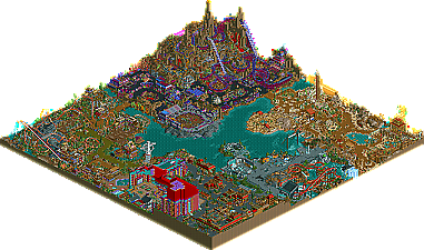
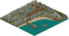
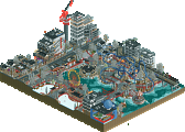
Park / Dimensions: Realms of Creation
-
 28-May 07
- Views 25,661
- Downloads 4,521
- Fans 12
- Comments 123
-
-
 87.50%(required: none) Spotlight
5dave 90% no Cocoa 90% no Liampie 90% no MCI 90% no Poke 90% no Sulakke 90% no Fisch 85% no Stoksy 85% no Xeccah 80% no geewhzz 75% no 87.50% 0.00% -
12 fans Fans of this park
-
Full-Size Map
-
Download Park
4,521
-
Tags
Similar Parks
-
Stardust Circuit
-
Luna Park
-
Fujin
-
Stardust Jubilee
-
Giari Palms Theme Park
-
Virginia Key Resort & Casino
Good:
The amount of ideas you have, some better than others, but makes for an enjoyable viewing experience
Your attention to stuff like restuarants etc. rather than just rides, really good
The architecture was generally awesome
Bad:
A few hacks and ideas that I simply didn't understand/couldn't work out the function
Kinda what Phatage said; the coasters were average at best and didn't match the outlandish, in your face style of the park
Exactly what Fatha' said. He put it perfectly
The fact that you claim this to be realistic
BigFoot - Thx, and you can buy an RCT2 disk for less then $5 + shiping &handling
Pyro - Awesome feedback Matt. Seems like you and Fatha' are on the exact same page, well I agree with you guys. The Hotel/Casino does not fit. Lets face it, the map is 128x128. So I jammed it in. Why would I do that? Well, because a megapark would need one and imo the park needed something huge (other then the mountain). Cramped is a good word for the Earth area. I knew all along id have a rapids and coaster in the same place and otherwise an area would not have a big coaster or the park would be left with no water rides. This area was the one meant to have an innovative Ed style coaster, something like his Battlefield RCT coaster was in my head, only it was a flying coaster. I am glad you really liked the sand area, but a little surprised you were not sold on the maze *shrug* The colers = stolen from Universals Outrage by X-Sector, I just love that part of that park and had to steal em as he is a stealer himself! lol. The colors in the Dino area are just meant to be cartoony and I also think some of the forms were weak compared to the rest of the park. Like I said before this is the only area of the park without buildings made of 100% building blocks. About the themes meshing I will go back to my IoA defence and say that even IoA fails to pull off meshing themes, I mean you go over a bridge and boom! no more Dragon's that breath fire and ice your now chilling with the cat in the hat and eating green eggs and ham. Tho The segway from the entrance to the dino area did suck very badly in the tester editon, tho I think the stone sign helped it's look just a bit in the final version of the park. Thx for the comments, now go work on your park!
RCTFAN - Sounds like you will have more to say later, I am looking foward to hearing why you had those reactions
RCTNW - Thx James. I am in no rush for feedback, take your time.
Posix - Well I am glad you like the flying Jenny, it's the most personal thing in the park to me. You know one of my new goals is to make something you like, tho does that mean I'll need to play LL?
Fatha' - Ohhh a 5 part series?! Cool idea, you already have me eagerly awaiting the next 4 posts. So far this is the best feedback I have gotten, and I am nearly in 100% agreement with it. I already talked about the hotel up in my reply to Pyro. The entrance was very poorly planned, keep in mind I started with it 2 years ago when I was not as good as I am now, back then my plan so simple and stupid *I think I'll make some really tall bright towers with flowing waterfalls and call it a utopia* So I did that and it was so weird I scrapped it, (HOWEVER, it is finished and somewhere on my old PC and I intend to release it soon...). So yeah that really hurt. After I got so many complaints I did take a good look at it and realize I had fucked up, but what could I do now? What I decide on was building 100% for myself. Naturally I put in some run of the mill entrance stuff, but the main idea was to put in exactly the kinda stuff I wanted to see if I walked into the park, stuff I am fond of. I say the park is realistic, yet I have the entrance built 40ft off the main level or "First floor of the park", why would I do this? I have No fucking clue to be honest with you... I just wanted to create a huge problem and see how many ways I could think of to solve it. I think I found 6 ways to get people to floor 1 in total. In the end I am happy with the entrance even if it is not an "entrance" in the true sense. I think you will have enjoyed the themed areas better, so I am very much looking forward to your feedback on them Mr. Grinch
trav -
vekoma9 - Thx for the feedback, but keep in mind that the park is 2 years old and Toon's supports are about 6 months old, so feel free to cut me so slack as I did manage to get them into the park in the first place and try to make the B&M look a little more realistic, even if I did not have room for enough slanted ones. Seems you like hacking. You know im trying to get around to adding to my hacking guide about how I deleted the entry/exit off of them, it's 10x more simple then Levis' winhack way
deano - Thx for the feedback I made you post so you'd be un-banned. I plan on blackmailing many more people into posting replies at least until we have another spotlight
zodiac - Well, he really said that.
Todd Lee - Hold on, I go to RCT2.com and give you wonderful comments on your VP and you don't like my park and you drink tea? Ok I hate yours too now, so we are even, ha! Ok well im kidding, thx for the props on the hotel and I still like your park... Mama Bears parts that is
Metropole - Thx, and yes I do think it is a realistic themepark with some fantasy elements, but I am kinda offended when people say it only fits in one of the two category's. Also do you mean the other half of the review you sent me? Well like I told James there is no rush, altho I do hope to have feedback from all me testers so...
eeg_Head
Xcoaster
Ty
and iris
Sometime this month guys... please?
Small Change in NE Release Protocol Announcement
In a week or two there is a good chance a new .zip of the park will be uploaded with lots of new stuff including a modified version of the park.
Anyone else who wants to do there for there NE release please let me know. I see no harm it can do, it should give people a better version of what they are downloading.
Kumba
I meant exactly what I said... this park has no depth. There's a difference between themes that are very impressive and that you can immerse yourself in (like IoA to reuse your example) and yours which only seem to consist of small details and not much else when it comes down to it. Once I see all the details... that's it. There's just not that much else going on in terms of the areas as a whole. And yes, lack of atmosphere really contributes to this. It's just not a park I can really sink my teeth into when it comes to exploring it. The sheer amount of details and attention paid to them is just too distracting. Most of your themeing is used on all the "little things" that like I said before... only impress on first sight. I'm not saying this makes for an awful park... in fact it's quite fun. But your style sacrifices atmosphere and depth. You can't have a crazy detailed park that's a lot of fun like this one and expect it to have great atmosphere themes that you can really dive into. It's just not possible with your style of parkmaking.
And OLE in what park(s) have you seen better Depth and Atmosphere?
What I really want is an example and until you can give one I don't think you have a case. You should have something? I can link to some parks I think fit the bill, but it's on you...
A case for what? Can't I have an opinion without having to prove myself to you? What are you trying to prove here anyway? Jesus christ...
Ok... if you really want examples:
Bijou Magique
RoB
Isole Calibara
Ports of Magia- and other parks by Artist
your Bayfront Parc did a better job imo
parks by JKay
Get my drift here?
Ha, now wait a minute, I never said I hated it. LoL, and my tea is actually chocolate milk. Yummm...
In the hotel, after looking again, I actually like the colors. It's the teal floor on the upper level that throws me. That's the only color I would have done differently. Don't ask what color I would have used, I have no idea. I like the pool tables up there, they even have the pockets!
Dino eatery is one of the better restaurants I've ever seen in RCT. I like the color combos there, (even the teal).
And, the Survivor area in Insular Insomnia is almost all me.
Edited for speeling mystakes.
Edited by Todd Lee, 03 June 2007 - 01:47 PM.
So now here I am.
Now while I find the park to be spotlight worthy I pretty much agree with what Phatage said about it. The level of detail and the number of ideas are certainly astonishing and award worthy on their own. Sadly the park and ride layouts fail to carry this through. The woodie just feels big, fast, and overdone. There's no real substance to the layouts. Mirage, or more accurately the whole Land of Sands area were lovely because they almost seemed willing to accept being orthodox.
While the architecture seemed like it should've radiated it's greatness it too had something incredibly "samey" about it with the exception of the games and arenas. It was all detailed and therefore beautifully ornate; it even had purpose... But the forms just got lost in the layers of "extras" and colors. None of the coasters really impressed me, though Bone Shaker and Mirage certainly entertained my attention for a moment.
Now that the bashing is out of the way though it's time for some praise! I admire your willingness to step outside of the realm of comfort, of doing the same old textures in the same old way. You manage to create dark atmospheres that aren't gloomy, and gloomy atmospheres that aren't dark. I adore the casino with it's little advertisements in the "world poker" part. I loved how you had midway games scattered though-out the park and all the flat rides were well integrated into their respective environments. The "ride" roofs that could be made invisible at the touch of a button are a simple but brilliant way of avoiding building a "roofed" and "unroofed" version. I also liked that while the buildings, rides and pathing was all heavily laden with detail that you left the majority of the land relatively open. The contrast between open space and the detail really helped to bring out the better side in the park and create it's unique and lovable atmospheres.
That said congratulations on your first legitimate spotlight. The effort, skill and execution are all there, even if the frosting of details over the top obscures things some. I can't help but wonder though; what would a new "Kumba" solo look like without all the recycled themes and ideas? I mean do you really need to do everything three times over in public releases before you nail it? And (imo) Artist's Dino area in Islands of Excitement still kicks the shit out of any of yours aesthetically. No offence though, you've just finished one of the top five parks ever made in rct2 and you did it your way, which is quite an accomplishment unto itself.
Ride6
As for the park for me, I have gone and looked at it several times and each time it’s a new experience for me. That is rarely accomplished these days. In most cases, you view it once and then never open it again let alone opening it several times in the past few days. Again congrats for having a park with that kind of reaction.
As for me, it was a bit of a let down for me as I had built it up in my head as a very different experience. Not your problem but my own. The ideas for what you came up with, I never would have thought of. The bowling alley, the casino with the poker tables, the panda bear in the basket above the path, the restaurant with the floating tables, the coaster cars roaming around the land under the other coaster (I forgot what it was called). All of those were fun to look at and I wish I could manipulate the game like that. I have a hard enough time creating elevators with out a visible base. Hell, I can’t even do a simple track merge.
With all that said though, for me, it was too much on one project. There are so many ideas that they could have been used on other projects instead of trying to fit as many as you could onto one map. I think each area itself could have been expanded into it’s own map and then expanded to help tone it down just a bit. For me it was in your face, bold and overload. If I had to pick one area I liked over the others was the sand area. I liked the bamboo pole work, custom sign and the coaster had some exciting parts to it. Again though, I would have liked to seen this area expanded on and spread out over a larger area.
Perhaps this is where the lack of atmosphere comments are coming from, but then I could be wrong.
I also know you asked me to test it however I’m not sure this feedback would have helped as it is more personal preference than problems with the park.
I hope this makes sense but if not, we can talk about it on aim.
Anyways, congrats on the park. It will be one I keep, draw inspiration from for ideas, however a park I will not model after as it is just not my style.
James - rctnw
Corkscrewed Offline
Some old habits die hard. Remember that.
Fatha' Offline
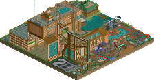
Well, the idea behind this area is swell, but yet I don't know if you necesarilly pulled it off as successfully as it should have been. First off, you present the idea of Nature's Fury being displayed in a lab-like setting....and in fact, the entire area is one big laboratory. We can't observe natures fury in one giant laboratory, and I think it might have been best if you would have made this area more natural. Or perhaps, even, you could have modeled this area off Jurassic Park (where dinosaurs are studied in a giant laboratory, but still their natural settings and behaviors are preserved). In fact, i think THAT is what you lacked when you made this area. You really did not demonstrate the full fury of nature... You started to in you little shop area where you had each shop themed individually and what not, and that was very successful. Another good thing you did was have an area that showed the actual statistics of great disasters, which was a very nice touch. Instead of demonstrating the full force of nature over the entire area, you really just displayed it. I would be like watching a tornado in a laboratory, but not realizing just how powerful and destructive it is....and I think the way you could have done this was create ruins and rubble (Burning houses, frozen neighborhoods, and whatnot). Then again, that really is not practical for an area of this size, which i think is unfortunate because it's size undermines its potential.
Now, my favorite part of reviews, ripping the coasters a new one. Heh, actually I won't be that harsh on this one. In actuality, it was quite a good ride. It was fast paced, it was intense, and it had nice elements, and most of all, a great ending. It had size, and was quite ominous, especially from a peep's perspective (walking along the area and viewing it). The intimidation factor is there....but my question is this....WHAT exactly is this ride? Hurricane X? It does not resemble a hurricane at all, and does not have the theming a hurricane themed ride should have,. For example: had it go through a torn apart village, it would have been fine. But to name it Hurricane X and have it soar over a rapids ride (that is MUCH better themed might I add) and throughout the air makes no sense to me. Another positive about the coaster was its station, modeled much like an auditorium where the people inside the station could watch the coaster go through its elements and layout....very very nice touch here. It may seem like im asking to much of you with this ride, and probably I am. The fact that it actually is a good ride already gives you a head start in my book, but I don't think you finished it off....for example, like SAC did with Eversio Lemuria or Phatage did with Denali. They made a great ride into a great experience, and you failed to do that in my book.
Earth's Fury
AREA RATINGS
Idea: 6/10 (The whole lab thing is great, but you didnt fully explore the idea of natures fury).
Theming: 8/10 (For a lab theme, it does its job well).
Architecture: 8/10 (Some nice building designs here).
Layout: 8/10 (Works well, gets the people involved with your attractions).
Rides: 8/10 (its missing a flatride perhaps, but overall the rides are quality).
Guest Friendly?: 9/10 (Very straightforward area).
OVERALL RATING: 7.8/10
RIDE RATINGS
Hurricane X: 7/10 (Great layout and intense ride, poor theming).
Rampage Rapids: 9/10 (Nice ride, love the theming).
Resistance Survival Training: 8/10 (Good job).
Tsunami: 7/10 (Great location for a skydiver, but bad bad name and theme behind it).
OVERALL RIDE RATING: 7.7/10
OVERALL AREA RATING
7.8/10
--------------------------------------------------------------------------------------
Entry Area
Idea: 9/10 (Great idea, the whole map thing and golf ride, the idea for the area introduces the park well).
Theming: 7/10 (You had an idea, and executed it well, and the medieval theming is somewhat nice).
Architecture: 9/10 (Some nice building designs here).
Layout: 7/10 (Its an somewhat decent layout for an entry, but its not 'magical' like i said above).
Rides:1/10 (its missing a flatrides....MUST have flatrides....but the ride there is awesome).
Guest Friendly?: 5/10 (Tons of shop, bad bad theme park experience for an entry....and its not organized well, with the path layouts being confusing at times).
OVERALL RATING: 7.9/10
RIDE RATINGS
Ana's 13 Hole MiniGolf: 10/10 (Great ride, and I like how it acts as a mini theme park for ur park).
OVERALL RIDE RATING: 10/10
OVERALL AREA RATING
7.9/10
---------------------------------------------------------------
OVERALL PARK RATINGS
Entry Area: 7.9/10
Earth's Fury: 7.8/10
Dino Rigs: N/A
Mt. Morbid: N/A
Land of Sand: N/A
Overall Park Rating: N/A
I'm still writing on my review, which I'll post when it's ready
SF
The main thing that really put me off the park was how cluttered it looked, I felt that there was maybe just a little too much going on in each screen. This prevented me from fully appreciating any specific area because you're being distracted by other parts of the screen. The hotel was maybe also in the wrong place as it crampt the entrance slightly but other than that I feel you maybe should tone down how much stuff you add into each screen.
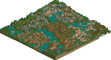
Oddly my favourite park of yours is probably the original Dimensions, which somehow caught my imagination (especially the Land of Ditto area), I think because it's a little simpler than your later parks.
Anyway good job on the park, well done on the spotlight and I look forwards to future work.
woofenskid - wft
Ride6 - I agree on the weakness of the layout and some of the rides (IMO all the rides in the land of sand, Dinolishion, Dem Bones, Ana's 13 Hole Mini Golf and Monster Scrumping fit the bill as fresh new kinds of rides) I just was not that willing to get to crazy with the rides and imo a simple park layout is the best park layout. Thx for all your comments and I already verbally assaulted you on AIM for that crack about Artist' Dino theme being better then mine, if it was not for me that area would have been shit
RCTNW - You just put your finger on (and Phatage put his finger near it too) the anwser to a question I get a lot "Why do you add so many details?" well like you just said James, you can open the park many times and keep finding new things. It's not a park you can just open once and look at for a few minutes and get everything, no you need to really dig in, imo to get everything you'd need to read the read me and pour over it for about an hour or two, almost like a good book. I know what you mean by it being to any compressed ideas, yeah I could have spared them out, but I prefer a lot of ideas in one place or so. Thx for the comments, I know it's not exactly your style, but I am glad you enjoy it for what it is. Now send me the MMW map so I can see my Giga
Fatha' - Part 2! Ok I must confess that Earth's Fury was that last area and maybe a bit rushed. You did misunderstand the theme, it's not a big lab at all, it's a part of Earth stricken by disasters and falling apart. Scientists foresaw this and built labs to study the area. So it's labs on-top of Earth. I did agree however that I did not demonstrate the full fury of natural disasters. I though about ruins and busted buildings, but decided against it due to the science aspect of the area which would have predicted the inability to do that with secces, and yeah the area was also to small! Im glad you like the coaster, whille building it I though it was you kinda style. What is it? Thats a good question, at first it was going to be a flying coaster so I consitered calling it "The Sentinel" but I just was unhappy with all the layouts I made and knew id need a smaller coaster, so I built the B&M invert you see there now. Why call it Hurricane X? Great question, I think mainly coz im obsessed with Hurricanes and also because of how fast the final layout is. So I guess it represents the winds of a monster Hurricane. Your feedback is the best man, I love the stats and everything. Im really looking forward to the next
Six Frags - Must be a hell of a review if it's taken 2 weeks
Leodardofury - Thx for the comments. I am glad ou like the first Dimsions park and I think with whatever I do next it will be more simple... tho my current idea for a PT3 finals entry would be another but simple or normal
Keep the feedback coming, I love it all