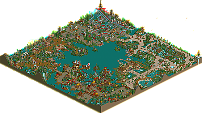
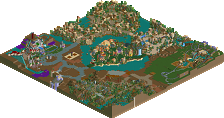
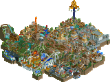
Park / Islands of Enchantment
-
 28-June 05
- Views 19,563
- Downloads 5,117
- Fans 5
- Comments 133
-

-
 83.13%(required: none) Spotlight
inthemanual 90% no ][ntamin22 90% no Liampie 85% no robbie92 85% no Stoksy 85% no Cocoa 80% no MCI 80% no nin 80% no Xeccah 80% no Poke 75% no 83.13% 0.00% -
5 fans Fans of this park
-
Full-Size Map
-
Download Park
5,117
-
Tags
Similar Parks
-
Outpost Prehistorica
-
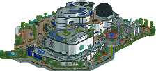
Millennium Discovery Museum
-
The Falls of Time

-
Brachiosaurus
-
IOA Rome
-
The Testament
Well done Chris. I will leave comments on the park later.
Overall, it was a great park, but lacked originality. My biggest concern again was the speed of your coasters, which I found to be lacking. Theming was nice though, coaster layouts were solid, and everything came together well. Very nice job.
Corkscrewed Offline
posix: To be honest, I didn't think the included logo was that good, which is why I made my own. And most people seem to think that this blue one is better than the original, so I guess I was onto something. But you sound more worked up about it than Chris!
Anyhow, you have done a fantastic job. Its spotlight placement was inevitable, it was always going to happen. Hopefully, i can finish Masterpiece soon and follow in your footsteps!
-X-
inVersed Offline
My favorite area was the Jurassic area.. It seemed the most thought out and it seems like you really took your time on it. I also liked the coaster there.
The other areas were nice, I liked seeing the improvements from PoM. Overall I had mixed feelings on this park, it had some good coasters, archy, and atmosphere sometimes where others it lacked all three
Still a nice park man, I personally think it is worthy of a Spotlight
...which, as the label might imply, chris didn't even do.
I feel like this is evil's jab at me for not working on ANTI
You wound me, mark
Sorry I couldn't make it to your little party. I Was on a vacation and felt bad about missing it. Heard it was fun.
Anyway it's great that we've already had 2 spotlights since the NE Awards voting. Hopefully we'll have at least 7-8 this year. At this rate Artist will have 3 of them *rolls eyes*.
Anyway here are my thoughts:
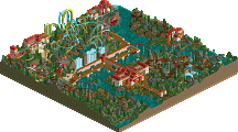
+ Compass Cove- Good colors and textures, sure a bit typical for a pirate theme but I love em' anyway. The whole things seems very well thought out (bits like the stairs going up to the MCBR on Cutlass do alot for me). Cutlass itself is an excellent coaster witha unique and interesting layout & very realistic pacing however it has one glaring defect: the launch should've started much closer to the station and then you could've left the last few inclined tiles open so the ride would "coast" into the first inversion. I just think it makes things more fluid which appears to have been what you went for with the layout. The Search at the Cove wasn't so great either. It's music clashed with the rest of the area (bad) and the theming (like the signs) seemed to aviod being piraty at all costs. "Yes, we found the gold"!? Why not "Arrrr, we plundered me gold" or something like that? The optical illusions involved with some of the drops and such though were excellent.
+Hotel/Waterpark- Seems forced and it's boring. Needs music and some different textures. Basically it's everything I hate about this "neo-classical" style. The pink flowers and your excellent thick folidge save it from complete horridness though.
+ Garden of Eden- My favorite area of the park by a long shot. The music, colors, textures and folidge just blend to create this wonderful bright atmosphere. It doesn't hurt that Gaia is my 2nd favorite coaster in the place either. The atmosphere (btw) kinda reminds me of the bright areas of Mt. Sinister in rct2 thanks to the folidge and overall brightness, no suprise that I would love that.
+ Hammer Smith Forge- Bah. The duelers are excellent in every way. My favorite of the coasters here... However the theming/architecture seemed to loose it's normal ability to look elegant here. It all seems forced, like you wanted to do Gotheburg but you didn't want to be accused of copying. It also lacks the color use seen around the park and goes with typical grey castles. There are a couple bright spots, like around the duelers stations however as a whole it's not nearly up to the high bar you set with Compass Cove or Eden or of course:
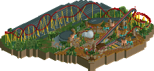
+Land Before Time- Other than the crappy name this area may well be the most original prehistoric theme ever. Or at least in a full scale park (OP by WME & Phatage in h2h was damn original too)... New Breed is an excellent layout with the exception of the one excessively slow bunny hop towards the end. Tours of Azga River were rather nicely done also, except for the folidge in the way of the boats, what sillyness!
Overall: The park shows improvement in all aspects and more importantly is spotlight worthy in that respect. Your solid landscaping and folidge have further matured, the folidge in particular sets this park apart from the cloud of "neo-classical" crap. Theming in most 3 of the areas was well above and beyond the status quo and often bordered on perfection. Ride interaction with buildings, paths, etc, was everywhere. The colors were special and unique without becoming gimmicy (Watermelon Cove), insted enriching the atmosphere with more life and energy. IMO this is spotlight worthy, I didn't expect to like it nearly as much as I did however there was brillence in 3 of the areas, brillence beyond anything I've seen in quite some time and the counts for a lot in my book.
Excellent Work.
ride6
I don't see why everyone is praising "the improvement." Spotlights are not about parkmakers improving, it is about getting the best of the best.
"Oh that's great RCTFAN you started using color, you've improved! Spotlight for you."
It shouldn't be a talking point for merit of a spotlight. I'm not all up and about with the spotlight histroy because frankly I could give a fuck about the conceited contest, but do most parks have this many guest things? To echo micooooooooooooooool's post, what did Chris make? Maybe this should be considered a colabo? I might be wrong though.
Putting all that aside I still love the Dino area. Very creative and warm. Do more work like that, Chris.
P.S. English and German versions of RCT2 run at 1280X1024!!!!!!!!!!!!!!!
I give you a 7.5/10.
I will have more to say later. thanks for the comments guys.
Corkscrewed Offline
So you're saying screw the footage of the park in-game.. screw the text talking about the park.. screw the fact that everyone knows the video is about Islands of Enchantment... just because the logo is different, suddenly there's absolutely no connections?
That stands as the most absurd thing I've ever heard you say.
Besides, I'll say it openly, the original logo was pretty lackluster. It looked like something out of a Microsoft clip art gallery. I'm not gonna say I'm the super best greatest graphics guy ever, cuz obviously I'm not, but I will stand behind my logo in comparison to the other.
That's if you want to make a big deal out of this of course.
and really, i wonder if maybe you go the wrong logo, heh, because i find it thrice as good as yours.
oh and Jacko i will remember to leave a comment of that standard on your work in future.