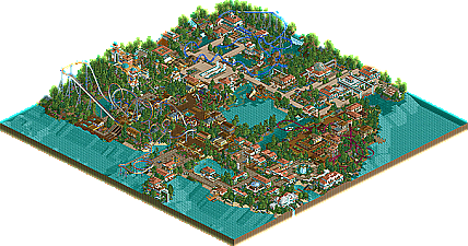
Park / Sikinos
-
 05-April 06
- Views 9,542
- Downloads 799
- Fans 0
- Comments 74
-
No fans of this park
-
Download Park
799
-
Objects
340
-
Tags
Similar Parks
-
Fusion Survivor 2 - Ultimate Tribe
-
The Ragnarök
-
Internet City
-
Campi Vinobacci
-
Disney's Shadowlands
-
Cinemagix
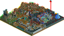
your buildings are a bit simpeler now, the previeus screen was better because the builings had better shapes.
the custom supports you use I don't like either
I personaly don't like the blue you use in the canvas roof, maybe you can change that in a other color also
but the screen still looks very good
Also, I hope this isn't another rct2 park with shitloads of water everywhere...
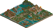
Such a small turn before a series of elements like that... it will be either be too fast on the turn, or too slow on the helix. Therefore, bad pacing.
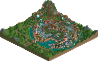
I completely agree with mantis and blitz. That turnaround element not only looks akward, but also seems impractical. I'd tinker with it, mostly. The rest of the screen is actually quite nice, yet sparse. Definitely a decent park you have going here.
Guest_LC_BlaZeR Offline
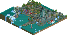
Screen 3: My favorite so far. Nice work!
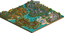
Screen 4: Really good. I don't like that building in the center of the picture though. It looks to plain compared to your third screen.
Keep up the good work,
Clockwork
Guest_LC_BlaZeR Offline
Coming Soon.
edit: i reread this and would like to say i have nothing against slob, turtle, or steve they are great parkmakers and this is their style and they have mastered it and it looks great but it seems everyone is trying to pull something off that really is somebody else's style. so in conclusion <3 to everyone.
Edited by chapelz, 25 March 2006 - 10:58 PM.
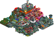
The building is ok, but seems insignificant.
are you serious?
When i first started building this park i did'nt know who slob was so i don't know how i could be trying to pull his style off. I obviously know him now and yes turtle has been an influence for my style in this park but for my first solo im extremley proud of it.
Your'll be seeing it soon anyway.
Edited by J K, 26 March 2006 - 06:38 AM.
8 Cars!
http://forums.nedesi...showtopic=13363
JK, this is looking nice. I like the 1/4 tile works you've got, especially the little waterfalls. Keep it up.
j k, the park is very pleasant to look at but doesn't do much more in my opinion.
Fatha' Offline