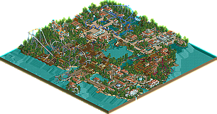
Park / Sikinos

Park_1478 Sikinos

74 Comments

  • JBruckner%s's Photo
    Take away some of the trees and it would be very slob.
  • artist%s's Photo
    i LOVE it...good job 9/10
  • J K%s's Photo
    Ok heres a new update. Enjoy

    Posted Image
    The cycad bushes arn't staying
  • RCTCA%s's Photo
    That looks really nice J K. Cant wait to see more. Keep it up. :D

    -PM :et:
  • Levis%s's Photo
    I like this screen more :) .

    but youre walls are a bit empty and dissapointing :( , maybe you could add something to youre walls to give it the WOW factor :) .

    the aquaducts are nice but why don't making a turn in it ?

    the function of putting flower under those poles I don't get and I don't like it either, maybe you could change that :).

    the water is niceley done but the borders are a bit borin, why don't you put a wall there to remove those ungly land borders ;) (I sugest those ruin walls).

    and why don't you make it youre self a bit more challanging and don't make buildings of 4*4 but give the bottom a strange shape, in that way you can give a lot more to it (balcony's etc.)

    ontheless it looks pretty good :p .

    sorry fot my bad engelish, I see I need to practice more at school :p
  • JJ%s's Photo
    I am really liking this park of yours JK, like others have said, i can see you've got a lot of potential to be great, just with those few little touches, you'll be on yur way in no time :D
  • PBJ%s's Photo
    oke... first of all... the first screen was better...

    i'm noy a huge fan of a "mirror-mode" in RCT... if you get me right.
  • Xenon%s's Photo
    I see you fixed a few of the little things since the last time you showed that area. Nice work.
  • Phatage%s's Photo
    It has an overall nice feel that is easy enough to achieve, but I really admire the little things of brilliance that aren't often, if ever, done. Things like the vines on the land side near the top of the first screen and the single wide path in that last one outside the theater give what initially seems to be a turtle or artist park some defining characteristics. If I could recommend anything, it would be to put more foliage hanging off the buildings.
  • Jazz%s's Photo

    I really admire the little things of brilliance that aren't often, if ever, done.  Things like the vines on the land side near the top of the first screen

    View Post


    Vines on land slides? I had plenty of those on Monsoon Mountain; maybe a bit too many....


    ~Jazz~
  • J K%s's Photo
    Thanks for all the replys. . . .

    Levis: I will add more detail to the walls, thanks for the advice.

    Blah188: Thanks dude

    PBJ: Im not bothered about mirror mode, i agree it should'nt be done that much. All ive done is packed the building with detail so the mirrored building is'nt really a problem.

    Xenon: Thanks glad its better.

    Phantage: Hanging foliage would definatly help the 3d cinema, thanks alot for the comments.

    Jazz: The wooden coaster in monsoon moutain rocks.
  • Jazz%s's Photo
    ^ Thanks, man. :D


    ~Jazz~
  • JDP%s's Photo
    dude man, great job so far on the scenery. keep it up. can we see more pictures of you coaster(s)?
  • J K%s's Photo
    New screen.

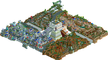
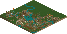
    I wanted to go for a contrast from the white buildings as i thought too much could of been to repetetive. So heres a new screen of the "Kids Kingdom" Its shows the kids coaster and some of the small shops around the jungle themed area.

    Posted Image

    Enjoy

    JK
  • JDP%s's Photo
    JK i must say you did a well job keeping up with the scenery in one spot...well done on this part of the park...

    Edited by JDP, 14 November 2005 - 05:44 PM.

  • X250%s's Photo
    Its very good, maybe make the flower arrangement a little more organised and add a few more bushes underneath the coaster maybe. Not bad apart from that.

    -X-
  • JKay%s's Photo
    Overall, this screen is excellent, except for a few nit picks of mine.

    1. I don't like the brown track; theres not enough contrast
    2. To me, the wagon wheels, wood piles and barrels feel out of place and kind of litter the awesome atmosphere you have going
    3. I don't like the "X" shaped roofs. I prefer "V" roofs, but thats just me.

    Still, this is great stuff. You're definitely on my "watch list" right now.
  • ekimmel%s's Photo
    Definitely need something under that coaster track. It looks bare.
  • Jazz%s's Photo
    You are a very talented parkmaker, I see much potential. I agree with Jkay on all of his points; especially the track color. Contrast would make this screen nearly perfect, IMO. It's also refreshing to see something other than the white.


    ~Jazz~
  • J K%s's Photo
    Update.

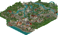
    Just a screen to show some of the progress ive made, the park is coming along well and i am very happy with it so far. This screen shows another restaurant near the coast of Sikinos with a shot of Sparta the parks B&M.

    This screen is'nt totally finished yet IMO it need a bit of tweeking enjoy.

    Posted Image