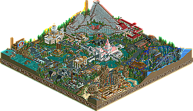
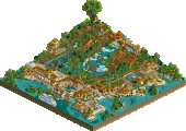
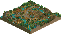
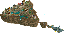
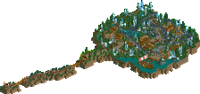
Park / Zodiac Thrills
-
 28-February 06
- Views 11,953
- Downloads 829
- Fans 2
- Comments 73
-

-
2 fans Fans of this park
-
Download Park
829
-
Tags
Community Forum Software by IP.Board
I could not find a fault at all, it had a consistant quality all the way through and i enjoyed it all. 12 different themes on one map is pretty hard and you did nail it.
All the rides were exellent. I especially liked cancer (my starsign), aires, and taurus. Cancer was incredible and rounded the area off nicely. Airies, absolutly amazing coaster, i loved the interlocking corkscrews. Themeing of the mountains were excellent and the sign for the ride really made the ride for me. Taurus was excellent as well. It would be amazing to ride and it was one of the best of the four coasters.
Some extrmeley creative ideas and i loved the way you did some water features. Excellent park and obviously my favourite as you had the same idea i had, just pulled off earlyer and obviously better.
This was a shock to me that you were 7th but it makes the competition better in my eyes, as i thought you really were going to be in the top 3.
Edited by J K, 02 March 2006 - 10:40 AM.
Nicely done indeed!
Corkscrewed Offline
Effortless Sophistication
This is when a person makes something that is richly detailed, yet looks like it was made in like five minutes.
That's what the Phish has brought in Zodiac Thrills, a park that has a LOT more than meets the eye. I'm going to have to echo Phatage's sentiment about details, because there were a ton here. Even small things that might not even be considered as details. I like how the signs literally WRAP around the corners, not just turn. The stone archwork supporting the Capricorn railroad tracks by where Sagitarious drops into a ravine. The cliffy "supports" for Scorpio. The way the "Aries" ride sign is STRUCTURALLY ACCURATE (there's an extra block behind that supports the dot on the 'i'. There are so many things that are wonderful that it'd take a while to list them all.
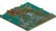
And the coasters! I thought your flyer was lackluster from the screens. Not so... what the screens prevented me from doing was move around, which is crucial to exploring your parks. Seeing how things interact with nearby and farther surroundings was really neat, and the theming helped support a lineup of terrific coasters! Taurus seemed a lot longer than it was (in a good way), while Scorpio looks like the funnest family coaster I've ever seen. If Vekoma really did build a flyer like Aries, it might be the most popular Flyer ever (assuming they work out the smoothness issues.
This park is so rich that I could probably spend another half hour looking at each ride, thus wasting even more time. I think cBass got shafted a bit, although I can't say that for certain.
However, this was one helluva park, and had it been full size (and developed accordingly), it would have been a definite Spotlight.
MY RANKINGS SO FAR:
14. Old Red [5.0]
13. Kumba [6.2]
12. Six Frags [6.6]
11. Jazz [7.6]
10. Magnus [7.7]
9. Dark Janus [7.9]
8. JKay - Ecstasy Falls [8.4]
7. cBass - Zodiac Thrills [8.6]
I think that pretty much sums up this park, and the little things picture thing I promised is coming soon...pure genius...
The only drawback to the park is the map was too small for all your ideas! I loved so much in this park..the archery target with arrow, the redo of your Capitol building in Wisconsin, Taurus wooden coaster, the carousel building, the Capricorn train and area, the BIG pink building with the cool flag on top....
I could go on but I'll stop. The most amazing thing about your work is that you can take any objects and create something. Of course, you showed everyone with Wisconsin you can make a park without custom scenery. Very creative, original, and talented....thats you.
Makes me wonder now what will be next...and we have how many more to go?
I love this contest
On a sidenote: I'd like to use your words Toon...for when people complain about judging at RCT2.com...you said it so eloquently. If everyone would just be like DJ and just be happy they get such a nice presentation of their park...
Edited by Buckeye Becky, 02 March 2006 - 09:30 PM.
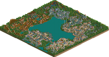
Although the front of the dam may be impressive, I still love the attention to detail for the back end of it, as well as the sunken boats along the sumbarine adventure.
That observation deck surrounding the coaster's drop is genius, as well as the coaster's "Apollo's Chariot"-like placement. Even the quarter-tile targets, seemingly obvious, are yet brilliant!
This open plain of grass is incredibly well placed, as displays those wonderful arches perfectly in the open.
I love how the train's track colors are adapted to not stick out agains the supports of the woodie.
I just love the placement of this river and the path/bridges that go over it.
If you look closely, you'll see a peep on the queue line. That helix placement is impecable, gives a great foreshadow for the queuers, as well as that terrific queue line placement throught the building surrounding the courtyard.
On top of the totally ingenious inverted-interlocking-corkscrews, the supports are magnificent!
Details like this glass lookout to the river below show how much Cbass took into consideration the experience of the peep rather than the above view of a bird.
And there's so many more but I haven't got the time for now.
(but the last two screens don't work for me)
But those are extremely great details Phatage. I viewed the park again since you put me in the mood, and I saw a peep sitting at at a 'picnic table' with a custom table and everything - something I've never seen before. I wanted to post a screen but MSPaint isn't working.
Did anyone else notice the drains in the paths?
HandyAndyG: Virgo is not a coaster. It's a coaster simulator. The coaster virgin has never actually ridden a coaster, only the sim. The cycling coaster track near the castle entrances is just a teaser. I suppose that's a pretty elaborate and expensive bit of scenery, but it could technically exist.
also, i think my favorite area was the area around pisces, with the queue line going through the rocks and the fish on the wall, it was awesome. congrats again.
RMM Offline
Edited by RMM, 03 March 2006 - 08:51 PM.
Your commentary on this screen only validates my point that many current players are too focused on the details and creativity. The landscaping in this screen is quite poor. The angles are too sharp and walls of rock are created which instills an artificial atmosphere. The dam has no texture to it, nor do the vines with the tables on top of them.
The observation area does look nice, but how why would it attract anyone? It is essentially a dead space. What's on the otherside of that fence? A store or building or attraction on the otherside would give the area much more dynamism. The verticle "Sagitarious", as well as the blue walls lack design integrity. There are a few other objects in this space that don't have any reason for being there either, such as the targets, the floating blue things and the vine with the table on top. Again, the landscaping is quite poor due to it's uniform appearance.
Generally a good screen, but the windows are placed so low into the columns that they prevent structural honesty. It's a very classical form, the arch; intuitively strong. When holes are punched in the the strongest part we can't believe it to work. That classical style now looks artificial.
The roof in this screen is overbearing. Yes it has colour and texture, but the lack of variation taints its apperance. The long, uninterrupted slopes or ridges are boring to look at. Even cBass agrees, as even he tried to break it up with a a few chimneys here and there, unfortunetly to little avail.
Again, I'm not trying to bring the park down, I'm just pointing out the negatives Phantage failed to mention with his positives. There are advantages and disadvantages to everything, there is no one solution. There are only better solutions.
You're grasping at details rather than looking at the big picture. Jazz went in and took the easy 1 point shot. cBass attempted a 3 and missed, rebounded and got a two, the effort was clearly on a whole different level here. Not that anyone should ever get and "A" for "e"ffort.
Oh and my apoligies to Jazz, I'm frusterated with Nate's views here not you. Nate I respect you greatly and still hold you in very high regard, however that doesn't change the fact that I completely disagree in the this case.
ride6