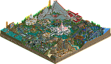
Park / Zodiac Thrills
-
 28-February 06
- Views 11,949
- Downloads 828
- Fans 2
- Comments 73
-

-
2 fans Fans of this park
-
Download Park
828
-
Tags
Similar Parks
-
Fusion Survivor 2 - Ultimate Tribe
-
Busch Gardens Sydney
-
Mont Saint Michel
-
Kitabasaki Dragonland
-
Tièrre Mòrtica
-
Memory Lane
Edited by CoasterCrzy, 03 March 2006 - 10:53 PM.
RMM Offline
But if your gonna take a shot at playing RCT artistically like this site is, why not do all you can to make it look great? There's no point in goin half ass and taking the time to finish and send it in. It makes no sense to me at all.
It's hard to explain what I'm tryin to say exactly. If ya want me to try and clear it up if ya didnt get it then let me know.
There may be many details but it does look rushed to me. Maybe it was. Or maybe it's just not a style I like over others.
Edited by RMM, 03 March 2006 - 10:54 PM.
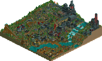
Coasters are hands-down the best so far. I'm in love with that Schwartzkopf. Aries was... unique, to say the least, and had some really interesting elements. (Betcha anything someone's going to steal the interlocking corkscrews there.)
Neat details -- the crab for Cancer was awesome, and the 'coaster virgin' was entertaining. WTF is with Capricorn though? I... don't get it.
All in all, definately the best so far.
I REALLY wanna see the next few if this is #7.
-ACE
Corkscrewed Offline
I've heard that tone before, and that comes from years of seasoned architect thinking.
Basically, Nate wants synergy. The parts must be good, but they must also contribute to the whole. And a truly great park will have a whole that is greater than the sum of its parts. Most of us call it that extra intangible.
In any case, while Nate's points are valid, I don't think those specific problems that he pointed out detract the park enough to lower it down to a seventh place. Of course, that's my opinion, and Nate has his. I enjoy this sort of discussion.
anyways.
i'm sort of trying to get up-to-date on these things, and, honestly, i didn't like it. some areas were very nice, but, overall, it didn't do much for me.
ps: nate, why fuss over the arches being structucally "honest"? there's a much better reason to attack them: they look stupid.
Edited by cg?, 04 March 2006 - 12:20 AM.
This contest has nothing to do with risk assessment. I judged on what I saw, not potential.
Toon, you explained what I had difficulty putting into words. You seemed to make a similar statement yourself in the "Time Machine" topic; as did Turtle. It's nice to see that some of us are thinking on the same wavelength.
Hahaha! I've designed a home for school; part of a mini-townhouse development (four homes) but we only had to design one and just place the others. Anyways, I'm happy with my house but my instructors were commenting on the lack of privacy due to the huge amount of glass and the fact that there are no walls between bedrooms. They have a very good point, but I can't change it now, I don't have the time (Due on Friday). The point is that the most difficult part of architecture in my opinion is trying to think of everything! I assume privacy may be one of the upmost important values when designing a home (atleast to the client), but I was so focused on apperance and flow inside that I lost sight of that. It's manually drafted, but I've taken some pictures and may post them.
The point of the story? We're all suseptable to being too focused on one or two details that we lose sight of the big picture. I think this contest is great example of this.
Corkscrewed Offline
Dude, that was amazing. The coasters were fantastic. Aries and Scorpio were near perfection for their types. The hacks, in general, were great. I know I will be going to look back at this. I loved it and all of the originality.
(You didn't use the hack.
Xcoaster Offline
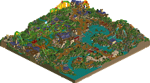
First off, sorry for the late reply. You can be sure I'm not just now getting around to looking at it, but I've been busy so I haven't had much time for this. Anyways, I don't have a lot to add about my overall feelings for the park, other than that it was really, really good. There's no doubt that it's the best one so far. Excellent coasters, archy, and details. Honestly, I think I'd put this in nearly the same league as BOMB. I think you achieved what you were aiming for, that is to create a more realistic theme park based around one central concept. As opposed to BOMB, which was definitely more fantasy, and less of a feeling that it could an actual theme park, but still with a strong central concept. Though BOMB's concept was certainly more intriguing, this one definitely makes up for it by being more like something in real life, as opposed to a purely conceptual piece. The only part of it that was more along the lines of conceptual as opposed to realistic would be the zodiac symbols around the park, but I think they create a nice frame for it, and don't detract from it being realistic, since they seem more meant as something pretty for us to look at instead of land siding, as opposed to actually being a part of the park if it was built in real life (though I suppose something like it could be done, though obviously not exactly as you did it). While I agree that it may have lost a bit by trying to have so many themes in such a small area, I feel it worked very well. For one thing, there was still a central theme to the park, so I didn't mind at all that the smaller themes were more varied. If you'd decided to build a park with about five distinct areas (which is about how many I felt) and they weren't tied together, then I'd be distressed. But as is, I think it all meshes together fairly well.
The only thing that stood out, maybe too much, was the Virgo castle. I get the theme and everything, but... It's sooo pink compared to the rest. Plus, the idea just feels a little too much like a rip on the DisneyLand style castles (which includes the one at the Magic Kingdom). However, despite that the castle is a little offputting (I certainly don't hate it though, it's probably just my least favorite major thing in the park), the idea behind it is interesting. I figured it out once I realised that the coaster was a continuous loop (and that iris didn't mention it as one of the coasters). However, it does seem like it might be a bit too much for just one simulator. But I suppose I can suspend my disbelief a bit. Also, on a bit of a side note, once I realised this area was more focused on the simulator than the coaster, the idea came to me that maybe the image you watch in the simulator would be based directly on an image you'd get from the coaster, maybe from a camera on the front of the car. However, this probably wouldn't work, especially since your pseudo-coaster isn't very interesting once it goes underground. Still, it's an idea I might play around with later. A simulator for coaster chickens where they ride the same coasters in the park, at the same time as everyone else. Hmmmm...
All the coasters were very nice. None of them seemed of much lesser quality than any of the others. I loved Scorpio. Definitely my favorite coaster of the PT so far. I love how it wraps around the rock pillars. Taurus was a nice woodie. I imagine if it was a real park, it would probably be my favorite coaster there. Sagitarrius was cool, and it definitely fit the theme well. I got the Arrow joke, though I wasn't certain that it was an Arrow (well, S&S), until you said so. And Aries was an excellent flyer. I got the whole ram thing, since you're going head first.
Here are some details that caught my eye. I liked the stranded Pisces subs. In fact, that whole area was very nice. Probably one of my favorite spots in the park. I really liked how you did pathing with the invisible paths and building blocks. It looks much nicer than I thought it would. I tried it a little bit in my park, but it was mostly out of necessity, and wasn't used to such an extent as here. Those grates were very nice touch as well. I think you may have created a new level of detailing that can be added to parks. Also, as everyone else thought, the Cancer sculpture was cool. I liked the design of the Yin-Yang cafe. Aquarius was pretty good for a more relaxing rapids ride. Where it went by the buildings over by Cancer reminded me of the rapids ride in the Scandinavian area of Europa Park.
Anyways, in conclusion, I was very impressed. True, it's not perfect, but I don't think you could've perfected an idea this big in a map this small. So, great job. This one will be tough to beat.
BTW, how do I always write so much?
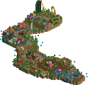
I really loved the park cbass, there is something to saying it was a little bit too much for some people ;P. The flyer does incredibly well concidering a to me flawed layout, the landscaping there is brilliant. The landscaping near the damn is indeed a bit of a downfall, so are a few other little things. But ultimately, if you place this below the entry of jazz, or any other park before this (i can somewhat understand x250s entry, possibly jkay's, though i wouldn't do it myself).. *sigh*.
Hopefully not the best park in the contest though, i'm looking forward to steve's.. something tells me it's nice =D.
Islands of Adventure in Orlando is a great example of what Nate is saying if I understand him currectly. It is a park with varying themes, all carried out greatly, and the parts all contribute to a greater whole. Every little nook and cranny of the park has a reason for being where it is, and all the neat features are assisted by efficient placement, a great example of this being the way that guest are forced to walk around/over the rapids ride in order to eat or enjoy the shops in the entire Popeye themed area in which the rapids ride is. Also, 2 of the park's most popular attractions, Dueling Dragons and Jurrassic Park, are both located in the back of the park. This means that guests are forced to walk through an entire half of the park to get to them, causing guests to see the amazing theming in the parks other areas wether they intend to or not. And the best part is, all this is achieved and the park still keeps an amazing flow and consistency. All the sections fit together perfectly despite their distinct variations, and the "big picture" attributes of IoA cause for a stunning overall park experience.
Oh, and did I mention I absolutely loved your park.
Edited by eman, 06 March 2006 - 09:59 PM.