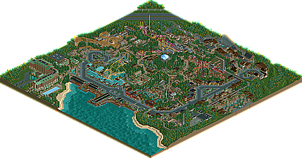
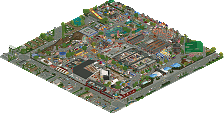
Park / Hyatt's Northwest Adventures
-
 31-March 11
- Views 22,126
- Downloads 2,709
- Fans 9
- Comments 54
-

-
 84.23%(required: 70%) Gold
RCTCA 100% yes Kumba 95% yes prodigy 95% yes geewhzz 90% yes Maverix 85% yes Milo 85% yes nin 85% yes turbin3 85% no BelgianGuy 80% yes Casimir 80% yes Levis 80% no Liampie 80% no Louis! 80% no 5dave 75% no posix 70% no 84.23% 60.00% -
9 fans Fans of this park
-
Full-Size Map
-
Download Park
2,709
-
Objects
487
-
Tags
as for the park I was simply blown away, this is my kind of park where everything is simple yet elegant and like robbie said in the review, this doesn't need all those fancy bells and whistles to be a freaking great park.
Congrats and I hope to see more where this came from
BG
This is awesome, I'm especially fond of the Intamin mine train, yeah it's small and breaks down a lot, but somehow it just really hits me. The other random thing that really stands out for me are the train station by the hotel, which really strikes me as being beautiful. All of the coasters are excellent in layout, color scheme (especially), and surroundings, as is the vast majority of the architecture.
A few minor criticisms:
The architecture in the "Leavenworth" area seemed somewhat clunky.
The Mt. ____ coaster names seemed overused.
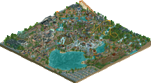
I felt that the central mountain seemed unfinished compared to the rest of the park.
The scale for the hyper seemed bizarre.
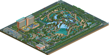
I thought it was strange, in terms of the larger resort, to have two similar GCIs so near to each other in parks owned by the same company.
I know it sounds like I'm ripping you apart, but if I were to list what I liked about the park on the same level of detail, I'd probably crash the site.
-JDP
For example I think the ride placement here is some of the best I have seen. The Hypers out and back section with the helix at the bottom of the hill next to the path is visually perfect and the view as you came down that path would be amazing. Staying with the hyper the Queue line alone is incredible, weaving its way around and through the ride. As mentioned the scale of the ride is a little off but for pure aesthetics it is second to none.
I love the little area down by the water front. Especially the restaurants on the piers and I love the little details, Such as the position for a ship to moor being marked by the poles and the mechanism for lowering the gangways on the pier.
Coaster design is exemplary across the board and really adds to the feel of the park. The corkscrew and final turn of the Invert is another example of the perfect amalgamation of realism and aesthetics.
I'm gutted you have decided to stop work on the project as a whole RCNW and I hope its not too much to do with this missing out on Spotlight. It's a truly staggering piece of work and I hope to see more from you in the future.
I'm sorry I didn't get a chance to vote on this. But My vote would have been: 95% and a Yes.
Knowing how it ties in with the other maps makes it that much better too
Hands down Spotlight in my opinion and I don't understand how this didn't win, I only count two people that voted below Spotlight level?
--This isn't addressed to anyone in particular, just a general 'warning'.
Well, it was a great park, the layouts were really awesome, but I just don't like all these big buildings, I'm sorry. I'm not really liking your style of designing buildings.
Congrats on finishing, really good park!
Looking forward to your next one,
Yannik
I tought the park had some really nice rides and good atmosphere. But EVERYTHING was the same. its all build in the same style. and this is why I didn't tought it to be spotlight worthy. Imo a spotlight needs to have something special, and this park was just really good.
What I don't get is how you can vote 100% for this (or any park). if you vote 100% that means there is nothing wrong about the park and it can't be any better than this. Imo there is always a way to improve so this can't be 100%.
This is what trav said in Dreamport's topic: "I think we've become far too ready to award Spotlights now, it seems to me as though when a large park is finished to a decent standard, it's awarded a Spotlight where in the past something of a similar quality would only be a Super Runner Up." Although I disagree and think all previous spotlight/gold decisions since the start of the accolade panel were justified (minus Brighton Glen maybe, still not sure!), I think he makes an interesting point. I think gold isn't a category that's necessarily weaker than spotlight; they're parallel categories. As I said before in HOA's topic, Spotlight is for innovation and shit we haven't seen before. This park is really fantastic, I enjoyed it A LOT, but it's not something that groundbreaking. The spotlight drought from a few years back has ended and there are plenty of awesome parks again. We recently had Dreamport, and good candidates like TTA and SFSF are just around the corner. If the best 10% of submissions get spotlight and your park is not among the top 10%, maybe that's due to other parks being too strong and not your park being too weak. With every new (high scoring) park the border between gold and spotlight gets redefined.
Pros and cons
+ As Roomie said, the ride placement (including paths and stuff, I call it composition) was out of this world. You're easily one of the best in the community with that.
+ Most coasters were godly. There might be a few award candidates here! The inverted coaster was easily the best in the park, really sublime. Unique layout, looks good from every angle, and I think the theme actually works really well here. My favourite architecture from you, too.
+ Size
+ Peepability. Just a shame the front of the park was so quiet...
+/- More details than your last park! It makes your park look better zoomed in (your parks usually look best when zoomed out due to the size of everything) and improves the credibility. Good job!
+/- Your architecture improved as well. It looks really great in places, I can actually distinct some themes now! In some places however, there were still these two-tone colour schemes... The boardwalk area was really well done, I like how colourful it was. The monotonous architecture on the other side of the road there looked great too in the middle (shoreline gifts), but the spaghetti factory was horrible honestly. It just had no shape. Also, the alpine-like architecture (forgot the name, sorry) was on the one hand really good looking, but on the other hand WAY too big and dominating. Sometimes my screen was filled with just roofs, roofs and roofs.
+/- The hyper coaster looked really great, but I think it should've been taller. A lot of other coaster were actually, so I'm not sure what this coaster adds to the collection.
- The entrance itself was so well designed, I actually said wow out loud when I saw it. It's a shame that the wow was followed by a meh soon after that... The area behind the entrance was really dead. The architecture was pretty nice here, but there's was too much of it with too little content. On top of the superfluous architecture the square was too big and bare.
- Foliage was great in the more garden-like areas and on the paths, but the filler foliage (I don't mind filler!) just looked unfinished. Not a too big deal though.
Again, I'm sorry that you barely missed the spotlight. The park itself wasn't great enough. The Hyatt's project as a whole however, is more memorable than most spotlights. When I tell my grandchildren about the glorious RCT community in 60 years, I'll tell them about the legendary projects of among which the whole Hyatt's project certainly belongs. It's so fucking big and consistent. Legendary.
Personally, I've never been so impressed by a park's coaster line-up. Wow. I can't really put my finger on it, but there seemed to be something standout about each coaster layout. The GCI, the Gravity Group woody, and the B&M hyper were all unbelievable.
The only thing I really disliked was the naming of the coasters. I get what you were going for, but the boring names really didn't fit the exceptional designs.
But otherwise, spotlight material for sure. Excellent work man.
I'll write a review after I download the park and view it.