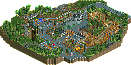
Park / windsweep

37 Comments

  • chorkiel%s's Photo
    I'm not sure about this, it was really good!
    Barely any flaws but for some reason it was also barely appealing.

    The layout was good and very flowing but it was just a part of the map and it didn't really stand out.
    That merry-go-round was cute but that queue was just NO.
    The foliage was amazing but that was the only thing that really stood out.
    There was a lot of gray and the buildings were just pretty squared/boring.
    The station was pretty good.

    Overall I think if this had been placed in a bigger sized park I'd love this.
    But as a design I think it's not outstanding and that's what I think a design needs.
  • zburns999%s's Photo
    I'm really torn on this one. Like, it's technically a masterpiece. Sammy, I'm really amazed at how far you've come since your earlier work. It was obvious to me while viewing that everything was painstakingly crafted to fit your vision. The foliage was great and the landscaping was even better. But, that's just it. It's almost like you went out of your way to create a perfect recreation of a really dull place. Like, I'm not exactly sure what I'm looking at. It almost feels like an industrial park or something, where somebody plopped down a GCI. Very strange.

    As for the coaster, though, I thought it was great. Not too keen on the mcbr, but I can see why you put it, and it did sort of emphasize the nice finale you worked in. I also loved the station pass-through; it was probably my favorite of all the ones I've seen in RCT. Train colors were great,and all the twist and turns totally had me believing this was a GCI creation. Only real flaw I can see is that the lift hill supports made no sense. They were kind of just floating there in some spots. Oh well, not a huge deal.

    Anyway, nice design. I definitely think it was worthy of the accolade! Keep it up man. I'd love to see what you could do with a bit more inspiration.
  • Fizzix%s's Photo
    I really liked this one.

    The foliage was indeed great, and it flowed so well with the land. I loved the coasters sweeping turns and interaction with itself. Great job Sam! I gotta say though, I love me a tan GCI!
  • Austin55%s's Photo
    Very Nice SSSammy. Im gonna do a Liam style +/-

    -Lift hill supports, floaty
    -Big pretty pathway, with no one to use it.
    -The Cingular ad, on top of being ugly, Cingular hasn't existed since 2007 or so, lol.
    -The architecture, sorry man, it was just so grey and bland, awkward shapes to. Didn't know what anything was.
    -That hideous oak tree thing. I just cant stand it.

    Neutral
    The MCBR. Love it or hate it I guess.
    Foliage, I never have liked yours really but most people seem to love it.

    +Pretty much everything else.
    +The layout, love the twists after the drop.
    +The tram station, while awkward, was nice.
    +The carousel, reminded me I was in an amusement park.

    Sadly, this wasn't your best work, but I think you know it. I know you'll pull of something better. But it certainly wasnt bad.
  • Phatage%s's Photo
    It seems like you spent a lot more time on this, coaster layout at least, than people are giving you credit for. You've created a very aesthetically pleasing layout and found places for crossovers/headchoppers that were pretty creative. However, all of that won't really matter to riders when the second half of the ride is paced so much slower than the first; reverse this order though by starting out slow and getting faster and you have something refreshingly unique and well thought out. Oftentimes the best way to avoid bad pacing at the end of the ride is to just end it earlier, but regardless, the turns and hill should be tighter in order to create as much if not higher forces at appropriate times during the late parts of the ride. Although seemingly small, the coaster was actually pretty large in terms of number of elements and ride duration so cutting it down for momentum's sake wouldn't have been a bad thing if done well. Supports were a little sloppy in places too, detracting from realism given how GCI supports are usually very pleasing to the eye.

    Other than that, it's a little hard to see past all the grey in the park but things appear to be composed well. I think you should have found another solution to railings on those stairs given that they didn't show up well from all angles. The landscaping was nice but didn't really make sense; why would the park fence off those areas (and even hire somebody to mow them) if they weren't accessible to guests and/or they didn't contain any scenes (theming) for the train ride? Other things like the queue entrance and the back corner of the park made things seemed a little unfinished too.
  • Metropole%s's Photo
    Sorry Sammy, but this one just did nothing for me. The parkmaking ability was there, but there was just absolutely nothing to keep me interested on the map at all. The coaster was nice enough, but the architecture, foliage and landscaping were just....there. When I view a park/design, I want to be inspired. Here, I just wasn't I'm afraid. And it doesn't sound like you were either, so there may be the problem.
  • mardy%s's Photo
    Always love your reviews, belgianguy!

    I dont get why i have a american flag, im dutch?)
  • turbin3%s's Photo

    the layout is pretty good... the foliage, the massively wide paths, landscaping and architecture are all just blah. I don't see a design here, enjoy your gift SSSammy because someone definitely gave you this...

  • musicman%s's Photo
    Ok, since no one is answering me about the writeup, here I go.

    The layout was pretty nice, I guess, and I must commend you for separating the final brake run and the transfer area, but I'm not a fan of the final helix, I think it could of been shaped more, instead of just using the default helix element. The entire station area seemed bizarre, with the station shorter than the train and the Great Bear-esque supports over the transfer track. The overall feel of the map wasn't very good either, it almost felt as though my game was about to shatter somehow (if that makes sense). The other two things is that I can't understand the motivation for the train colors, and I think the tram would have looked better with more foliage closer to the track.
  • SSSammy%s's Photo
    here is the readme:

    Hello new element!
    So, this, for all explanatory purposes is my attempt at a design, complete with SSSammy style (or lack thereof) and imperfections. For all its faults, I believe it is a solid attempt. That being said, I would not be surprised if it doesn’t win. It’s messy, and the atmosphere is dead.

    Reasons for not wanting to complete it to a higher standard?
    1. If I hold it off for too long, the work will grow more and more stagnant.
    2. I feel as though I need to give back to the community in some way.
    3. (most importantly) I’m fucking bored of it.

    So, love it or hate it, here it is; windsweep.

    Thanks go to:
    - Anyone who tested. You don’t need a name-drop to feel important, you arrogant tosspots.
    - Anyone who ever helped me ever. Same goes.
    - My mum.
    - Weird al yankovic.


    Oh, and PS: thank you to all you wonderful people in release and voting! And also the dashing and handsome admins. Apart from Louis. Fuck you, Louis.

    Only kidding. Take me back? Good.
    Why are you still reading? Go open the park!

  • musicman%s's Photo
    Thank you for posting that. Considering none of my concerns were addressed, my comment stands as is. :)
  • tdub96%s's Photo
    Well first let me start off by saying if this barely won a design, i dont know how I'll win one any time soon.

    Although the layout on this was very nice, very flowing, and definetly realistic, it wasnt design worthy to me. I felt like this layout would definetly be a great asset to a Spotlight park submission for a park with other coasters. But by itself, nahh. It is a good layout dont get me wrong, just it was better suited for a park then by itself in a design attempt. Hope this you guys understand.

    Sam, dude I always love your work and this is not an exception. The foliage and landscape is top notch in my eyes, and this along wiht the surroundings, more than made up for the coaster as i stated those reasons above. The carousel area was so cool, and the station was so small and simple but worked so well here. Also, really liked the backstage area and central architecture as well. Oh, and as someone said before, cingular no longer exists :p

    Good stuff sam, youre easily one of my favorite parkmakers. 75% if I were on the panel. Nice job and congrats. :)
  • Liampie%s's Photo

    Although the layout on this was very nice, very flowing, and definetly realistic, it wasnt design worthy to me.

    75% if I were on the panel.


    You should see a psychiatrist...
  • tdub96%s's Photo
    You didnt understand what i was saying obviously...this layout woulda looked better in a park, not in a design by itself. It WAS a good layout...
  • Magnus%s's Photo
    Congrats Sammy.

    From the overview I was hoping for a nice design, but looking at this in detail I can see why this only won an accolade barely. The layout itself was ok at best. The second half is too slow, the station flythrough, as much as I like it as an element itself, didn't work too well for me because of the curve in front of it. The interaction of the beforementioned curve and the transfer track didn't help it either. All in all the layout feels a little forced to me. While you had some strong ideas for it it does not come together as a whole for me.

    I liked the natural feel of the park, but the gray path and gray buildings somewhat ruined the atmosphere for me. The little details you added were nice to watch and show your talent. I hope you find more motivation next time and show us of what you are really capable of.
  • SSSammy%s's Photo
    okay, we have a lot of similar kinds of comments here, so i will economise and reply in bulk.

    a lot of you are saying that the coaster was so-so. i thought it was fairly good looking and had a nice sense of flow, but i was apparently completely wrong. obviously you guys know better than me, so...

    as for the drab surroundings, i thought that the foliage and landscaping was my usual standard, but obviously landscaping isn't what people look for, so... the moral of the story is; i got bored and didn't want to waste all the work i'd done. it's obviously not the same standard as CKS but i thought it was well worthy of design.

    thank you for all the comments and to verti for the logo and to BG for the write-up. good work guys, i appreciate it. i'm also sorry you guys didn't enjoy it and found a lot more to criticize than to congratulate.


    my next design is coming along really super quick, and anyone who is going or has already comment on this thread will get a screen when there is one availiable. i'm not into that whole posting a gay screen when it isn't really needed kinda dump place thing, so guaranteed, it'll be a nice screen when i get round to posting one to you guys. this design will be 32235 times better than windsweep. promise.
  • robbie92%s's Photo
    I think the issue with the layout was that you focused too much on flow and aesthetics, sacrificing pacing in return. My main issue is that this design is just as inticing, if not more so, in a full-sized overview as it is in game. You placed everything with purpose aesthetically, but there's not much substance beyond it looking pretty. That being said, it is GORGEOUS, though I personally find your foliage to be a bit overbearing. It's like you're trying RRP-style foliage, but without the subtle details he uses, so it just hits you. It's still damn good, though, so don't think I don't love ya.

    BTW, here's a more in-depth response I gave during testing which still holds true:

    Looking at the whole picture, it's definitely pretty, but I just find that it lacks life in some way. The architecture is technically beautiful and very crisp, but it just lacks character for me. The only exception to this is the storage shed for the coaster. It reminds me of what I want to strive for, based on something RRP said a while back about creating "imperfections" within your work. What you have is just so sterile and clean and "perfect" that it doesn't feel real, and therefore doesn't give off a character of its own. The storage shed is saved by the vines growing over it; they give it a context and a tangible connection to reality. It's not nearly as "scrubbed-down' as the others and that's its saving grace. All I'm saying here is that, while beautiful, the architecture lacks character and warmth of any sort. It just feels like it's meant as filler, which I know it isn't.

    The landscaping is all great, although you might have possibly gone a little overboard with the really tall grass pieces, as they are in a lighter shade of whatever color you select on the palette and therefore stick out.

    Now for the important part: the coaster. I honestly didn't like it at all, which seemed odd since your coasters are usually quite nice. I feel like you only worried about aesthetics with it and completely forgot about pacing, operations, and flow. Visually, it's quite nice. However, you can immediately see that there's pacing issues when you see that it needed a 12 mph lift. Unless it's an Intamin, there's no excuse for a lift that fast, especially on a woodie like this. If you wanted that speed, the drop should've been taller. As others have said, the pacing was slow as well; GCIs tend to feel faster as they progress due to smaller and smaller turns towards the end of the ride. They have a speedy, zippy feel to them, and this ride lacked that completely. Probably my biggest issue with the layout was the MCBR. First, a coaster of this size doesn't need a MCBR, which should be used for blocking purposes. The way you set up the MCBR also killed any pacing the ride had. The back cars were slowed down before they even hit the top, which would be a HORRIBLE experience for riders. The end of the ride, which should be quick and fast and thrilling, ended up as slow and fairly "blah." Remember that GCIs are speed machines, smooth but fast, with quick turns, laterals, and surprising pops of air. Elk accomplished that pretty well, but this fell short.

  • SSSammy%s's Photo
    robbie, admit it, you only wanted the screen.

    thanks bro. you get me man, you get me. :p
    thanks for the feedback in the making of this, it's just too bad i couldn't utilise it too well. fuck having no inspiration.

Similar Parks

Members Reading