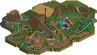
Park / Colossos
-
 18-June 11
- Views 8,811
- Downloads 1,070
- Fans 0
- Comments 23
-

-
 71.92%(required: 65%) Design
That Guy 85% Louis! 80% Metropole 80% 5dave 75% Liampie 75% tyandor 75% JDP 70% K0NG 70% Kumba 70% Levis 70% Loopy 70% Milo 70% geewhzz 65% Maverix 65% BelgianGuy 60% 71.92% -
No fans of this park
-
Full-Size Map
-
Download Park
1,070
-
Objects
220
-
Tags
Similar Parks
-
Scarecrow
-
Melody of the Light
-
T-Express
-
Riverland Walheim
-
[H2H8 R1] Durham, Knaresborough and Staithes
![park_4075 [H2H8 R1] Durham, Knaresborough and Staithes](https://www.nedesigns.com/uploads/parks/4075/aerialt3813.png)
-
[NEDC6] Unfriendly Invader
![park_6135 [NEDC6] Unfriendly Invader](https://www.nedesigns.com/uploads/parks/6135/aerialt6375.png)
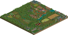
Surroundings were nice, but sort of lifeless. Don't get me wrong...the map looked great! But there wasn't much there to hold my attention. I did like the farm-lands in this case, though. Definitely built up the "German countryside" vibe for me. Nice design, man. A well-earned accolade for sure.
The logflume was a nice addition. It was fun to watch, I only felt it could have used a water basin after the big drop. The other flatrides were nice as well. For some reason I really like the top of the roto-drop.
The foliage was great too. I only did not like the little bushes next to the path where guests enter the area. The archticecture was very nice as well, no complaints here.
The surroundings did fit with the coaster, though I felt it could have used a bit more attention. Now it were just some fields. Perhaps you could have added some power cables, ditches or a farm.
Overall a very solid and deserved design. Congrats.
Though while looking at it I found it rather boring.
There was nothing that really amazed me or surprised me because you have showed everything already in the AD.
I honestly loved the archy layout and such but it missed something new that would make me go 'wow'.
I have to say that I was very happy when I saw this coaster on top of the site since I loved your topic in the AD.
anyway good coaster, really like the look of the part on the upper right
you can do better with your skill set but you don't seem to make the effort to actaully do so.
In the past half year there have been only 3 wooden designs, of which one was a hybrid.
Other than that though, what was there was very uninspired and thus boring to me. The free fall was totally uncalled for and the flume looked like filler. It would be great if you could find the same passion you found for the layout for smaller rides as well.
What really sucked is that I had pretty much seen the whole thing before I opened it, but I wasn't going to mark down for that...just lay off on the advertising a bit next time.
Congrats on the win.
-JDP
And I don't mean to take anything away from Turbin3, I just don't see why this is such an obvious "best of the year."
And to everyone who didn't like the farm-lands here, I actually disagree. I thought they made the ride really believable, for some reason. I can really imagine just riding along a highway, looking off to the side, and seeing this massive wooden coaster seemingly constructed in the middle of a field. It was a cool touch, and one of the better aspects of the design, I think.