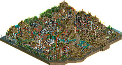
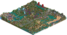
Park / Vulture
-
 13-July 11
- Views 18,084
- Downloads 1,900
- Fans 1
- Comments 50
-
-
 91.54%(required: 65%) Design
Maverix 100% BelgianGuy 95% Metropole 95% nin 95% robbie92 95% That Guy 95% wheres_walto 95% Wicksteed 95% Casimir 90% JDP 90% prodigy 90% turbin3 90% Milo 85% Kumba 80% Loopy 75% 91.54% -
1 fan Fans of this park
-
Full-Size Map
-
Download Park
1,900
-
Objects
469
-
Tags
Similar Parks
-
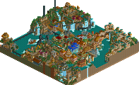
[H2H8 R3] E.V.I.L.
![park_4103 [H2H8 R3] E.V.I.L.](https://www.nedesigns.com/uploads/parks/4103/aerialt3847.png)
-
Eternal Springs City
-
Voyager
-
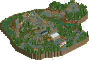
[MM2014 R2]The Mirage Hotel & Casino's White Lightning
![park_3188 [MM2014 R2]The Mirage Hotel & Casino's White Lightning](https://www.nedesigns.com/uploads/parks/3188/aerialt2809.png)
-
Thoughts
-
SALGA
I felt the same way, too. From the inversions, and typical lineup of those inversions, it just felt like a coaster that was renovated to accommodate the next best thing.
However everything else made up for that-- every little piece of the map had something for you to discover. The landscape was very over powering, much like the buttes and rock formations of Big Thunder Mountain. The brown is fine with me, but the foliage, Like cocoa mentioned, was just an odd choice. I mean, I get why you chose some of the colors, but the translation didn't come out in the best way.
However it is nice to see something from you, and the hype did not disappoint. Congrats, K0NG!
So I was slightly able to get past that and found the park enjoyable. There were some nice little ideas here and there including using the mini golf for a gold-panning ride, the control booth for the top spin, and the maintenance truck among others. The seemed to be an unnatural divide between green foliage and bare land though. Using more of the 'dead', leafless trees could have signaled that there was a forest fire or something that ravaged the area (I don't think birds would be able to do that/ would if they could) or that the barren part (aside from the mountains) was at a different elevation than the lush part, but as it was, it didn't seem that the two halves fit together. It seems apparent that you meant this, but for the barren part then, it would have been better even without the grass scenery except by the river.
The architecture was nice and robust and of a good scale. The building shapes were interesting too. The annoying thing though was how you needed to line almost every single roof with deco. The deco lining can be very effective when used in moderation, but the way you liberally applied it to almost every building made looking at this park similar to reading a whole paragraph of bolded text.
About the coaster itself, I definitely agree with both sides that say it is a bit generic but there is the point that B&M have only built one so far. But put that aside and I think that regardless of realism, it could have been better. The first thing that many people visualize when they hear the word 'vulture' is a couple of menacing birds swirling above a dead animal that is soon to become their meal. A great idea then would have been to have a high perched helix or figure-8, not unlike Great Bear, Krypton Coaster, or Cheetah Hunt, right after the lift hill going into the first drop. The wingrider trains would have been perfect for this, suspending the riders overhead 100+ feet that seems to be a lot more, maybe even circling around some queue line zig zags symbolizing that the coaster was to take the queuing riders as it's next prey. That 2nd roll could have come a lot closer to the path below too. For the finale, I think it would have been more interesting not to put a set of interlocking flatspins because it restricted the coaster to interacting with itself rather than the interesting landscape you've created. And the ending itself was pretty anticlimactic too, any bird-themed ride could always benefit by having more of an emphasis on helices and I think you could have fit some sort of swooping helix between the second flatspin and the brakes. Then the transfer track wasn't B&M accurate and the storage train itself had an additional car? In general, if pacing was something you were striving for (which it's obviously ok if you weren't) the pacing should have been dialed down too.
So I definitely found it enjoyable but even not my favorite recent design, which would be Inyoni. I don't know why people are calling this to be a lock-in for best design of the year when it's July, it's good but we have half a year left, right?
The layout was pretty dull...
As far as the quality of the map as a whole, I think this might be second only to El Encierro. There was really a great amount of stuff here that kept me busy for a while. It's always cool to look through a park/design where it's obvious that the parkmaker never really took "no" for an answer. Any idea you had, you put in the park and executed it perfectly.
As for the layout, it was good. Not anything mind-blowing. The pacing, in my opinion, was very good. I also loved the lift hill/first drop. Looked awesome. My only real complaint with the whole design is exactly what others have pointed out. This really could have been a floorless, sit-down, etc. I feel like the elements of the ride didn't take full advantage of the (fantastic) surroundings.
Anyway, thank you for finally proving to me that you are, in fact, one of the best on this site. I've been thinking it for a while, but now it's pretty evident. Congrats man.
Anyway.
It's...it's beyond words...really.
Totally deserved the 91.
'course I haven't opened it yet, it looks that good just from the overview. 8 MBs is kinda big...reply again with a more in depth review in a bit.
The park layout was pretty much a circle which is of course a common use in theme parks, but going to each bridge or section of buildings is a bit random. I don't know much about amusement parks such as Six Flags or Cedar Point, but K0NG seemed to be going for more of a heavily themed complex in which case a more Disney-like approach would have been more necessary. You see park layouts in Disney as more 'systems' and built as an attraction in and of themselves. They provide a story while exploring the area. Hope you know what I mean. As an example; Disneyland's left side reached from the 'hub' features Frontierland as almost another mainstreet (in layout) where you're introduced to a run down town with a number of buildings on each side, which leads to the large lake (integrated into the theme) ahead in which a bay-like pathway hugs the coast, and adding to the layout's concept/ story, an island (which can be accessed and explored) rests beyond in the center of the water body. There are also a number of boats and water transports in the lake and the view of a large attention-grabbing mountain in the distance (Splash Mountain) built to appear as part of the "natural" landscape of the area. Hope I'm understood here.
Concerning the landscaping, I don't believe it was executed to the fullest of it's potential, but had a solid idea. Looking at landscaping in theme parks, most establishments are on a very flat surface and if there is any landscaping involved in the theme, much man-made (faux) rock work and artificial land forms are used. Splash Mountain isn't an actual mountain and it uses mostly artificial materials, then designed to more parody such a land mass. Here in Vulture, K0NG seemed to go all out in creating as real a looking landscape as possible, as if the park was built on this very topography. Real life parks never, or very seldom come close to this. I believe a theme park could indeed create an environment like this, but feel the outcome would be more,, superficial I guess you could say. The result would be something looking much more artificial because it is indeed man-made land and that in themepark terms, would be compromised for such reasons as the park's budget, aim for a more cartoony atmosphere, limits in resources and/or surely other possible reasons. In RCT, the 'real' landscaping and the landscaping done for theming should have great contrast to each other in getting the point across.
Perhaps I'm just stating something I'd more like to see in RCT, and K0NG's intentions were far from anything I've mentioned and his concept and execution were exactly as he intended. All I'm really saying is RCT park layouts never seem (most of the time) as thought-out as I'd like them to be, built for more story-telling with how it's explored and the layout's overall experience.
As for how I feel for Vulture itself, IMO a well deserved design. The point of my post is that I'm just left dissatisfied with the layout and landscaping in most parks. But congratulations K0NG, on finishing and winning design. It's still quite good.
FantastiCo actually posted something truly useful.
But really, interesting post.
And I wouldn't say K0NG has a style completely his own...
Both K0NG and Kumba use lots of brown