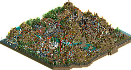
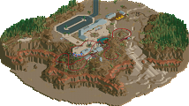
Park / Vulture
-
 13-July 11
- Views 17,238
- Downloads 1,795
- Fans 1
- Comments 50
-

-
 91.54%(required: 65%) Design
Maverix 100% BelgianGuy 95% Metropole 95% nin 95% robbie92 95% That Guy 95% wheres_walto 95% Wicksteed 95% Casimir 90% JDP 90% prodigy 90% turbin3 90% Milo 85% Kumba 80% Loopy 75% 91.54% -
1 fan Fans of this park
-
Full-Size Map
-
Download Park
1,795
-
Objects
469
-
Tags
Similar Parks
-
Eternal Springs City
-
Fish Canyon Corkscrew
-
[MM2014 R1] The Guardian
![park_3163 [MM2014 R1] The Guardian](https://www.nedesigns.com/uploads/parks/3163/aerialt2783.png)
-
La valle dell'avventure
-
Canyoneer
-
Ankara's Valley
edit: Nice write-up robbie
I hope everyone enjoys this. As much as I truly do build for myself...I always think about what you guys will think when you see it. I went through hell to finish this...but, other than seeing Kumba going against his normal high vote here and ensuring that his design remains atop the rankings...it was absolutely worth every minute I spent on it.
Plus...I finally fucking FINISHED something.
Make sure you look around the whole map....there's a lot of shit that's not obvious at first glance.
Only thing I'm bummed about.....I was so happy to finally finish this that I forgot to name/place staff. I had some killer ideas for that.
Ehhh, next time
None the less, congrats on one of the highest scoring designs around here K0NG
Why do i think dat, The interlocking Corscrews! There To Close, i know it's RCT-2 but a little detail.
In the Bend element which is banked there's a Support which i think the Train would hit with theese trains in the Real thing.
Further it's an Amazing job you did! Theming is Fabilous and on the most points the Layout is Brilliant!
It's an amazing piece of art.
There were so many things in this that I liked. The mine train, the magic shoppe and way more.
Looking at the overview there is a lot of brown though you've found a way to not overkill it with brown which is awesome.
The design was awesome, also for it's scale!
Congrats again.
The pacing towards the end sucked. The architecture was fantastic but the only problem with it was the colors were bland.
75%
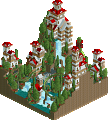
On to the design now; It was really great to watch. The lay-out was really nice. Even though it was laggy, I could see it had a nice flow and a good pacing. The colors were nice and the supports were executed properly.
The station was pure awesomeness. Really nice, loved the details, the logo and it had the perfect size. The queue was also really great. I loved how guests could see bits of the coaster.
The surrounding architecture was very nice. Each building had it's own identity. My only complaint could be that you used the deco art on every building. The foliage was weird, but as I already said in the AD I really liked it for some reason. It fit very well with the coaster. The landscaping was just insane.
The supporting flatrides were nice, I especially liked the carousel. The water ride was nice, but I think it went waaaaay to fast around the corner after the drop. The architecture around this ride was really sick though.
I'm really happy to see you finally managed to finish and submit something, so congrats on that and congrats on an incredible (deserved) score.
Oh, why are there two logo's? I liked the one in the read-me better.
inVersed Offline
The landscaping was shaky, realistic for the theme... I guess, but still hard on the eyes. Also the unnamed staff can always gets a -5 from me, but you had some unnamed rides too, so that took it from 85 to the 80.
Overall the themeing was fantastic, great work there. I loved all the mine equipment and the use of tracks. Really a great design, just that landscaping made the atmosphere so dull. Cork used to drive me crazy with that. I am just not a fan of dull colors like that when the effect the park/designs overall atmosphere.