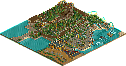
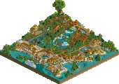
Park / Discovery Island
-
 08-April 07
- Views 5,483
- Downloads 459
- Fans 1
- Comments 47
-
1 fan Fans of this park
-
Download Park
459
-
Objects
187
-
Tags
Similar Parks
-
Halcón Azul
-
Seaquarium Curaçao
-
Obeah and the Cursed River
-
Blue Lagoon Bay
-
The Good Earth
-
Age of Sail
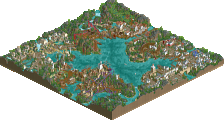
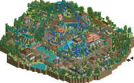
^Screen unfinished.
NP
Edited by Pineapple, 15 June 2007 - 02:09 AM.
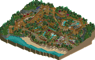
Other than that I love it.
Demolish the one building (it's not worth trying to save, believe me), and add some plants and you're well on your way to a winner. Oh yes, and I did notice the backbone you added to the B&M there, nice attention to detail.
Ride6
The other screens are much better, but I generally agree with Ride6
============================
Mexicana - 100% Complete
Caribe Plaza - 80% Complete
Area Underconstruction - 5% Complete
OVERALL PARK - 70% Complete.
============================
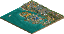
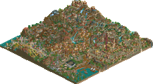
Complete Full Screen
Almost Complete
NP
Edited by zodiac, 05 May 2007 - 10:07 AM.
Foliage is to be added.
If this was in real life the peeps would have to be about 10 - 15ft tall to be hit by that train.
EDIT: oh, there's going to be foliage in that area...ok, the I guess, that there's not another suggestion.
-JDP
I love it!