Park / Cocoas Unfinished Parks 2013
-
 26-May 13
- Views 28,488
- Downloads 811
- Fans 2
- Comments 328
-
2 fans Fans of this park
-
Download Park
811
-
Objects
599
-
Tags
Similar Parks
-
Moonlight Magic
-
The Aegean
-
Blue Oak Amusement Park
-
Disney's American Waterfront
-
Acqua Alta 1896
-
Venetia Harbour
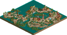
I'm sure this park is going to be great!
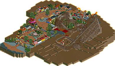
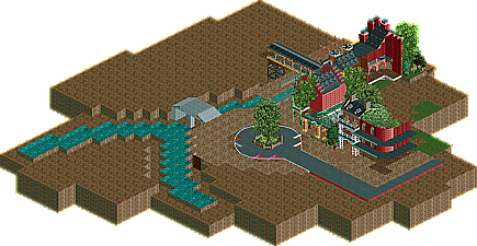
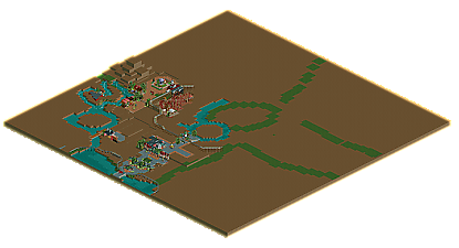
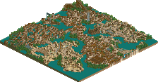
First up is a teaser bit from my rct2 design nightingale which I have just decided to pick up again.
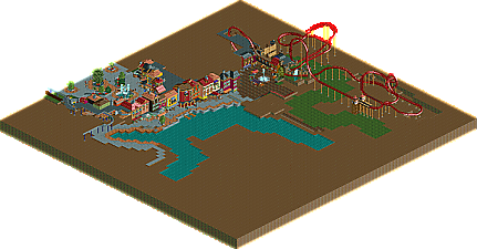
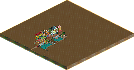
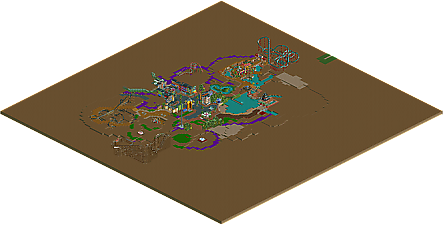
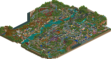
Next is a bit of New York (I hope it speaks for itself though) in a probably-abandoned fantasy park I started. However, most of the ideas will probably get put into something else.
RMM Offline
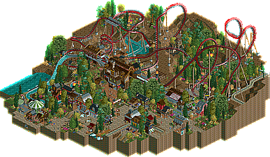
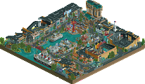
Seriously though...that second screen is pretty sweet.
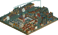
And, what's with all the recent comments on people's screens that seem more like artsy-fartsy critiques of paintings or photographs than evaluations of an RCT theme park in progress? "It simply draws the eye toward the center a bit too much, almost as if I had to fight to look away".
It's just a sampling of a section of his latest video game project that he wants us to see. Not some fucking avant garde preview of an upcoming gallery showcase. Do you guys have your pinky pointed out while you type this shit too? I'm pretty sure that NO ONE really thinks about the overall composition of each screenshot and what it "says" to the people that view it.
C'mon man, if you take a theme, especially for this "fantasy park," go all the way with it! Give me trash, dirty-water dogs, rats, bustle, urban chaos...
favourite player on the board right here.
@robbie: well I knew the "new york" bit would be the weakest part of the project, as i just don't have an eye for all of the little fire hydrants and realistic details and all that stuff that probably should go along with a new york theme. I don't really want to go into more details as to the nature of the park, but this really would have been a minor section. and anyway I basically have called it off
and to everyone else thanks
I'll comment how I want to, okay?
That said, if you don't know how to compose a picture that's likable, you'll never make a park that's visually appealing either. Being pretentious about our pretension isn't really the way to go about solving it either.
@jk: thanks, considering I actually get anything done. which is never likely.