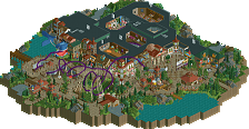
Park / Laguna Adventura
-
 04-August 23
-
Laguna Adventura
- Views 3,788
- Downloads 267
- Fans 8
- Comments 25
-
-
 83.50%(required: 80%) Spotlight
RWE 90% yes Babar Tapie 85% no CoasterCreator9 85% yes G Force 85% yes In:Cities 85% yes Liampie 85% yes posix 85% yes Terry Inferno 85% yes Faas 80% no Scoop 80% yes Xtreme97 80% yes SSSammy 75% yes 83.50% 83.33% -
Description
An adventurous trip around the world!
-
8 fans Fans of this park
-
Full-Size Map
-
Download Park
267
-
Objects
1
-
Tags
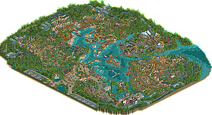
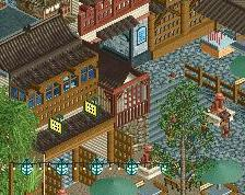
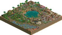
![park_4086 [H2H8 R1] Tahendo Zoo](https://www.nedesigns.com/uploads/parks/4086/aerialt3817.png)
Amazing park Jappy and team! So much to see here. The vertical loop on the RMC was a brave choice but maybe not too offensive. One of the many highlights of the park for me is El Niño, this extreme spinning coaster is incredible in both the layout and the setting. Well done!
Congrats on the release Jappy! Huge park that successfully executes its themes, and really feels alive and atmospheric. The entrance has that IOA charm with the sort of ambiguously tropical architecture which might be my favourites. The Asian, Jungle and Pirate areas were other highlights for me in terms of the theming.
More detailed comment coming up but I love this. I think you've done yourself very proud with this release.
I wish you the best of luck with Laguna! I definitely think this is a spotlight.
Damn Jappy what an amazing park. This really shows that you have been long overdue of getting that elite parkmaker status!
Lets start with something I really like, the fact that the parking lot is just a few tiles on the entrance of the park. Dont get me wrong, I get that some parks for the sake of realism want to have huge parking lots because thats how they are irl, but man do i hate to look at them. in my eyes they are just tediuos map fill ups. so seeing this parking lot being really small is awesome!
The entrance as a whole is really great. I love how the entrance sign sits on the little hill with the waterfall, makes for a great welcome to the park.
South America area:
I love how all the rides interact with the pathing and environment in this area. the theming is really well done and that little drink stall in the Temple Trueno station building is such a cool detail and works really well.
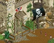
Pirate themed area: (the one with Captains Splash Revenge)
Like Scoop said on Discord, This is your best area in the park. The buildings are done so well here and really give that pirate/caribean feel to it. 1 thing i dislike is the path type here. it feels a little to clean in some places. but thats just a personal thing.
Arremsea area:
Again great theming and lots of cool little features to look at. highlights for me are all the broken ships scattered around the area. Maybe the area could have been a bit bigger(?) seeing the amount of land and foliage that surrounds this area it could have used some more buildings for me.
Asian area:
Even though this is the smallest area it really feels likes this is the area with almost the most content in it. The buildings here are awesome and the pagoda object here works really well. Also the use of the fisch rocks to create a small mountain looks awesome.
(btw i dont comment on coaster lay outs because i dont feel like im the person to critique them, if they have a nice flowing lay out and dont look like a spaghetti monster i am already satisfied)
African area:
Besides the amazing interaction Springbok has with itself. i think the highlight for me in this area is the safari ride. seeing it go under all the bridges and placing myself in one of these cars does feel immersive. Architecture is also really nice here. if you would send in this area in for the Grand Tour Etheopia contest it would fit in really good, amazing job!
Gotta admit when I first saw the House in Bayou building i really thought to myself "thats one ugly looking building" I then realised it was a haunted mansion and I feel stupid for not realizing that earlier. So congratz on making a building look intentionally ugly i guess...
As for the building facade on the other side, I like all of the buildings accept for the white building with the steeplechase railings. I guess you wanted something other then square building, but this one just doesnt work for me.
All and all I think this park is amazing and I gave it a big fat 90% score even though it wont count as a score for the final rating. Great job Jappy and i hope you get that red name after this!
Very nice park here Jappy! I immediately got excited when opening the park with that lovely atmosphere, especially the custom music made me want to explore all what is to come right away. I'll sum up what my favourites and negatives were below and some screens;
+Coaster Layouts
+Pirate area
+Entrance area
+Color schemes
+Deco polish when you used it
+Foliage
+/-No interiors, especially on the big buildings, could've added +1, kind of missed opportunity, but I get some people hate doing them.
+/-Some areas dense with architecture, some areas too bare/spread out, could've been more consistent with park planning.
-Park layout, especially the pathing was confusing
-Backsides of buildings/back area too plain in comparison with the rest of the park
---------
Some screens I liked and disliked;
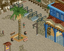
Love the little parking. Not overdoing it, but still showing it's there.
Great atmosphere when you open the park. The letters are a great touch with the water feature behind it. Lovely central building in the entrance and I'm a sucker for good custom music, and this hit the nail on its head!
When you enter the park, this is a lovely scene to experience! Very nice architecture, and a great central eatery with seating area
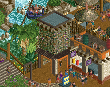
Great structure work on the ship at the bottom, and clever integration of the bow of the ship into the architecture. Also nice job on the quay and the lights above it, sets a nice atmosphere.
Love how you integrated the snake head into the station building of the coaster. Guests will see right away what that's about.
Love how you did little well themed rides like this throughout the park, but this one especially. Well placed, good foliage and nice use of animatronics
Best scene of the park I think. Seeing this screen on discord made me excited for the park and I think it speaks for itself. Just great interaction between all of the different parkmaking aspects.
Nice front facade for the darkride inside and clever usage of the drinks stall.
I like the little peak inside of the darkride, but at the same time I was hoping you'd done more interiors. After seeing this I used cut away view to find out, but quickly realized you didn't do them. Like I said above, I understand people don't want to do them, but missed opportunity (at least for me) to get a +1.
The other gripe I had was the convoluted layout the park has. It seemed a bit unorganized and chaotic at some spots with no clear view points..
Overall nice job Jappy
Lovely park and great achievement finishing a park this size!
What I loved:
+ Great atmosphere throughout!
+ Entrance area was very cool
+ I especially loved the medium-sized family coasters like Springbok and Volare
What I loved less:
- The coaster layouts of the RMC and the extreme spinning coaster were a bit too weird/crazy for my taste. I don't think they look good, which is a shame considering the prominent place they take up in the overall view of the park.
- The naming of some rides was a bit too random/generic for me. You have these heavily themed areas with rides like "Treasure Mine", "Captain Splash's revenge" and "Oasis".
Holy crap. This thing is massive. I was sitting down to write a thorough review after spending what I felt was a not insignificant amount of time with the park... and discovered an entire other roller coaster I'd somehow previously missed.
Unfortunately I can't give each detail the attention it really deserves, but in the broad strokes I think this strikes a perfect balance between feeling totally realistic and like actual park operations have been considered, but doesn't go over the top with crunch. Also the surroundings aren't half of the map - it's a huge park, and it's all park, and I LOVE that. You have a great mix of roller coasters at a good variety of thrill levels.
Entrance - Might be my favorite section in terms of layout and just willingness to let the surroundings breathe. Big open spaces, I like the planters and color palette, the buildings are detailed and feel like the shops and restaurants you expect to see at the grand entrance of a huge park. If I had one gripe, and it's minor, I think another ride might have gone well here somewhere, rather than the big theater building. The spot where the Lounge Cafe sits is the obvious spot but I really like that building. Maybe a chairlift or other transport to the opposite section?
South America - First thought, wow El Nino seems really intense. I actually really like the layout for Volare a lot even though it's a little slower than I think it maybe should be, and as already mentioned of course that facade for Templo Trueno is incredible.
Caribbean - These structures feel a bit too... big to me? Like everything is ~double scale or something. But the framing of Captain Splash's Revenge is so good I don't really care. It took me a few passes to realize that this is one big contiguous area with the smuggler's zone (Arrremsea makes sense now... still hate the pun though). The loop on Arrremsea is bold. The layout in general I find a little awkward. Treasure Mine gets all the good interactions and framing for the zone, and I think is the better integrated and more interesting of the two.
Taiwan? - Love the architecture here. I think this is probably my favorite area, and it helps that Sherpa is a totally kick-ass layout. The mix of how dense it feels, the scale of the fake mountain, interspersed with some natural-feeling wider open sections. Some gardens but not overboard. I just really like this zone.
Africa - Feels very different from the rest of the park! Very brown. Again I fear the big E-ticket ride is the one that gets shoved out of the park and doesn't get any of the cool interactive moments of its supporting brethren. Springbok may be the single strongest layout in the park in terms of sheer integration with the theme. The playground in the back seems a little out of place, but the bone prop and snake head for King Kondaa are great.
Louisiana - French Quarter architecture is great. The steamboat is great too (though I find it funny the mock steamboat for the building is again like twice the scale). Voodoo is a great little layout, I wish it had more of a story to it though (I see the hints of it with that trackitecture spire too! just needed a little more clarity, maybe another structure or two?). I really like the big flowery planters here, and all the sunken foliage helps this area stand out.
Final zone, boats land - Agree this is kind of an awkward space. This is a bit of the penalty from exploding out an additional zone from the core (entry+4 corners) classic model, you have this huge space in the middle that's almost big enough to be its own entire distinct themed area, but there's not really anything in it except huge bridges and some boats and shops. I don't know if you could have crammed a whole ride in here but it did stand out to me.
All that said, on content alone I think this is an easy Spotlight contender. My biggest gripe is the timing a lot of the coasters, where a train always gets stopped at the top of a lift while it waits for the second train to clear the only block at the end of the ride. If you're really dead-set on not having MCBRs this is really hard to get around for sure, it's just a pet peeve of mine.
Congrats on finishing the park Jappy.
I love the way this opens, from the placement of the sign (Which is fantastic) on screen, the entrance complex to the custom music. Also, that path detail. Other than the entrance the Asian and Pirate areas are a couple highlights to me, some fantastic stuff there. Only downside was a few rough edges sort of (Clipping/glitches, maybe a little less detailed outside the park proper vs the great level of detail inside), but nothing that really ruins things. Overall a great release, best of luck on the spotlight vote, if it wins I think it's deserved.
First of all, congratulations Jappy on finishing this project, the amount of work involved is impressive and it's always a great achievement to complete a park of this size.
+
-I find the coaster stations really cool, like many I loved the King Kondaa station, this snake head sculpture is incredible, a wink to Kondaa at Walibi?
-The architecture of the Africa and Pirate zones is superb, I'm glad your park came out after mine, I don't think I could have stopped myself getting inspired by your buildings. I also really like Sherpa Mountain in the Asia zone.
-It's very simple but I really like the little detail of the landscape with the rocks on the right, it's a great way of breaking up the rigidity and bringing variety to the landscapes.
-I really enjoyed the various shows, particularly in the pirate zone, which I love and which add a lot of realism to a park.
-
-I sometimes found the organisation of the paths a little chaotic, particularly in the Africa zone where it goes off in all directions.
-You decided to make backdoors, that's always cool but unfortunately I find they lack a bit of detail and work compared to the park.
-The same goes for the big lake in the middle, it's very personal but I find it a bit huge and lacking in detail.
There's a real oldschool vibe in this park! It's definitely a park that's hard to rate, It's quite different from recent releases over the last few months, and that's what makes it so unique and personal. Well done again Jappy, you can be proud!
This was pretty fun park I really enjoyed the streamline build quality in this. You can chunk out a ton of content like this. The coasters were all pretty good a lot stronger than other releases I've seen recently I think a lot of other builders struggle with layouts nowadays. Either they were well done, executed realistically, refreshing in a way or just theming was applied nicely. The themes were a little generic but they were all well done. I think exploring a bit more diverse ones or just personalizing them a bit more would've went a long ways. For spotlight consideration I think this just lacked a big "wow" moment for me. The soda machine as Asian letters was probably my favorite thing.
This park sure looked like fun to build!
So glad to see this one released! Followed it from the start and immediately it was clear you had something going on with it. It took a bit longer than your previous solo parks (it's kinda sick Everland and CM were released in the same year) but it's a big step up compared to your previous work. With every new project you do, you improve so well and it's really visible.
The entrance is great, that lounge cafe on an island really sets the atmosphere. Great way to start a day at this theme park from the peeps pov. Colors are amazing and the archy is really good, this is also a point you've improved massively on.
South-America is one of my favorite areas of this park. Really love the style you went with here. With all the lush foliage I also believe it would be a blast to walk around here as a peep. El Nino is a great coaster, love that it's both a bit spaghetti coaster and out-and-back. I also really like that bridge over the launches, would make a great photopoint. The rapids are also really lovely and that terrace on multiple levels between the lift and drop of it is gorgeous!
The pirate area also has great archy, great atmopshere. Especially the part around Captain Splash Revenge. Really dig the beach and the openness towards the lake. My biggest minus point is also here in the pirate area and you know what it is because I tried so much of talking you out of it... the RMC... The lay-out is pretty bad imo, it doesn't flow and it looks janky but not the good style of RMC jankiness. My biggest problem is however its location: just build over the lake which makes there's hardly any possibility to create an environment to make the coaster shine. It's all out there in the open over the water. I just really find it looking pretty bad, from a rct viewers pov as a peep pov. To close off with one positive note: the first drop of it is nice and it popping out of a skull rock is really cool.
The Asian area is the last zone you started and I think it shows a bit. Not meaning that bad, but this whole zone feels a bit more elevated compared to the others. All the buildings are so done well, I think you have a thing with Asian theme(s), would like to see you do more of it! The village seems cosy and the himalayas with the flyer is a great backdrop. That flying coaster is really, really good and I love the theming you did here. That would give a great irl experience.
Ride wise, I think the African zone is the best area of the park. Springbok is for me easily the best roller coaster you have built. So good. Also really love the orange color and the station with its blue roof, it just works so well. The safari is also a great ride and has been placed really well with much interaction. The splash is cute. King Kondaa is a great addition to the zone and also provides a nice backdrop for this zone.
Then New Orleans. A lot of cool facades, the boathouse facade is ofc the star of the party here. Also lovely music choice here. Voodoo is a great coaster too, always love a cool Gerstlauer coaster, we need to see more them ! House in the Bayou is also done well, really like the location, away from the central NO plaza.
When you had these paths going over the middle of the lake, I was wondering what you'd to them. It is a bold move but I think it works really well. You themed it well and I think it would be really fun to walk there.
Overall I really enjoyed this park a lot. You keep pushing better stuff out there so I'm excited what future Jappy parks will bring, because this was really good. Clearly your best work so far imo, and my favourite Jappy park personally. I think your next improving point should be your coaster layouts You have shown with Springbok and Vodoo you can do it!
Also have to congratulate Scoop for the amazing logo he made!
Congratulations on the spotlight and for finishing such a massive park.
I think this park has many splashes of brilliance. For example, many of the coaster stations, especially the RMC one with the diagonal sail. The flyer layout in the Himalayan-themed section was also very nice. I was also quite impressed with the entrance area, it felt very clean while also maintaining a good level of detail. I wonder if instead of those long wooden paths through the lake, a system of ferries could have been created instead? Just a personal preference.
My biggest criticism for this whole park is how in some areas, highly-detailed and well-composed parts are juxtaposed with areas of much less detail. The areas which I primarily see this in are areas in which rides and/or buildings are against the large lagoon.
One thing I appreciate about this map is the attention given to peep sight lines and realistic details, including backstage areas. Those were really well done. I also found the parking lot to be quite well-done. Not too large but still a good feature of the map.
I think this score is very well-deserved and you should be proud. If I were a panelist, I probably would have voted 80/yes. Great work!!
First of all, thank you for the very kind comments! It is always heart warming to hear that a park you've made is being appreciated and loved by an audience even though, as it should be, it is made first and foremost just for the joy of building. The Spotlight is just the crowning achievement. When I joined back in 2015, I never dreamed to hope that I would ever win one, but here we are 8 years later.
The thing is that without the help and encouragement from New Element, this park would almost not be here. As with every park, I started this full of excitement and with a vision. But somewhere along the line, during the African area, I lost interest and seemed to get nowhere with it. Interest left completely and it felt draining to just opening this, hence the reason this took way longer to finish than my usual parks.
But the advise and help from everyone made me push through and I found a renewed love for this. Fun streams on Discord talking and showing helped massively with this, hearing everyone's excitement. Also the feedback for release was invaluable to help updating the older areas to the same level as the last ones built. In the end, I was even sad to see this one completed, although I am glad I can move on to something new and fresh. The first screen and teasers have already been shared here and on Discord.
For me personally, I can now happily retire from the accolade race. Finally having achieved Spotlight does relieve some sort of pressure put on by myself to strive for the very best. Even though I always say 'Build for the fun, don't care about the panel', I think everyone subconsciously always sort of keeps in the back of their mind what the score and accolade will be. Even I would be lying if I said I didn't want this to score as high as possible. Although I will always try to push the quality of all my projects, it is nice to know that it is no longer 'needed' to do so now.
Now I'm going to look for some salt and pepper, apparently I mentioned that if Laguna ever won Spotlight, I'd eat my own legs....
Peace out and bon appétit!
Entrance area: so beautifully colourful. Pleasant paths, even around the parking leading up to the entrance. Great music too. Just a view of this entrance would make for a good screensaver. It has the exact right vibe for an entrance area. The architecture is well done, but I like the stone bridges even more. Really cool area layout. The island in the lake is part of this area as well I think? I really like it, feels like a video game level. The tower - is it inspired by Toverland? It has Toverland vibes. Cool eclectic look: minas tirith turret, thatch roof, blue and orange… Works out. I would love to spend some time here to escape the madness of the park. Perhaps I’d even want to spend some time there without the park.
New Orleans may be my least favourite area, but it’s maybe good to get that out of the way immediately. First of all, I like almost everything you built here, so don’t worry. Voodoo is a great coaster, I like the turn around the flat and the track going over the path. The cork at the end is also nicely placed. Station is a highlight, but the tree I don’t like. Trackitecture trees don’t belong in a park like this. The Bayou Buffet shed is a bold move, but I think it works. Architecture in the back is obviously lovely, but here I do have another point of criticism. The transition from a low density environment to a high density urban environment is poorly done - kind of non-existent. The backsides of the buildings are also kind of terrible to look at. House in the Bayou is a great building again, but because of a lack of care for transitions between areas, it feels like it’s part of the African area more than the bayou area. To end on a positive note: the purple flowers and dark green fencing are powerful.
I love the open landscaped look in the African area. Great subtle theming and great rides here, from the safari ride to Springbok (back half of the Springbok layout has unfinished landscaping though?). We were talking about good queues on discord - this is a nice example of a good queue. The town part is also great, the architecture is so nicely textured. Wooden pole overload pays off. Love the soft colours, and touches like the wall fountains. It all comes together well. Antilope is a hilariously small flat, not sure it works next to all the other custom flats that are quite large. Oh shit, there’s a bonus coaster. Really nice last minute addition, excellent layout. Not sold on the colours, and it’s a bit far removed from the rest of the park. But it’s realistic. Playground is also nice, haha.
The Asian area is another good one. A bit smaller, but no lesser. The architecture here is fantastic, with all the dark shades. The yellow roofed buildings is kind of dissonant here. I understand why you did it and I think I actually advised you work on the cohesion in the area, but perhaps the ‘problem’ was mixing Tibet with what looks like may as well be Japan in the first place. Both looks are different enough that they could be their own larger areas - look at BGA. I think this is also advice for your next solo - make your themes more specific. In this park, only New Orleans is very specifically tied to a location. This is reflected in the very generic and uninspired naming in the park, one of the few real flaws I’d say - fortunately easy to overlook. Anyway, Asian area. Sherpa is great, the name (one of the few good ones) also fits the way it’s position. Slow trek up the mountain - fast way down. You did something I tend to hate: mix a lot of different rock objects, included the infamous LOTR rocks. You’re actually sticking the landing here, so well done.
This is one of my favourite spots. I love that triangular seating area, can see myself sitting there. Immersive.
Moving on to the pirate area. Actually not a huge fan of the mine train sub-area. Everything kind of drowns in a sea of foliage. Dynamite and food trucks also make me question what the temporal setting is here. The bit around the enterprise is more open, and the rockwork helps a lot to create a visual barrier between the foliage and the ‘park’. This is another spot that I find quite immersive. Arrremsea I was dreading based on the overviews earlier. I’m relieved to say I like it more than I expected, but I still think this is one of the weaker spots in the park. For a coaster whose supports and footers are so exposed and integral to the setting, I think you should’ve put more effort into making them look good or even interesting. In a lot of places the wood just disappears into the water. The word lazy comes to mind. But the drop, the loop, that looks awesome! Much has been said about the rest of the area already, it’s fantastic. You really nailed it (other than the naming).
The Mexican (?) area is yet another area with a super strong colour scheme. And again there is an above average number of tracked rides, and they’re all very good to great. The temple angle for El Nino is so good… Dark ride facade, love it. Volare’s interaction, top tier. Love the path textures. Love the terraces around the rapids drop. There is very little to dislike here. El Nino is wild. It’s not my favourite coaster and I can imagine this would never exist in real life, but the park can be a little larger than life. That’s what the game is for.
A final criticism is that the park is quite unpolished in selected spots. This is especially apparant in the foliage, but also in the back facade of Sherpa’s station for example. I can imagine you were picking up the pace towards the end - both out of excitement and wanting to get it over with. Since the end product is so good overall it’s easily forgiven, but it’s definitely something to consider when choosing between 80, 85 or 90 as a panelist. That’s the territory in which nitpicking matters.
Some major points to consider:
+ Ride design
+ Theming, architecture, atmosphere
+ General park-ness, in a realistic sense. Makes it immersive.
+ Scale and grandness
+/- I think the park would’ve been even richer with some more ‘little things’. Even if it’s just two things per area.
- Lacking area transitions
- Uninspired naming
- Unpolished
Jappy, I think it’s safe to say this is your best park yet. There’s some spots of unfinishedness or lack of polish, and I have some other nitpicks or two. But I’m happy to vote 85% here, as well as the yes vote. I was ready to cross my fingers for you waiting for the score, but delivery was instant as I was the final vote. You got it and I’m very happy for you! It was about time for you. Not too late, but not too early. Looking back at your previous (great!) parks I think it’s right that this is the one to get it. Well done mate.
I really like the vibrant lake setting with the powerful vegetation and the different thematic lands surrounding the lake. It appears to me that you had a couple of specific ideas and visions that you were very fond of and that you incorporated into the final product very well. Coasters creating a skyline type sight line when looking across the lake is definitely one of those cool ideas, as is emphasized by the RMC and the extreme spinner even reaching into the lake so they are visual focal points. The warm entrance area and the placement of the extreme spinner’s spaghetti bowl are a very fun opening to the park. The ride line up is very nice and the fact you went for different thematic zones is of course appreciated.
I do wish that you had taken a bit more effort to give the themes even more character and more individuality though as their depiction feels a bit safe and somewhat follows what you’d expect for the depiction of each theme. That’s your choice, nothing wrong with it, but it does reduce some of the wow factor for me.
In my opinion, going all in when it’s almost done and really adding content, purpose, life, details, and standout moments to polish the park is something that elevates a park to the highest tier. It does feel like you could have added further quality and points of interest here and there so the viewer is immersed at all times. Some filler, sloppy rides names, and some spots that appear to not have received as much attention or don’t really feel thought through all the way reduce that immersion a bit for me. Once more, that level of perfectionism or attention is somewhat your choice and its perception is completely subjective. The park isn’t unfinished by any means. But these things in my opinion hold it back from going into the really high scores.
The final result is a bright, fun, and relatable park that gives you a good time as a viewer, just like it definitely also would as a guest. The park feels huge, but mostly so in terms of how far it stretches, not necessarily in terms of content density. It has some small park vibes here and there, like the central shortcut paths on the lake being single tile paths. I’d expect there to be lots of traffic on busy days, so while the choice to go for this is cute and atmospheric, it does give me some questions in regards to believability. My favorite ride in the park is Springbok. The dueling launches are a wonderful element and the settings is one of the most unique and most conceptual and thought out ones on the map. I love that, this is exactly the level of attention, planning, immersion, and love and care that I want to see. The area flows well and stays in the viewer’s memory.
The park is a deserved spotlight and I’m happy for you you finally got this accolade. You’re one of the most consistent builders on the site and I can’t wait for your future releases.
Congrats on a beautiful park!! If you want to, you’ll easily make further steps upwards in terms of score.
what a brilliant park. honestly, i thought the score would be a little higher, feels like an 85-90 to me (not calling anyone out, everyone actually voting is more qualified than me ha).
first of all, I really appreciated the major ride selection - each coaster felt really cool and unique, and even just having different car types made me want to watch the layouts.
entrance area was really nice - i'm a sucker for that light, airy, tropical feel, and this was great. not too much going on but everything here was lovely and i loved the compass. great architecture, great atmosphere.
next area i hit was new orleans. great coaster, like i said it's a type we don't see often which makes it more likely that i'll watch it honestly. great teacups idea and some nice little architecture. the boat and boat building were both fantastic. nice area, if not slightly small.
then i moved round to africa - loooovely atmosphere here and you managed to make a LOT of dull brown color look good with the path and the land type. there are enough pops of color to set things apart. love the orange coaster, great pops of color on the supports too. great little flume, i kinda wished that the dark green coaster had another color to stand out a little more but it was fun to watch.
next area was nepal, which i think was my favorite. blue flowers are awesome here. what a great coaster, the support color is spot on (colors throughout the park are fantastic actually). the area around the coaster is so great, feels like a real park with the theming. nothing to pick out negatively here, archy spot on, atmosphere great.
next area was pirates. honestly i didn't love the coaster here, mainly because those supports are just so dominating (not your fault, just the coaster type). having said that, it was still a fun coaster to watch. the little mine train was a great supporting coaster, and i loved the custom boats here for stations. great little show too! my favorite part of this area was definitely the area around the splash boats. felt very pirates of the caribbean obviously, but it's just such a great bit. PERFECT archy here, spot on scale, just a great little area.
next up, incan (maybe?) area - what a good take on a theme we've seen a lot. that dull red color really works so well here in conjunction with the oranges and blues you've got going on. again, an interesting coaster choice that i didn't love, but did appreciate watching because it's not something we see often. great little suspended coaster as well, and the rapids are really nice. i really loved the pillars here that run throughout the area - such a great theming item that feels very real.
overall, such a great park to explore - quality throughout, and the level was really consistent. i'd struggle to work out which order you built things. really appreciate you finishing a park of this scale, massive achievement and a deserved spotlight. congrats!
Thanks for a wonderful park and congratulations on the well-deserved spotlight! I've been a big fan of your work for years and this is no exception. Probably your best work so far, and I still think you haven't reached your limit yet. You excel at building fun atmospheric parks with intricate themes. Keep doing what you're doing and I'll keep enjoying the heck out of it!