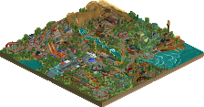
Park / [PT4 R7] Medieval Climate Optimum
-
 27-June 13
- Views 32,571
- Downloads 837
- Fans 2
- Comments 36
![Park_2859 [PT4 R7] Medieval Climate Optimum](https://www.nedesigns.com/uploads/parks/2859/aerialm2509.png)
-
2 fans Fans of this park
-
Download Park
837
-
Objects
1
-
Tags
![park_2838 [PT4 R4] God's Own Country](https://www.nedesigns.com/uploads/parks/2838/aerialt2492.png)
![park_2812 [PT4 R1] Unnamed Entry](https://www.nedesigns.com/uploads/parks/2812/aerialt2475.png)
![park_2399 [H2H6] R3 - The Replacements - Worlds Of Fun](https://www.nedesigns.com/uploads/parks/2399/aerialt2136.png)
![park_2824 [PT4 R2] Drop of Doom](https://www.nedesigns.com/uploads/parks/2824/aerialt2482.png)
I noticed the footers, but frankly I dont care so much about them. When I think of a woodie I picture corners which have beams going down diagonally also to absorb all the forces which are exerted on it when the car goes trough the corner. a little bit more of that would probally made me like it even more.
5dave, I'm not sure what a BBS is!
And Steve, what should I improve then? I welcome all critiques! I agree with others that to criticize scenery when the focus should be on the coaster isn't exactly right, but I do see that scenery is part of the whole package. I doubt any sort of re-do on the voting would get me any higher percentages, but I am happy with my score.
I guess expect more of the same from me, I enjoy making more classic style out-and-backs and old-school woodies. I am inspired by old PTCs and the famous Fred Church designs. All the B&M supports and layouts confuse the hell out of me.
"MFG"
Okay. Well, I thought I had a block brake at the very end of the ride in the last brake run, and that is also why I have a few lifts at the top of hills scattered along the ride so I could increase the train count to 3 and do so with fluidity and no block brake stops. I don't have my park opened, but I thought I put a block brake before the station, if not thats a complete oversight on my part.
Unlike Sammy I did decide to do some hacking to get what I wanted out of the station, but in the end I'd say his park is more atmospheric than mine anyway - lots of respect for deciding codex was too much hassle and making it look great.
As for my entry...
I'd like to clarify an error by the admin team; if you check the park name in my savegame you'll see that my entry is clearly titled "Hashtag Flyby Flowlercoaster 1," and is not untitled as mentioned above.
I happened to have a pretty solid GCI-like layout hanging around, and because I rarely build ultra-realistic this was a great opportunity to rewrite the ending to add a goofy flyby, slap some light theming on it, and relive the Hersheypark Wildcat experience of my youth; classic boardwalk-style peaked roof station, terrifyingly opaque layout, built on a field extension to the park.
There's of course been some great controversy through the prelims; what I find particularly interesting is how the numbers here are so much higher than an average design submission. If nothing else it shows that despite being a group of dudes who clearly have their own individual opinions of how things should be, the panelists are largely taking into account the specific criteria for each prelim.
I'll get to the RCT2 entries later, but for me it is important to point out that <80% does not mean the entry is unenjoyable, incomplete, or "bad."
also LL entries <3
][ntamin: some interesting and unique ideas in terms of layout, like that over-the-station out-banked turn thing. just not quite enough there, but it was pretty nice
ottersalad: a pretty good shot for someone relatively unknown. the layout seemed a bit 'stretched', which may have been the effect of a lot of diagonal use. Architecture was a bit cliche and bare, and color choice was a bit iffy, like the grey building seemed way out place. foliage needs a lot of tidying up, but overall the entry was pretty solid and 'complete'
maverix: a lot about this seemed awkward to me. the architecture was strange and piece-meal and didn't really fit together at all, let alone how awkwardly shaped some of the buildings were. the station was almost good, but it had a big brown box sitting on top of it. the layout was also funky and sort of meh, and a lot of the detailing was 'curious', like the brown tarmac paths and ruins around the top spin.
dimi: amazing! perfect all around. amazing, unique layout (seriously, I love it), great architecture, bright, classic dimi vibe, landscaping and foliage is spot-on, and just finished all around. could have been a design! great work
mrbrightside: I actually like this. the station is a little plain but still very fitting and pretty, and the layout is pretty cool. foliage could have much improvement though. also, queues shouldn't just be dirty grass, that just looks silly
i got SSScrewed
Maverix- Solid layout; I think it needed some more context to really feel like an outstanding or centerpiece attraction. No eruptions?
Otter- This layout was probably the weakest of the bunch, but I think it did a good job of replicating the Geauga Lake villain's feel.
Brightside- Very cool take on a boulder dash-type ride, looked like a total blast. I wish the surroundings had been more thought out.
Also, in case I hadn't mentioned it yet, Sam's gravestones-as-spotlights on the ride sign is brilliant.
Yeah, too bad Villain wasn't the most exciting rides in the world. I've always wanted to get into making real rides and I thought a ride that I'm very familiar with would be a good introduction to NE.