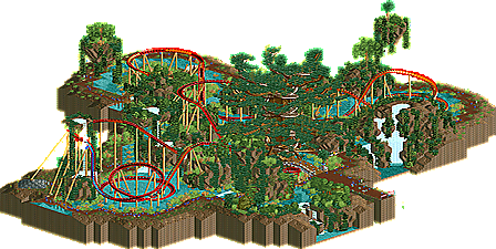
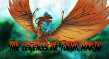
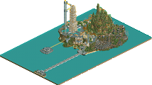
Park / AVATA - The Legends of Toruk Makto
-
 14-January 15
- Views 2,729
- Downloads 543
- Fans 1
- Comments 5
-
-
Description
"The way I had it figured, toruk is the baddest cat in the sky. Nothing attacks him. So why would he ever look up?"
- Jake Sully
I made this park in 2012, RCTschool's TTT Event.
(TTT = Team To Team)
Full screenshot is here
http://ssagssl.blog.me/220189038990 -
1 fan Fans of this park
-
Full-Size Map
-
Download Park
543
-
Objects
154
-
Tags
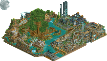
even though i really dislike the movie this was pretty cool! the large mountains perhaps could've been dealt with a bit better, a lot of them were quite empty. also i dislike some of the colour changes on the track, i think adding in the black was just too much.
overall a great design though! 70%
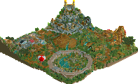
This is very inspirational. Ambitious landscaping and that tree is a work of art. I liked the floating rocks and the waterfalls as well.
I'm not a coaster expert but I enjoyed it however that s-bend at the end killed flow though. I didn't mind the colour changes but some were unnecessary.
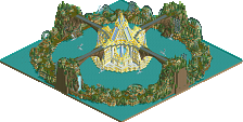
Overall, I did really enjoy this. Original and daring. Beautiful. Well done.
Was this submitted without restoring clearances? That was a bit odd...
Anyway I really enjoyed this. It's unorthodox and certain aspects of the landscaping are quite beautiful (like the waterfall). The tree was a bit messy for me but it was really cool, the large floating island was excellent. Making everyone blue was a great idea by the way.
The coaster itself was fun to watch. It didn't blow me away but I'm not sure it was meant to, the landscape seemed to be the key component to this submission.
Unfortunately this also gave me the vibe of being a little bit rushed... nothing was named except the coaster (I don't care if you name trackitecture but naming food stalls / staff can bring a fun element to the park), the ride had no footers, the queue / station area was very plain and like I said before the clearences weren't restored and those held this back a little for me.
Overall I love the creativity and more than anything I'm just happy to someone who hasn't released anything in almost 5 years come up with a cool submission like this. Despite it's setbacks I still thought it was really cool and I hope you get an accolade for this. 65%
yay! more korean work! we need to revive some sort of korean advertising thread like in the old a.d. so we can have a bit more integration with their community. fording into the korean websites is just too difficult imo
as for this design
I liked it. was pretty well put together, a more standard layout than normal, I think. It could have been more lush and colorful and filled in... it was a little bit boring. the center tree was done excellently though. and I liked how everyone was blue.