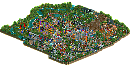
Park / Kings Valley
-
 18-January 15
- Views 6,498
- Downloads 744
- Fans 1
- Comments 16
-

-
 67.50%(required: 60%) Silver
][ntamin22 80% FredD 75% Ling 75% geewhzz 70% Poke 70% MCI 65% robbie92 65% Faas 60% Liampie 60% inthemanual 55% 67.50% -
1 fan Fans of this park
-
Full-Size Map
-
Download Park
744
-
Objects
405
-
Tags
Similar Parks
-
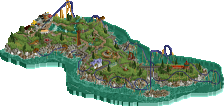
[MM2014 R1] Vertigo
![park_3118 [MM2014 R1] Vertigo](https://www.nedesigns.com/uploads/parks/3118/aerialt2765.png)
-
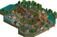
[MM2014 R1] The Guardian
![park_3163 [MM2014 R1] The Guardian](https://www.nedesigns.com/uploads/parks/3163/aerialt2783.png)
-
Stormrider
-
Valravn
-
Vulture
-
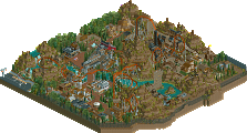
[H2H6] R4 - Flying Germans -The Classic
![park_2416 [H2H6] R4 - Flying Germans -The Classic](https://www.nedesigns.com/uploads/parks/2416/aerialt2159.png)
it's finally here! i finished this over christmas break, and needless to say it's been great working on it and sharing my work. i hope you guys like it!
Just looked at the overview. I'm seriously excited to download this later tonight and take a look. Will edit this post with my thoughts, but I can say confidently this looks like a gold accolade.
EDIT: Well, maybe not a gold accolade. In-game, it still looks good, just it wasn't too memorable. I felt like I was done looking after a few minutes whereas in a gold park or most silvers I'll spend a long time looking around. This one left something to be desired. I think you missed a lot of opportunities to really stand out. For example, the entrance interacting with the wingrider's tunnel and turnaround could have been so much better. I think you got lazy there. Queues were pretty dull; the best parks have really good queues. I know that's weird to think but it's true with a lot of the best parks on the site. And having a B&M and Intamin coaster in a small park doesn't make sense to me. I think it would have been better if you focused on what small parks typically do (purchase from cheaper designers, use relocated coasters, etc.)
However, there were good things. I liked Peril, that S&S wooden coaster. It had some great flow and looked great. Canyon Blaster also looked really good. Architecture was mostly good. Overall, decent job. 60% from me
Well, I just wrote a review of this, then closed the page and lost it. -_-
I think I'm gunna be the low vote. I think this makes too many of the classic gdb mistakes. The layouts weren't impressive, the river rapids were awkward and un-believable,4 with the weird indoor parts, and I didn't think there was much thought given to the surroundings, with grass banks and random rocks. There was also some weird quirks with a few buildings, like low ceilings or thin walls.
Generally though, the architecture was good, the supports were good, and there were a lot of lively, interesting moments. I just think there was a bit too little planning overall. I don't mean to be too harsh with this, I still love you Gijs. I just think there's room for improvement.
You know most of my thoughts on this already, but I'll do a complete review after I view it in-game with changes.
Great to see that you finished something though!
EDIT: Changes weren't overly extensive so I'll just summarise and add additional comments.
Overall, I'd give this a 60. There are a number of nice things here [spanish architecture and the indoor section of the rapids with the ruins], but the foliage is a little too clean, and your attempts to give 'identity' to buildings are quite forced. The placing of the 1k park maps object a few times outside a building does not give it identity. The problem is the similarity between buildings and the fact that in such a generic setting too many things look the same. The spanish area is great because each individual building is unique. The problem with main street is that it's flat. There's no real flow in and around the buildings because it's just a straight line outside.
Really awesome to see you finish something though. On a technical level I think that you're a very good player, it's more a matter of taking greater care when it comes to context and exploring some more adventurous ideas.
I don't feel that simply changing the woodie colour to brown really worked particularly well if you kept the kind of boardwalk style. In that the random rainbow arches really did not fit at all. I still maintain that the old colour didn't go with the surroundings, but the new version didn't go with the style. Glad to see that you changed the stair colours to something that worked a little better with the paths though.
I really liked this one!
The coasters were solid, although the "Canyon Blaster" could have been a bit faster.
The architecture was good, no complaints here.
I think the foliage was to clean, giving the park an a bit unnatural look.
The rapids were great! I really like the idea of those two indoor-parts. Normally a rapid is either a flowing river like thing, or this "coaster-like" thing, but the combination is really refreshing in my opinion!
"Split second" looked out of place for me. Completly "hidden" from the park and a bit out of theme. Just to modern, compared to the rest of the park (same thing with the gyro drop).
I gave 65%
First off the level of progress you've made in the last year is really incredible. Looking at things like Woodland lake and Century Cape and then looking at this you'd think you were looking at work from a totally different player. I can't commend you enough for that.
Second of all this is easily the best thing you've ever done. The landscaping and waterways were quite beautiful and the park was very lively and fun. I actually really enjoyed most of the architecture, your use of color is great and while I was worried this would appear rushed based on how quickly you completed it I was happy to see that I didn't get this feeling at all when viewing it.
While I did really enjoy this park it wasn't without it's flaws. Coaster layouts still don't seem to be your strong point as with very one of them (except Canyon Blaster and Split Second) it seemed like you had a good concept of what you wanted to do and executed all of those ideas with no regard for how to return to the station. I'm not sure if this is the case or not but it seems that way because Peril, the arrow and the wingrider all return to the station in an awkward, zig-zaggy way almost like the finales of all 3 rides were complete afterthoughts. You built what you wanted to build and it came out really nice and then it just seems like you went "oh crap how do I get back to the station?".
Another issue was that the pacing of peril and the wingrider were a little fast in places. Peril's finale of unbanked laterals and low to the ground track would be extremely painful and seemed very unrealistic. The wingrider only had one element that was taken way too quickly but unfortunately it was the barrel roll which was evident as soon as the park opened. Take a look at Gatekeeper videos and you'll see how slowly it goes through that element. With riders on opposite sides of the track experience very different lateral sensations you need to play it a little safe with these coasters which may be why a lot of people criticize them as being "forceless".
I also noticed a few little things that probably aren't a huge deal but minor details count so I wanted to point them out anyway.
- The enterprise rises the wrong way. These rides always rise up near the path, not away from it. I would turn that around.
- Over by the Scrambler you have a transparent fence clearly showing the backstage area for those buildings on the main midway. This would never happen in a theme park. That area should not be so easily visible.
- That carousel is a little awkward looking
- The Rapids ride was overkill. I admire your creativity on this ride but I could have done without the indoor section.
- The transfer the wingcoaster makes no sense. Look at some B&M transfer tracks and you'll see how they generally work.
Since I pointed out some negative minor details I also want to point out some little things that I really liked.
- The area by the water and the octopus ride were very nice. I could almost picture myself standing there in one of the quiet corners of the park enjoying the scenery. That was a great little area.
- Canyon Blaster was really well done... I hate to say it's my favorite coaster in the park as it was so small but it probably was.
- I loved all of the buildings on the "Split Second" side of the main midway.
So overall the park wasn't perfect but it was still really, really good and very enjoyable to look at. It makes me really excited for your future parks as you've finally shown the ability to finish a full size park and do it at a high level. Great job... you should be proud of yourself. I see this as a high silver.
I'm more strapped for time than I normally am, but I'd never miss voting on this. Long story short, I can't read what everyone else has said but here are my thoughts.
I love basically everything about this park. Bear this in mind as I list he only criticisms I can level at it:
- The overall park layout is a little dumb. While the big T-layout to your main street and the intersection with the main swath of path running perpendicular to it really works in terms of showing off architecture, Split Second is really visible from anywhere in the park. The entrance is hidden in a midway facade and the only other place you can see it is on one long spindly off-shoot of path near Longbow.
- Still too much of the green corrugated walls are visible on that rapids ride. It's also a shame so little of it really does anything with the queue or path or anything else. It cuts beautifully through the landscape without doing too much. This is balanced by the inventiveness of the indoor section, though, so I still really, really like this ride.
- Peril feels achingly classic in its overall layout. The buildings it sits on are gorgeous. But none of it is really visible except for that one enormously tall turn over the path in Canyon Blaster's plaza area. A queue or exit path that used that dark grey path could have been better. I just think of other great woodies and you can always see a good half of their layout from every side, dominating the area they're in.
- Parting thought: the cleanliness of that log flume will make you forever in my mind the Anti-Shogo.
Lovely stuff. Your progress is astounding and the quality of work from you is amazing. I kind of want to see you go crazy with a single ride to get more in-depth with how the paths interact with the ride from all sides, and to integrate themes into surroundings. I think even from a realistic perspective there is more room to go bigger and bolder with a lot of it.
75% from me.
First of all congrats on the silver! I was aparently the final vote. I was really doubting between a 55% and a 60% but because I really want you to know I appreciate you finally finishing a park I gave you the benefit of the doubt. I'll explain my vote below.
Things I liked:
- I actually liked the outdoor part of the rapids, looked really believable.
- I also liked the buildings around the wooden roller coaster, they looked fun and lively.
- The foliage inside the park was pretty cool.
Things I didn't like (I named more things here because I want you to improve):
- The (over)use of the steel roof. I know a lot of members see it as their favourite roof, but I disagree. Almost every station had a steel roof and even some themed buildings, why not just use tiled roofs?
- The log flume. What is it supposed to be? It looks like a traveling funfair ride. No theming at all and just weirdly tucked in there.
- The abolute lethal speed in which the wingrider takes the zero g roll.
- The fact that the foliage and landscaping outside of the park looked way too organic and man made.
- Why were all the backstage areas (which are ugly areas in theme parks that should be hidden) so plainly visible? Not only for us but also for the guests.
For my general idea about your building style and this park, I would advise you to listen to Stoksy and inthemanual since they echo exactly what I have been saying/thinking for a long time, and what I also think for this park.
Good luck on your next park!
yay silver
i'll take my time to respond to all of your messages tomorrow, and thanks to everybody who helped this park come along. so that's everybody who helped approve the park, all the guys that reviewed it for me, and ofcourse everybody along the way providing constructive criticism . this is a truly awesome community, and let's hope my next thing will be even better!
Overall there was a lot of attention put into the secondary attractions, which was very nice, and the architecture, landscape, and foliage are all consistently strong. Great work!
Congrats!
You should be really, really proud of yourself. I'm not hating on any of your work but I remember 8 months ago when you submitted Woodland Lake and were in one of Robbie's streams asking people to vote hoping you would get an accolade and ended up with just 46%. The park wasn't bad by any stretch but just 8 months ago that was your best work.
Then micro madness came along and you surprised everyone with 2 really nice entries and it was obvious to everyone that you had really stepped up your game.
Now you built a park that was only 2.5% away from a gold accolade. You went from Woodland Lake (again... I don't mean to hate on it) to 2.5% away from gold in less than a year. You've gotten so much better so quickly that it's really amazing. Is this park perfect? No... but it's a huge achievement and at the rate your going once you improve your layouts a little bit I can easily see you submitting a gold or maybe even Spotlight quality park in the not so distant future.
You should be really proud of the progress you've made.
I think this maybe should have sneaked into a gold. soz bro
I quite liked this park. Clean, realistic, etc. Some pretty nice themeing, even if the themes did blend into each other a bit. The park layout was a bit questionable and confusing in some bits which took away from the realism but I am certainly not someone to criticize park planning considering my usual style of building . But overall this was a lovely little park that was well put together and really pleasant throughout, if a bit done before. You should be proud of this one, and go on and make something really cool and creative next
best logo ever
lemme guess, liam did your logo?