Park / Let´s Build a ThemePark
-
 08-November 15
- Views 5,520
- Downloads 692
- Fans 3
- Comments 16
-

-
 66.25%(required: 60%) Silver
Chocotopian 80% csw 75% Kumba 70% alex 65% Cocoa 65% Jonny93 65% nin 65% Stoksy 65% Liampie 60% posix 40% 66.25% -
Description
After Spreepark I didn´t think I might be able to finish another park that big. Well it seems like I did though.
I´m really excited that Let´s Build a ThemePark is finished.
I hope you guys enjoy it :) -
3 fans Fans of this park
-
Full-Size Map
-
Download Park
692
-
Objects
1
-
Tags
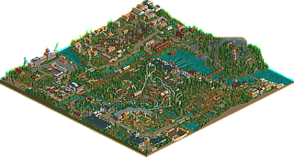
![park_4218 [H2H8/8] Morthal](https://www.nedesigns.com/uploads/parks/4218/aerialt3971.png)
Jan,
Congratulations on this achievment. This park transcends the confines of the Let's Build and truly became your best work to date. You never had problems finishing your projects, but this is special nonetheless. Awesome park with great coasters and solid theming. My community vote of 80% may be influenced by our friendship, but I do think you can be proud of this park, no matter the score it will get from the panelist.
BigB Offline
Great to see this park finally finished.
Since I followed it from the first minute, I will give you my detailled feedback this evening...
-------
Hmm, it feels kind a bit hard to comment on this, since I commentated your progress from the first episode. First of all, congratulations on finishing this, as well as on setting a new level for yourself. IMO this is your best work till today.
Entrance Area / Spain :
Decent entrance, even if you removed the „fuckin“ from the sign ;D. Tbh I don’t understand why you made the path invisible, but that’s fine nontheless.The facades are easy but typically MCI-esque. The blue Café feels to abstract for me.
The train station is simple, but beautifull, whereas the „relax zone“ feels uninspired and pretty… boring …
Don Quijote is very well executed and the Q is placed atmospheric (especially the part underneath the corcscrew would be nice in real life). The facades are, again, nothing special, but they just fit, so they do their job well
Yamatai / Asia :
I remember being a bit sceptic when you decided to do an Asian theme, but I think the outcome is good because Himikos Palace turned out in a different facade style, which is not entirely 2x2.
The grey castle and the station of the ferris wheel (which is officialy called „Schild“ in your savegame ) do not fit that well IMO. Also the tons of conifers are not my cup of tea, as well as the pink quarter flowers going over to the Skyrim area.
I would have liked to see some oft he stalls used as roof variations like Jonny did in Inselfieber.
Life is strange:
Best area in the park because of Roland Mack dancing next to a beert ruck.
Seriously, I never played Life is strange, so I cannot comment on the content / relation tot he game.
To make it short, the brick buildings are cool, the wooden ones are boring standard stuff. I like the gas pumps and the barn.
Polarized seems fun (allthough 24 people died because of a rollback) !
Hobbingen:
Well, you have to know what it is supposed to be, otherwise it is hard to identify what those building are. I think the solution you have chosen is okey, nothing more and nothing less.
What I dislike is how seperated the Prancing Pony is from the rest of the area. If you are at the Great Smialls you have to walk a marathon to get over the river, or you have to walk through the Hanse area.
Roman Area:
The coaster is cool. Villa Rustica could have been integrated a bit better, it is just so far away from the main path.
The buildings are very simple. The area could need more presitigious and outstanding buildings like the temple/palace in the upper corner.
Hanseatic Area:
Tons of facades. I suppose Störtebecker has some nice indoor theming like „Piraten in Batavia“, otherwise the 8 minutes ride time will be long
The facades are okey, but they get repetitve. The facades of the stunt show need more variety.
Fenrir Area:
A very cool layout. It‘s sad that I have the speed bug, but I remember when it worked with real speed. The station area is cool and definitely best solution compared to the ones you had first. The wooden houses on the top oft he mountain make no sense to me.
IMO there is too much foliage, so the cliffs don’t look like cliffs, what they are supposed to be. The backside oft he cliffs work well!
Hotel Area:
Definitely a cool idea, but the slide is unnescessary. The area around the pool may look better with another ground instead of grass,
Forgotten World / Jurassic:
I love this area! Predator and Arrival are just so cool!
The colours you used fit just well amd foliage works really good.
Skyrim:
Definitely the highlight of the park. Paarthurnax is an awesome ride which screams tons of fun to me.
The theming itself was not as Skyrim oriented as our Design. Nevertheless, there were some nice places which definitely made me think of Skyrim
This might be the longest comment I wrote on NE
Keep up the good work, I am interested in whatever is coming next.
B‘B
I think more than anything this park is a testament to the determination and ability for you to stick with a project. This is probably the first true high quality LP ever in RCT2, I loved seeing the park grow in the english videos, it was truly a cool experience. I'll definitely give this park a full review next stream, its definitely deserving.
If anyone else is having troubles with invalid file errors, just get rid of the apostrophe character in "let's" before opening the file. For some reason windows was displaying a weird u character instead of an apostrophe and obviously rct couldn't handle it
onto the review:
nice work! the park, in general, is pretty good. I really liked the white giga coaster (awesome colors+layout) and its associated area, as well as the entrance area and the looper. Other things that stood out where Nero's Palace, the splash boats/general area and the log flume. There was also a lot of fairly simple/generic theming, which looks good on the macro but didn't give me a whole lot to really focus on or remember as being exceptional. Bits I thought weren't as good included the (tiny) invert and its area, the flyer layout, the woodie layout (although it would be fun irl), and much of the brick area which didn't really come together imo.
I also liked the credits on the woodie, thats a nice touch.
Overall pretty good park, some nice elements, a bit forgettable, and some awkward. Definitely on the right track though, it seems like you probably improved a lot while building this park!
First of all, my congratulations that you finished again such a huge park. Your dedication is truly inspiring.
I think you created with Let's build a ThemePark a really nice NCSO park.
Like i said you already the biggest weakpoint for me was the the foilage. I had the feeling its so random. There was nearly everywhere this interplay between some flowers, stones and bushes. It seems you had no real concept for that.
On the other side, i think you had some pretty good layouts. My favourite was probably the Intamin Mega in the Skyrim area. Also the terrain woodie was very well done, although its a bit fast. The coaster fit so well to the terrain.
The architecture was very MCIesque with its strengh and its weakpoints. You improved definetely compared to your last parks but still i miss sometimes the depth in your detailing. Also it seems that you place sometimes details randomly.
My favourite part was definetely the entrance area. The diagonal entrance was pretty nice, also the surrounding buildings.
All in all i think this a pretty nice park, that is definetely worth for more attention. Your parks have some special, they inspire me to build something.
I am excited to see some new upcoming work from you.
First of all, thanks to everyone involved in this.
-Liam for doing the prepwork
-Jonny for doing the maps, fixing my blackholes (I promise to get better at avoiding those) and his constant feedback.
-BigB for kicking my ass during the buildingprogress whenever my motivation was not as high as it should be, the unreal amount of feedback he gives me on everything I´m doing.
-Version1 for tagging allong on some of the livestreams and helping me get some of the commentarys done for youtube
-Frossi (not on NE) for his feedback
-All those people on the back of the woodie for the constant flow of ideas, feedback and support over on youtube.
-And finaly everyone who bothered to comment on my screens here during the building progress.
It´s been a long and wel documented story. Building everything in front of an audience of some sort is a lot harder than just building for yourself, but it´s much more fun. Building something, putting it on youtube and seing the people react to it (if they do) is so rewarding. This may be the first park I´ve build where I dont care about the score I get, just because I´m 100% confident about everything I did in this park. Yes, some areas are not as good as others, yes I would do some things different now compared to when I started this but jeeez I wouldn´t change them now. Not in this park. That said, I´m glad it is here and I´ll give my best to do even better, to have even more fun building on my next projects.
@V1: Thanks mate!
@BigB:
That one is on you, you were supposed to find those kind of things beforehand Thanks for the long and detailed feedback!
@G Force: Thank you soo much, really glad you enjoyd the videos and I´m looking forward to see your review!
@Cocoa: I should have learned my mistake with the ´ sign in rct2 names, but well... Thanks for the review. I think the flyer and the woodie are a bit "over the top". Just too big/long/fast if you know what I mean.
@Jonny: I inspire you to build something? Good, now get out and finish Walibi Belgium!
You laid your finger on the exact spot there. I - hate - foliage. I just cant do it. It just bores me to do it and therefore I´m not paying as much attention to what I do (wich results in beasicly everything looking the same). Still trying to improve my architecture, as you said I think I got better but there is lot´s of room to improve...
Fantastic park. Improve the foliage and I would consider voting for spotlight!
Congrats on the silver
@csw: Thanks!
Anyone else got a opinion on this one?
Gold quantity, silver quality unfortunately.
This park started off really well, I loved the entrance area (especially it being diagonal) and the main street architecture really set the standard. However, I think the biggest problem I had was a lack of planning re: where rides were situated. You had this great entrance area, but then shoehorned a carousel in a corner. It's nice that peeps can enter the park and are hit by a coaster already, but that transition felt much too sudden for me. Then along that path you've put an amphitheatre? Why not have that in the Roman area? Surely it would fit better there? The arrow itself was quite good, I just question it's positioning.
Yamatai was certainly one of the better architectural areas; the facades were wonderfully detailed and seemed to break the standard MCI-building style. I actually thought that the log flume didn't need to be there; I would have preferred that you had had the quaint lakeside walk in that central area and themed it to asian gardens or something. I don't think it would have looked quite as forced and would have also prevented such clear framing of the ride by the path.
Life is Strange was half-brilliant, half-boring. The abandoned train tracks and 'salvage' yard were awesome! This is kind of why I partly wish that you'd further pursued the post-apocalyptic theme because it would have made you avoid the standard MCI-architectural style that came back so clearly in this area (all those wooden buildings).
This area really raises the foliage issues. If you've got coloured flowers (in a theme park remember) then they are constantly being watered. It doesn't make sense for the person doing the watering to have to traverse large areas just to access one or two flowers. Therefore, if you're going for manicured foliage then the coloured flowers should be 1) close together (preferably next to each, but transitioning across diagonals), and 2) closer to the path than other flowers. You want transitions between flowers, bushes, and trees.
The most clear representation of this could have been done by the Chaos Theory building. Instead of randomly placing flowers and bushes, you could have had a line of coloured flowers by the path, transitioning into and out of different colours (you're obsession with the red and yellow flowers in this area was unfortunate) creating almost a barrier of several tiles between the structure and the path. You could even have considered planters placed right up against the building if you felt some height variation was necessary - it's a large building, the foliage would surely be well manicured.
I also think that the arcadia bay driving school should have been fleshed out a bit more (make it look like a car park or set up a driving course rather than simply surrounding it with foliage), but that was a minor issue.
Moving onto Rome, which suffered much of the same foliage problems. It was solid, nothing really special, but it served its purpose. Architecture was maybe a little repetitive, but you at least combated that with using different colours for the respective buildings. It was at least nice to finally see some open space!
I actually really liked the form of Nero's palace, could have maybe used some air-con units on the roof but at least it was a large structure that was unique and served a purpose. The junior coaster was unfortunately quite weak, I felt that you tried too hard with it. It's a junior coaster, it doesn't have to be very interesting. I quite enjoyed the flyer overall; good job there.
Fenrir was ridiculous. Way too big, insane pacing for the first half. The layout could have been maybe half as long and you still could have accomplished the iconic woodie that you appeared to be going for. So much pointless stuff after the lift before the actual first drop and then some insanely fast turns. Sorry, but I was not a fan.
The nearby theatre/show was a nice touch, I felt that it was missing something but I'm not quite sure what that might have been...
The cliff should have been a cliff, and not a forested mountain. As BigB said; "the cliffs don't look like cliffs." While I'm glad that you tried to include some non-park features like the hotel; the slides (at least the teal one) was ridiculously forced and unnecessary. Almost ruined the area actually. I could nonetheless appreciate the beachside chairs; that was nice to see.
The jungle area was probably the best foliage-wise, because it made sense for it to be a mess. It contained a solid invert layout (great colours by the way) and two interesting tracked rides. One thing that was missing were non-foliage features. There were just too few of them.
The skyrim area was arguably the best. Had an iconic coaster layout, some nice landscaping, and things like the mine entrance (of which you should have had more) added some nice touches of detail to the area. I still think that it could have used less foliage and more architecture. Another problem that I have noticed with respect to foliage is that (other than the jungle area) the foliage selection is almost always the same regardless of theme. Instead of selecting 4-5 trees and using them to portray a particular theme in a particular area you seem to select all the trees and use them interchangeably in every area. Try to avoid this in your next project, and be stricter about what trees you are selecting and why you are selecting them.
The hobbit area was pleasant, but weak. The architecture embedded into the land was great, but just didn't do enough. Possibly either it was simply not big enough to make an impression on the viewer, or it was a theme that is a little too difficult to translate into RCT. Anyways, I commend the effort but was personally not overly taken-aback by the area overall.
Awesome to see such a large park completed, unfortunately it suffers from a few weaknesses in very important areas. Hopefully you'll be able to at least improve your foliage in you next project; because that would have brought this park up to a gold I think.
RCTER2 Offline
Why I can't open the the big map?
Sorry to be the low vote on this - rarely happens to me.
To be quite frank, I thought nothing about this was in any way outstanding or particularly interesting. I think it's very important for you to have finished a full scale project, and I'm sure you'll have learned a lot from it. Like others, I'm impressed by your persistence. For the few years you've been in the community, you've always brought an equal amount of amateurism and positive spirit with you, and in the future I would love to see you pair latter with improved parkmaking skills. I wish you will become a similar late-bloomer like 5dave. My advice: keep playing and be clear on what interests you in the game. Then go for that and develop it to set your style apart from others.
Sorry the audio quality really fell off near the end, I have a really bad setup at the moment. Hopefully I'll get a better mic and audio quality starting next year (if I continue doing the reviews). Anyways, a great park and really impressive feat, hopefully in the future you'll experiment more in the future with themes and even some CSO.
https://www.youtube.com/watch?v=TTtGY3sEuO8
@Stoksy: Thanks for the long indepth review!
I´m always trying to improve my game and I definitly need to improve my foliage wich obviously is my biggest weakness. As for the lack of planning you mentioned... Yeah, looking at it now some rides (the small LogFlume, the carousel etc.) and some buildings (e.g. the amphitheatre in spain) seem missplaced as a result of poor planning. But keep in mind that there was no planning at all, because this park grew as part of an LP on youtube. I just built what I wanted to and did not think more than one step ahead.
@posix: Shame you didn´t like this.
That´s what I´m doing since joining NE five years ago, just without finding a style that NE seems to approve.
@G Force: Thank you so much, It was quite fun having my own park reviewed during your livestream! There are a few things I want to clarify though.
-I did build a Skyrim themed Design called "Dovahkiin" together with BigB a couple of years ago. But the layout, setting and basicly everything xpect the general theme (and the fact that it was a intamin coaster) were different back then.
-You didn´t whatch/read The Lord of the Rings? Shame on you!
-Störtebeker is inspired by the "Flying Dutchman" at de Efteling and if you play the ingame music you´ll hear the actual soundtrack of the flying dutchman ride.
-The record for most gumdrops in a park goes to "Märchen Paradies"
-Fenrir is a two headed wolf, found in the nordic mythologie. The Area is supposed to be a viking area, but since you didn´t recognize it I guess I failed on that one.
-"Let´s Build a ThemePark2" is in the making, spent around 10h building in it as of right now. Not sure how I´m going to do the videos though, LBaTP was pretty exhausting on that regard.
-Last but not least: I´m not using CSO. Invisible path, support blockers or maybe some custon supports could find a way into the bench at some point, but playing with "real" CSO wont happen.
If you're ever looking for a park collab partner, I'd be up for it!
BigB Offline
^ nope, that's my job, sorry ;D