Park / Butcher
-
 09-January 16
- Views 3,400
- Downloads 424
- Fans 1
- Comments 21
-
 60.63%(required: 65%)
Design Submission
60.63%(required: 65%)
Design Submission
Cocoa 75% Chocotopian 65% geewhzz 65% Stoksy 65% alex 60% csw 60% disneylandian192 60% Austin55 55% Sulakke 55% nin 50% 60.63% -
Description
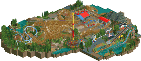
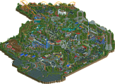
GCI coaster with some funky elements.
-
1 fan Fans of this park
-
Full-Size Map
-
Download Park
424
-
Objects
1
-
Tags
This is your first release? This is fantastic considering that.
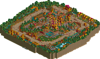
Very solid realistic design with some fun and well executed architecture. I quite like the station shape and use of rooves as well. Really simple but works.
The layout was quite good to, especially for how tricky GCI's are. You've done a great job with that.
I'm not sure it will win design but I look forward to seeing your future projects. You show lots of potential.
Layouts, supports, foliage, and landscaping were all fantastic. Rest is good but not quite at the level of the coaster. Your architecture feels a lot like SFC era CP6, which is not a bad thing, just needs more work and practice. Like Austin said, you have lots of potential if you keep building and improving. Hope we see more from you soon.
Thanks Liampi for adding this so fast.
Yes it is my first decent-ish map I finished.
I'm pretty bad in architecture and probably need a lot more practise with that. I have troubles adding multiple layers but there should be some tricks to that wich I haven't figured out.
That it looks like six flags stuff could be right, since I (tried) copied all of the buildings through google streetview of Six Flags Great Adventure, except for the stations.
I already started something new so I'll be playing this game whenever im not playing anything else.
Great layout and buildings, but there was too much blank space in between everything. A bit too much dead grass everywhere.
Good first effort!
I disagree with your own assessment. You have a great foundation of buildings to improve from. I'm not the best guy to get advice on realistic buildings, but you're well on your way. The best way to improve is to keep building, you've got some talent that will develop over time. Nice job on this project, looking forward to your next one!
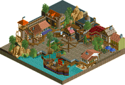
You had one good building (the cafe), one pretty poor building (the pink one) and the only other buildings in the park were average. It was enough for me, good layout, nice landscaping/surroundings, solid supporting rides (although I really disliked the peach supports for the water ride).
Enough for design imo. 65%
I thought this design was fantastic. It had solid themeing all around, great landscaping, felt very realistic, etc. It all worked together really well and felt like something I could imagine seeing in a real park. I also thought the layouts are fantastic and thats one of the best uses of an incomplete ride I've seen- usually they leave me going "ugh filler alert" but yours fits in really well and definitely leaves me wanting more (in a good way). Anyway definitely deserves design IMO, great first release!
Very enjoyable layout. Often, I feel like I'm looking at "traditional" layouts and elements in designs, but yours felt unique and had some lovely interaction with the water, hills and the support structures. The minimalistic metal walls in the tunnels and around the station really sold the realistic nature as well.
The buildings were nice with some cute features, but didn't really hold my attention. Some of the colours felt a bit too jarring given the rather arid nature of the whole area, and I feel like a little more clarity on the street in general would've helped. As it stands, it felt rather cluttered and obscured to me, despite there being plenty of open space elsewhere.
As Cocoa said, the incomplete ride was integrated well. It's almost a shame there wasn't a hacked train performing some rounds, just for the sake of some near misses and interaction. But still, a cool touch.
All in all, I thought you did a good job of capturing the realism of amusement park (as opposed to "theme" park) building. The high fenced off areas, façades, and the frequent sacrifice of form for functionality all contributed to giving this a very real feel. A decent coaster overall, and one which I think is design-worthy.
Its NE bro, got to hold up the standards.
What a beautiful layout. It had stellar interaction with the surrounding environment and demonstrated design-worthy skill. I'd give it a 65-70%, but I don't matter anyway.
I was on the fence about this. Layout was solid, but nothing more In my opinion (and it seems I'm in the minority!). Loved the first drop and figure 8 element. I thought that was a unique and thrilling start to the ride. After that I feel it looses focus a bit and meanders through a bunch of quite similar looking helixes. There's nothing wrong with this of course, many roller coasters do, but I would've liked to have seen the elements placed a bit tighter. Parts of it were a little lost in the wilderness. I suggest checking out the h2h Park Asterix if you haven't seen the woodie in that. It's a good example of a helix heavy GCI with lots of swooping turns like this one but it wraps around itself more and seems to have more logic to it. You nailed the pacing though, looked very aggressive and gci-ish. Support work was spot on too.
All the other stuff was decent. Architecture was simple but it did the job and felt realistic. Foliage and landscaping wasn't my favourite style - it was a bit too busy with the different ground textures and grasses.
Overall this fell short of design for me. Nonetheless it's a great first release and shows real skill, you should be proud.
Otsdarva Offline
You should expand this and turn it into a full park because the hyper interaction is great.
I agree about this not getting design. I searched up some design's that won it and acknowledge that mine felt a bit meh-ish. It's good to know that I myself see the difference between good and ok/bad stuff. And after seeing this now I totally understand the score.
I have to check out some more parks to gain inspiration, and improve myself as a more complete player. I also don't know if realism is the road I want to take.
Anyway, thanks for the people that took their time to check this out.
Just found this now, and it's really funny to me to see a new builder- dutch no less- take the progression that maverix and to a lesser extent robbie took years ago. That 2x2 white building I swear to god is 2010 robbie. I'm not saying that to knock you; you can learn a lot by taking elements from others' works and adding it to your own (by that, I mean copy builders better than you (by that I mean robbie92)). I'm a shit builder with no imagination who has never went to a theme park before, and if it can work for me, it can work for you.
Funnily what lost you design is the same thing mav had issues with until recently, it being composition and being devoid of soul. I know this is a year ago and you're probably better now but If you grew some balls and make the queue and station somewhat less of a forced-in gray blob you would have hit 65%
Now to see if anyone takes the bait and replies to my necroing
And some rough years to say. Quit with the gf. Lost both parents and entering a whole new job.
Time flies fast. Im building again cause I have time again. Cant wait to show more
And sorry to the people whom i disappeared to in oblovion, mostly bubsy.
Yesterday on Discord (join us https://discord.gg/cJse2c ) we were talking about players who quit too early. Now I saw that Butcher got bumper I realised you should've been in the discussion. Luckily it's you yourself who bumped the topic. It's great to see you're back! But ouch, that does sound like rough years indeed. Damn.