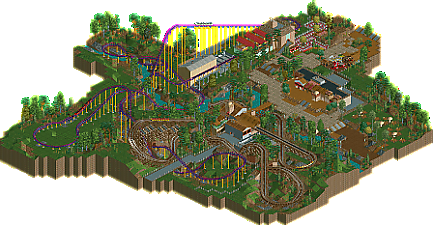
Park / Hunter/Wizard
-
 06-February 16
- Views 4,311
- Downloads 750
- Fans 4
- Comments 25
-
 64.38%(required: 65%)
Design Submission
64.38%(required: 65%)
Design Submission
Cocoa 70% inthemanual 70% Jonny93 70% Louis! 70% ][ntamin22 70% alex 65% csw 65% posix 55% pierrot 50% Chocotopian 45% 64.38% -
Description
did u miss me
-
4 fans Fans of this park
-
Full-Size Map
-
Download Park
750
-
Tags
Similar Parks
-
[NEFC] Great Mesa Gateway
![park_4822 [NEFC] Great Mesa Gateway](https://www.nedesigns.com/uploads/parks/4822/aerialt4720.png)
-
Attractiepark Berkenwoude
-
[NEFC] Down the River Ganges
![park_4808 [NEFC] Down the River Ganges](https://www.nedesigns.com/uploads/parks/4808/aerialt5009.png)
-
Sunset Valley
-
[NEFC] We Overcome
![park_4806 [NEFC] We Overcome](https://www.nedesigns.com/uploads/parks/4806/aerialt4750.png)
-
[NEFC] Pineapple Road
![park_4796 [NEFC] Pineapple Road](https://www.nedesigns.com/uploads/parks/4796/aerialt4695.png)
Ah that's a shame, I wanted it to win but did think it was borderline.
The landscaping and foliage was wonderful, this was minimalism done well. The entire area around the coasters was beautiful and felt very neutral - It demonstrated your focused, reductive approach well I think. The architecture on the other hand came off as sloppy and unrefined. If anything you could have actually gone simpler and cleaner with it as long as you give the buildings a clear identity. Some of the textures and objects used seemed a bit arbitrary and mismatched. The layouts were great, very nice interactions and you used the landscape/foliage well to accent certain elements (the clearing around the wide, low turn on the hyper looked excellent). Overall I thought this was a really refreshing park. I hope you keep playing and having fun.
Fucksake.
0.62% off! most of my submissions are controversial or so it seems.
the people who voted low supported their view really well and gave criticism that i will be sure to keep in mind when next i play.
I haven't been able to check it out in-game yet, but I gave a 75 on the overview (also to kick it into voting). I absolutely adored and think it's a shame you missed Design. Especially when you're so close.
Just checked this out in game, I quite enjoyed it. Wizard reminded me of a smaller Steel Eel which I imagine isn't a coincidence. Very nice.
I think Hunter was my favorite of the 2 coasters. I liked the use of trenches and tunnels. Both coasters made good use of the terrain.
Sorry you didn't win, but great work!
Love the first couple elements after the first drop on the hyper and how they are sequenced. Then it's followed by the open air section: I love the feeling of flying along a track in real life, and you don't need weird, forceful elements to achieve this, which is what you've done here with the large sweeping curves. Also the woodie is nicely done, and I liked how you ended it at a length you intended rather than trying to stretch it out.
A clear Design in my book.