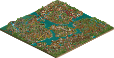
Park / Jappy's Wildland Adventure Kingdom
-
 02-June 17
-
Jappy's Wildland Adventure Kingdom
- Views 6,264
- Downloads 937
- Fans 5
- Comments 20

-

-
 77.50%(required: 70%) Gold
CoasterCreator9 80% Cocoa 80% G Force 80% Kumba 80% trav 80% Coasterbill 75% Faas 75% Stoksy 75% Sulakke 75% Liampie 70% 77.50% -
Description
Grab your hat, your backpack and some walking boots, get ready for an amazing journey around the continents!
Normally it's still compatible with vanilla, but for the full experience I recommend watching it in Open because of issues with the entrances and exits. -
5 fans Fans of this park
-
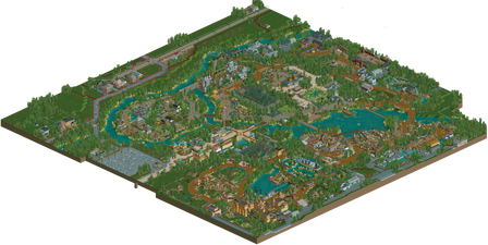
Full-Size Map
-
Download Park
937
-
Objects
90
-
Tags
Similar Parks
-
Giari Palms Theme Park
-
Age of Sail
-
VOC Anno 2004
-
[Disaster Micro] Sharkfin Cove
![park_3833 [Disaster Micro] Sharkfin Cove](https://www.nedesigns.com/uploads/parks/3833/aerialt3494.png)
-
Wraith - A Park Snippet
-
Seas of Antiquity
Worst park on the site
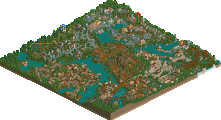
For a park this big a section by section review seems the best way to do this.
-Main Street - Pretty nice architecture with the entrance building. The guests queued up are a nice touch, however the ones frozen in the parking lot are a little distracting. Overall a pretty nice area.
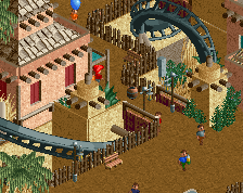
-Africa - This is a fun area. The whole area by Cobra seems a lot more compact and cluttered than most of your work, but it works here. I also really enjoyed the tiny floating village.
-Australia - Waicuckoo Mining was a fun ride with its switchbacks, but it didn't work properly and had to be restarted. The snow cups ride confused me at first but made more sense after seeing the awesome custom penguins. Architecturally I felt this area was a little weaker than the previous two.
- Frontier - This area was a little small but I loved the architecture. I understood every buildings purpose and inspiration and it came across well. The huge amount of peeps running through the goat exhibit was a little odd though.
-Ruin Area - I thought your path choice did a good job in keeping this area from being too drab. There might have been a little too many 1k rocks in one of the exhibits but that is a minor complaint. The escape ride is another good choice for a ride that fits the zoo atmosphere.
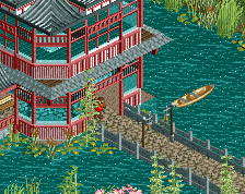
-Asian Area - I liked how you placed the more Asian foliage near the center of the area and gradually put more generic stuff towards the edge. The architecture was nice, but seemed a little weaker than the rest of the park. This area made great use of colors though.
-The outskirts - Honestly this was easily the weakest area of the park for me. I think you had object limit issues (?) but it seemed nowhere near as detailed and I wasn't a fan of the road textures.
Overall this is great work. You really conveyed the feeling of an exotic zoo. I think upon first viewing I would give this park a 75.
I've heard multiple problems about rides not working, must be because I opened it in vanilla
EDIT: thanks to the admins for replacing the file with broken rides for one that has working ones!
really fantastic work. this was actually better than I expected it to be, so good job on that- I like that there was a decent amount that I hadn't seen before.
pros: some really great detailing and archy throughout the park. there were a few spots with great composure and the buildings and atmosphere all came together wonderfully, and felt very lively. overall, it was very fun and exciting, and not too rooted in traditional sort of european parkmaking which was nice. always good to see a zoo park also. examples: boat in africa and the lush area around it, the entrance to the mine train (and some of the archy there), the plane and building next to it, log flume and western architecture in general, the tiger building, asian archy, and the green buildings with tan rooves in south-east asia part.
cons: wasn't always so consistent. while there were spots of really excellent parkmaking, there were also some less detailed buildings, awkward spaces, etc. Its like I can see you almost getting there overall, but still reverting to maybe an older, less detailed and less thought-out habit of building. the consistency perhaps brings down the park more than anything, as the good bits are really quite good, but its hard to say that the park as a whole was as excellent as my favorite bits. examples: a bunch of africa felt overdone/blocky/underdetailed, some of the grey indian archy and the coaster there, the antarctica area, a few areas of just lots of path and not much around it, aside from a few generic looking structures.
all that said, great work. probably not a spotlight from me, but I really enjoyed it and look forward to seeing you keep pushing yourself to really spend time on every building and composure in general to make it all click together. congrats!
From an aesthetics point of view, it's good but not incredible. Coasters and ride selection could have been better and more interesting. I also thought all of the outside area was pointless.
However, this park was a lot of fun. So many small details everywhere and that's what really pushes it over the edge for me. I know that I haven't found everything on my first viewing, so I'm looking forward to going back and seeing some more.
A few highlights;
Penguins
Diggers
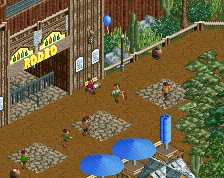
Rodeo in Western area
The crossing signs at the train tracks
The rapids ride
Interaction between queues and rides across the park.
80% and a yes vote from me.
I must say, this is one of the best parks I've seen on here. Another masterpiece, Jappy. I loved the theme of the zoo-theme park hybrid. I think my favorite area was the African area.
R.I.P. Karambe
It shows that you're a smart guy and put a lot of thought into the park and its concept and layouting. It's a very believable park in regards to that and in regards to the atmosphere. Probably the best zoo/park combination that I can think of atm.
It's obvious that at least 2 of the coasters were heavily inspired by real life coasters, but that's always interesting to see, as it puts a focus on how you interpreted that inspiration. The archy is good throughout.
I found the lion cage in Africa a bit off the path, but I guess that's okay, as you would want those in a less dense area. But due to the map edge, that habitat feels a bit forced.
Overall very very good stuff man! Both on the small as well as on the large scale. Something that one can look at again and again I'm sure, as there'll always be new things and ideas to spot and new concepts to admire when reopening this.
JWAK is another proof of how you keep improving yourself and still keeping your unique Jappy-style. JWAK is another big step up from your previous work.
You succeeded to create an amazing atmosphere. The Indian zone was intense and my favorite part of the park. All the other zones ware great too, except of the main street/entrance who wasn't really up to par with the rest of the park I think.
I like how the African zone ended up. You integrated the B&M invert really well and I think it's safe to say it's the best 'Black Mamba' based coaster I've seen in RCT. A bit of a shame the lions were in a hidden spot, would've switched them with the elephants because the lion is a pretty popular animal and you already had a great elephant spot in the Indian zone.
The Australian zone is original, I like how you handles the roofs. Very original coaster as well (teach me how to build that!). The wildwest zone is good too, I think you missed the American sea eagle here, that's the first animal I think of when saying America, should've been in here I think. The log flume was a bit weird, with drops so near each other. It could have benefit from more space.
The Japanese/Chinese area is really great, my second favorite part of the park. Dr Yu's restrooms is so greatly executed, so atmospheric! I think the pink trees help the atmosphere a lot too hehe #lovePinkTrees
Very neat details to find, as Trav mentioned before. I don't agree about the outskirts, I think they are almost always pointless. But you executed that well, it's really recognizable Belgian landscaping and ugly housing. I think the most critic on the outskirts come from people not really knowing the Belgian koterij and such
The mix of theme park and animals is great, it looks like Pairi Daiza with theme park rides added to it. And if you can achieve that look, you've done great! You can be proud on yourself Jappy! I think 80% is a well deserved score, whether or not it's a spotlight I don't know.
Full scale aerial added.
Congratulations on the Gold, score is right around where it should be I think. I'll try to get a video review done this weekend.
Damn, I was going to vote on this, and then I had to go out last night and missed my chance.
Alright, I've owed you a review on this one for awhile. Sorry for the delay.
First of all, I almost didn't vote because I was so conflicted between 75 and 80%. This didn't feel like a Spotlight to me but I don't see the logic in voting 80% and no on a full scale park. If it's 80% then it's a Spotlight in my mind so I eventually settled on 75 since I didn't think it was quite Spotlight quality.
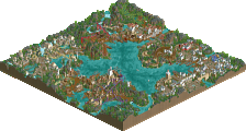
Despite that, this park is phenomenal. I love the zoo aspect of the park, it's a shame the animal objects are all such shit but there's nothing you can do about that. The animals give this park a totally unique vibe. I know BGA had a similar idea but this actually made the animals even more of a focal point and this park felt like a combination of a Busch park and a full blown zoo with a European flair which made it absolutely unique and a lot of fun to view.
Main street is great. It's very fitting and feels very zoo like. I love the colors here.
As for Africa, I really love the invert. Sure it's a Black Mamba ripoff but you did it well and aesthetically it was wonderful. I sort of feel like the final tunnel before the brakes was a bit long but now I'm nitpicking. The whole Africa area is wonderful.
Australia was odd. I loved Waicuckoo Mining and the area around it. The layout was fun, the switchbacks worked well and I liked the Expedition Everest inspiration. The areas further away from the ride don't do much for me though. The snow cup and penguin area isn't up to par, nor is anything in that back section aside from the awesome plane and hangar. Overall though, still very nice.
Frontier was spectacular. The flume was wonderful, the main street area next to it is outstanding and atmospheric and the shows were fun. Everything here gets a big thumbs up from me.
I was sort of torn on the ruin area. Some things (like the Tiger building) were OMFG amazing, the elephant exhibit was too. The foliage around the tiger building worked wonders to help keep it fun and colorful despite the grey and I really appreciated that.
The escape ride was good I guess, but I couldn't help but feeling like it was just a less impressive version if Airtime's Indiana Jones ride. Maybe it's not fair to compare them but it's hard to avoid. The bridge behind it was plain and awkward with the train tracks.
Asia looks wonderful. Great foliage, great colors, zero complaints here.
The outskirts of the park were nice too. I love the buildings and road textures.
Overall this was great. Some areas were better than others but overall I really liked it. Spotlight is easily within reach for you but I don't think this was quite there. It was painfully close though...
Awesome work!
I really liked this.
I loved the Australian mine train coaster, I would like to see you try more adventurous rides in the future. All your coaster types and layouts have always been too safe for my likings.
The thing I didn't like about this park, was that all bridges were really boring. This is a park with a lot of bridges, and they all look the same. You could have extended your theming a bit more with the bridges.
But overall great park! Great concepts, lots of creativity!
75% for me.
So glad seeing this released now and congrats on the gold, which is a good fitting accolade in my opinion.
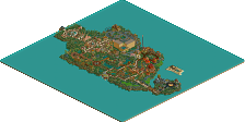
This definitely shows the improvement you've made during the last months/years. It can be seen the best while looking on those areas, where you perfectly managed to create a symbiosis between coasters, architecture, path and details: The mine train and Cobra. These are definitely my favorite areas of the park, cobra is probably one of the best black mamba-ish coasters ever done.
Escape from Shaladrivana was also very well done, the concept is amazing and while both coaster and theming are quite simple and easy to make, the atmosphere with the music, peeps etc. is just superb!
The east asian and the american area were the weakest areas for me in the park, although these also had some cool things like the Rodeo show. I just felt like there have been some missed opportunities by not giving these areas an eye-catcher or some notable attractions. Of course these areas still were pretty good technically, but i didn't liked them in terms of concept like the other ones.
Main Street and entrance were quite solid. Same goes for all the different animals and enclosures all around the park. Surroundings were also quite cool and i think all in all they added something to the park, so definitely a good decision to make them.
Overall wonderful park, but i agree that it is not quite Spotlight, but you're definitely close to it, i would call it parkmaker-worthy though, which is why i would give it a solid 80%. Hope you will improve a little bit more with the projects you're making at the moment, so your next big park will get you that last accolade that is missing in your collection, definitely looking forward to that what comes in the future from you!
https://www.youtube.com/watch?v=hdNjGMtCkzk
https://www.youtube....h?v=hdNjGMtCkzk
For some reason, video's aren't embedding in the site currently. So you'll probably have to click the link
Thanks to everyone for the nice comments! It truely is flattering to hear people say I've improved and that this is even Spotlight-worthy! Certainly motivates to come up with new stuff to share with this great RCT community!
I thought I commented on this, but apparently not.
Not that I've watched Russ' video review in full but I'm fairly confident he'll have covered most of my points.
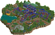
Your entrances still bug me, the whole asymmetrical style just doesn't sit well with me and it's honestly at the point where I'm thinking just literally copy the layout of 'x' realistic park and then go do whatever you want from there. I always just feel the positioning of all the core elements constantly feels awkward.
As much as I usually go area by area I'll just bring up the core points instead:
- Backlots appeared quite well researched which was nice, accounted for the animals as well as required access to rides etc. Understanding this I think is core when building animal-style enclosures because the enclosure itself will often have little-no movement so my eyes are looking for additional details to help contextualise and understand what I'm looking at
- Some of the area transitions felt really strange. It would have been nice if some more consideration was given to this, or at least thinking about the shape of areas and how they might work together. For example although I actually thought the penguin enclosure was quite nice it's rather shoe-horned position meant I was less enticed by it from a viewing perspective.
- A similar critique can be extended to the hyenas and also monkey and giraffe enclosures. My problem here was more that few enclosures really felt organic when they should be organic and sterile when they should be sterile. Penguin enclosure and goat feeding nailed the latter, but few if any satisfied the former [although the Asian elephants were definitely a step in the right direction]. While I can appreciate isometric view and RCT-limitations makes this difficult, everything felt super angular and I think attempts to consciously fight the grid system would have helped dramatically improve the feel of all the enclosures. Yes, enclosures are built by people, but you have to pick either sterile OR organic - I felt a lot of this park couldn't decide which it wanted to be.
- Admire the attempt at contextual outskirts, although not super convinced they worked. I'm always sceptical about the importance of outskirts, as they only work when done to near-perfection [ie Riverland] and I don't think these were quite there.
- Not every tile needs a tree. While it's great to see your improvement in foliage selection, it's now about foliage placement. Hopefully it'll come with time.
You're really close to nailing something Jappy, probably 75%ish. For me, there's still a couple stylistic things which need some improvement.
Sorry to you too, Jappy, for the late review.
First of all I just want to repeat what I've said earlier, it's incredible how fast you built this park. It's massive. With each release you raise the bar for yourself. This was no exception.
I think you've created a lovely piece of RCT here. There is this combination of wild animals, old temples, and attractions that creates this very fun and intriguing atmosphere. I like it a lot! Very good job.
Since my reviews are kind of crap, I going to mention a few of the highlights and some of the things I didn't like as much.
+ The railway museum. It's kind of simple but a very nice touch! Love it.
+ Western Frontier area was really beautiful and well made. Very atmospheric and believable in my opinion. The rodeo was great too.
+ The railway was nice. Especially the part where it goes into the little mountain.
+ Waicuckoo M. M. Such a nice coaster. Not sure if I liked the grey track, but that's ok. Looks really fun! Great job.
+ Outskirts was well done. I liked the red sidewalks, and the houses. The buss was pretty sweet too!
+ Cobra. Very nice! I'm keen on the layout and all the interactions!
Things that could be improved:
- Foliage became quite repetitive. It's not bad, but repetitive.
- Liitte bit too much grey. Paths, roofs, buildings, station platforms, fences, coaster tracks. Yeah, too much, man. Don't be afraid to use warmer colours in the future.
- The use of textures could be improved a lot. There are usually too many textures in your buildings. It just looks a bit too random in places. Aslo I feel there is sometimes a little bit too much going on with the path textures as well. Maybe stick to one or two path textures.
Well, by the end of the day, I think you did a terrific job with this park. And you too, should be proud. I'm very interested to see what you will do next. Keep working hard, Jappy!