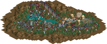
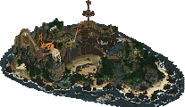
Park / Light Inertia
-
 12-May 03
- Views 1,249
- Downloads 216
- Fans 0
- Comments 12
-
No fans of this park
-
Full-Size Map
-
Tags
Community Forum Software by IP.Board
Hope you like it.
It was...okay. I certainly hope this is not your best work...
Silly goose.
It would have won, had we gotten more than 3 entries...
It might not be my best but I like to think there are some good parts?
It had atmosphere and not bad colours. Besides, duelling inverts seriously aren't the easiest coasters to do.
The landcaping wasn't bad either.
Still, I've never really liked your style Mantis, sorry. It was too obvious that you didn't put much effort into this.
I guess it wouldn't make much sense if I tell you everything what I think should be changed. Maybe just a few rather random thoughts...
Generally, even if a design, everything on the map should be filled with something I think. This would've fit into 50x50 or 60x60 and you wouldn't have had problems to do so. I know I haven't done it myself with "Vulture" but that's where I learned. TPM has done it in his design for the Blockbuster Challenge and got 2nd (or 3rd ? I'm not sure). Anyway, I think it's a huge + for every design.
To the duellers, I think you missed a few of those custom supports. The rails were sort of flying and the chairlift got too obvious and caused a bad effect on the overall look.
Other things I didn't like were the paths and the architecture. Paths too small and architecture boring. Your rides on buildings weren't well chosen in my opinion. They didn't REALLY look good, just a little weird I thought. I liked the end helix theming though. That looked interesting although I'm kind of getting off from using rides as theming.
Don't be offended now or anything, ok?, I trust you you won't be
By the way, are you Sephyx ? I find that nick nice.
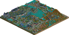
Freak, I want to see yours.
I own www.rcthq.com
I was the sole judge of this contest, but sadly, only 2 other entries were received besides Mantis'. So of course, I didn't create one.
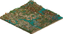
And Creator, yours sucked.
I don't really know what mistakes i've made with the custom supports as it's the first time i've tried them. If I missed some I didn't notice because I thought it looked pretty well supported throughout.
I do all of my designs on a megapark bench because if I make a smaller one using SGM is messes up some of the game options and other trainer functions. Plus, surrounding the design with water/trees seems to make it into its own private atmosphere anyway.
I tend not to use really wide paths because I think they end up looking a bit bleak and mean that you can't experiment with buildings that wrap round path/go over path etc.
I was experimenting with the coaster track, and you probably realise I always go for something new. The station building was a bit strange, but I thought the two temples were a little more....refined. But I can't really analyse my own work.
I'm not offended
My nick is Sephy (i like the name....a character in 'Noughts and Crosses' by Malorie Blackman was called it and I think it's just a cool name) but I put ~Sephyx at the end of everything for the sake of it.
Freak - you should have made one anyway.
Ich würde fast einfach so sagen "Das stimmt nicht!". Ich hatte noch nie nicht lösbare Probleme damit. Ist alles eine Frage, wie man mit anderen Trainern die Sache wieder hinbiegen kann
Wieso nicht? Du kannst das Stück Weg zur Not wieder weg machen, dann das Land anheben und den Weg wieder unten drunter durchbauen. Wo ist das Problem?
Eigentlich will ich ja keine Diskussion anfangen, aber da hier in letzter Zeit eigentlich überhauptnicht mehr über RCT gesprochen wird, mache ich es. Bin mir sicher du verstehst mich da
I suppose it's just personal preference. Every time I use wider paths I end up thinking it looks bare and, dare I say it, boring. Then again, people like you and X pull it off with aplomb, so it's probably just a problem with me!
Well I suppose you're right. RCT Rambling is never as active as I hope it would be...
Thanks for the comments, though, they're helpful to give me more perspective rather than being immersed in my own world of RCT.
Nick - thanks! heart-warming
Yeah I thought of that too because of the grey and the ice, but overall it reminded me of Blitz so I thought, well better only say the one.