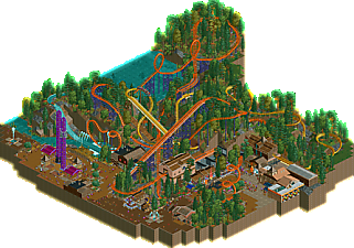
Park / Forest Fire
-
 04-February 18
- Views 4,002
- Downloads 470
- Fans 6
- Comments 27
-
 68.00%(required: 65%) Design
Fisch 80% trav 75% CoasterCreator9 70% Cocoa 70% G Force 70% nin 70% Xeccah 70% bigshootergill 65% Coasterbill 65% csw 65% pierrot 60% Poke 60% 68.00% -
Description
listening to old karl pilkington xfm shows and doing ncso
-
6 fans Fans of this park
-
Full-Size Map
-
Download Park
470
-
Objects
155
-
Tags
![park_3806 [NEDC4 2/15] - Interstellar](https://www.nedesigns.com/uploads/parks/3806/aerialt3455.png)
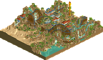
i like it a lot. you're defo talented with ncso. your main issue is that a lot of park elements needed more space; as it is it's spatially too cramped and doesnt lend itself to good queue design. that and your vertical scale is troubling at times.
Except for the jarring color of the power towers this is great.
I just love your work Sammy. Can I hire you to build my parks for me?
I love the colors and the interaction between the various rides. I didn't actually think this was too cramped, instead it reminded me of smaller parks that tend to stack rides as such.
This is exactly what i want to see from you, dude! It's simplistic, but atmospheric and great work. I'm a huge fan of both coasters and i love the colors (except for the towers, but that doesn't bothered me that much).
75% for me!
To anyone who doesn't like the tower colors; look up Vimto.
wonderful work, I don't have any criticism at all really, it was just great stuff all round. Reminded me of Steppenwolf for some reason, but I can't place why.
I'd really like to point out that twist, it was so cute! Loved it. 75% c:
The fact that not all the black wooden blocks faced the same direction really bugged me.
The rest was pretty cool. I liked the architecture a lot.
That batwing....so beautiful...
Amazing interaction, amazing flow, amazing ideas. Landscaping and foliage were on point too. Did you follow your own tutorial?
70%, only because I wanted to see more of this.
Very nice colors and very tasteful overall.
The part with the batwing + interaction with the splash boats was amazing.
I would have enjoyed this more if the theming was more pushed and had more context.
For me it just looked like another NCSO park built in a wild setting.
Wow amazing stuff honestly. Incredible colors and a beautiful beautiful setting. Such a well thought out main coaster. The interaction is also superb. I wish the layout of the log flume, the integration of the shot towers, and in parts also explosion would've had as much thought put into them as the main coaster's settings. Overall though I thought this was amazing and really creative! I didn't mind the cso-less-ness of this at all because it wasn't just a gimmick. It didn't need cso.
I liked this a lot, but unfortunately based on the comments I may be the low vote on it (though I still think it's Design Worthy)
I love that you took the time to make sure Slatemine Falls and Explosion synced with the first Forest Fire run like that. Explosion was adorable and it was nice to see a supporting ride that stood out on it's own.
As for Forest Fire, I liked it . It didn't blow me away, but it was nice. I loved the batwing placement though.
I did think it was kind of a shame that so much of these rides were hidden from the path. The double loop is beautiful but nobody could appreciate it. I also thought it was weird that the coaster flew up the lift at an insane speed just so it could sit up there forever at the top while it was block stopped. That's a minor complaint, but I found it odd.
Overall I really did enjoy this, I just felt like it was a little light on content and the layout didn't blow me away. It was good, but for a Design submission so light on content I was left wanting just a little more. I guess in a way that's a good thing.
+integration of all of the elements was masterfully done. the way you were able to make three rides interact with each other and with the landscaping in a non-gimmicky way was great.
+atmosphere and color usage were on point
+foliage is about as good as you can get with ncso. the fern and carrot objects definitely helped out and allowed you to vary up the underbrush.
+i'm an entertainer <3
+- ride layout was definitely good and flowed well. batwing was framed perfectly, but the double loop was obscured from view, and the double corked felt shoehorned into a very cramped area.
+- architecture was fine but it was definitely an afterthought. i can't really blame you -this is a design that purely focuses on rides- but didn't really do anything for me. a few touches here and there that could have made the buildings a lot better to look at.
-composition ranged from "okay" to "bad". a lot of things on this map just scream for more space to breathe; that's especially evident in the double corkscrew plaza. I would have liked to see more pronounced ride queues, more space for the double corks, and a buffer between the ride stations/queues and the adjacent structures.
I'd love to see what you can do with a tad more ambition and a little bit more separation from the rct scenario aesthetic. I appreciate that you seem to be self-aware in your work and never take yourself too seriously, but i see this and i see potential to be as good as alex in rct2.
yes im very affordable
Thanks for all the comments guys, i appreciate them all. I'll give proper replies when im not in uni
Just so you guys know, there is a little glitch with the tower ride queues. to fix it, just build a queue out of the entrance of each one and the queue will be fixed. Im not sure why it happens, but it does.
Very nice job SSSammy. I really liked the integration of all the rides, and I especially enjoyed how Forest Fire weaved its way through the whole map, showing off everything you made. Foliage was nicely done, but perhaps a little too much variety in some places for my tastes. Archy was also nice, fit the theme and made me feel immersed.
Some of it felt a bit "scenario-play-ish", but I don't think it detracted from the overall work. A nice piece of rct, and looking forward to seeing where you go next!
I really love the coaster layouts and overall composition. The architecture and theming was business-as-usual small scale NCSO - it was fun and pleasant but overall unrefined and uninteresting to me. Foliage and landscaping on the other hand was superb (as usual!).
this was cool! felt like a mix between BGW and dollywood. a nice lively atmosphere and two cool layouts. landscaping was pretty good. I do wish the buildings were a little bigger or featured more as it felt a bit sparse but what was there was pretty solid. the arrow station and the log flume station were the best in the park I think.