Park / Talon
-
 12-August 18
-
Talon: Grip of Fear
- Views 4,121
- Downloads 563
- Fans 3
- Comments 19
-
-
 72.00%(required: 65%) Design
Camcorder22 75% Cocoa 75% Liampie 75% posix 75% Steve 75% bigshootergill 70% CoasterCreator9 70% G Force 70% Jaguar 70% Poke 70% Sulakke 70% Faas 60% 72.00% -
Description
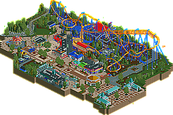
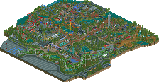
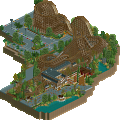
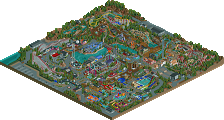
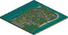
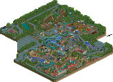
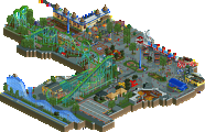
A recreation of Talon, a B&M inverted coaster at Dorney Park in Allentown, Pennsylvania, USA. I loved our annual trips to this park when I was a kid, and needed to make some part of it as a tribute! Hope you enjoy!
-
3 fans Fans of this park
-
Full-Size Map
-
Download Park
563
-
Objects
332
-
Tags
This looks like a really solid recreation. The first 80% or so looks absolutely spot-on, just the last flourish to the end looks a bit off but that's understandable thanks to RCT's fixed corkscrew size. I also thought the year 2016 was a cute touch.
Great stuff. I'm not too familiar with Dorney or Talon, so I can't speak to the realism of it, but the technical aspects show the big leap that you've made this h2h. Your buildings in particular are very nice, and I enjoy the mulch texture under the coaster. I definitely see this as design worthy.
Talon was one of my favorite coasters of a 5 park trip I took a while back in 2013. It really was a hidden gem. I love this rendition of it as well. There was a lot of atmosphere and character to the map. It really does help when a portion of park like this has rides that don't fit on a map still running. That's why I like doing it with my designs as well. I will say that the coaster's pacing is a bit fast and might have been better in that regard if it were a bit shorter. I may be wrong since it's been a while but the entrance feels a bit small to me as well.
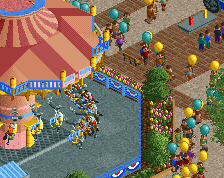
This is one of the coolest chair swings I've seen in this game and it ALMOST rivals the one done in paradise pier from h2h7.
For some reason I really liked this small planter a lot.
This might be the best coasters cafe we have seen in game. At least in my memory.
Overall great work. I can't wait to see whats next from you after the phenomenal h2h season you had and now this. If I could I would give this a 74% but I'll round up
Here in Brazil the Parks do not reach the feet of the American Parks and Parks Europe, but even so I loved.
The trees with the trusses and flowers became a charm.
Roller coaster and carousel was 10.
I loved the details of the roofs, the buildings are beautiful, hehe I liked the parked cars.
The entrace and detail of the paths became beautiful, the colors combined.
The blue car selling food was nice.
bush in wine color, fences, poles light, perfect.
Sincerely after everything I learned on this site and seeing all the details in general,wonderful, 100% ok for me.
(I hope the words well placed, I can not express myself as I have seen here in English)
Nice, this was much better than my attempt 5 years ago.
The last part of the layout is not the best.
The foliage looks a little bit too dense, especially with those 1k Half Bushes.
The swinging ride could have been on the same level and could have been split more tightly.
The talon sign looks a bit wonky but its not too bad, There was a really cool sign for the ride that was posted on the rct2 object list, but that site is long gone. I have it somewhere though.
The other custom objects look good.
The realism factor is great. Some angles for the buildings do not look the best.
This is an 80% for me
really lovely, vibey realism. You did a good job considering talon's slightly awkward triangular/diagonal footprint. Your rendition of NE's 12,000th coaster cafe is also really solid. I know you didn't invent it, but the mulch object really fills a niche that has been long unfilled in realistic parks, and brings the coaster to life. good work
I think you nailed the theme and recreation and i voted for it accordingly! 80%
Congrats Saxman on finishing this! I was really looking forward for its release and it didn't disappoint me. The progress you've made during H2H was huge and it's nice to see new stuff from you.
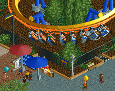
The ride was cool. Accurate enough for me and the flow was good. The red roofs were a bit too colorfull combined with all the yellow and blue. I would've used a darker red instead.
The foliage was very good but the mulch path still was a bit overdone. The borders between mulch and grass were so hard. I think it could've used more underbrush here and there.
The surroundings were great. Cool backstage stuff, cool buildings, cool swinger. The paths were classic Saxman. It just had a good atmosphere and that's definitely your strength.
All by all a good design submission. Very Saxisch and as weird as it sounds it really makes me wanna build dirty American realism again. A solid 75% from me.
Really lovely recreation, very well done within the confines of RCT2's scale. Atmospheric and fun while still being accurate.
I'm not that familiar with the source material and don't have enough time to look it up, so don't blame me if I criticize something that's purely based on the source material. I thought this was a solid design. Although the coaster is good, the paths are the real highlight here. You're obviously improving a lot with every project. Some highlights and comments:
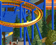
+ The layout was pretty strong. As I said, I'm not sure if it does the real Talon justice, but from an RCT point of view the coaster is pretty good. Nice pace throughout the ride.
+ The planter with the fountain.
+ Best custom swinger I've seen so far.
+ I really like the path figures here.
+ The brown planter stuff underneath the coaster looks great, but I didn't like the grey pieces.
- Some of the roof colours felt too bright and became kind of an eyesore. Especially the red roofs, the bright green one and the orange brake section.
- Architecture in general is the weakest point in this submission. While the paths feel very realistic and are on-point, most of the buildings looks slightly under detailed and cartoony.
- The red bushes don't work. I get what you're going for, but right now it looks like you painted them the wrong colour. Should have used another bush object I think.
- The entrance and carousel area lack a bit of atmosphere as the colours are dull compared to the rest of the map.
Congrats on the Design!
Congrats on making Design saxman! Well deserved.
Congratulations indeed. Only your third real solo project, and already a good win. You're one of the few examples where H2H does a player well, because you have the commitment and desire to do well. Very curious to see your next solo project, even if I know you are entrenched in strict realism.
And here I am, back from traveling and ready to respond to some criticisms/compliments!
First, before I get into it, I need to do something I forgot to do in the readme, thank my testers! You guys know who you are, and this design wouldn't have made it to its final state without your critiques and advice.
As I said in the readme and description, this park is special to me, as it was our "big" amusement park trip of the summer every year when I was a kid. Throughout the building process for this, I actually considered turning it into a recreation of the whole park, making layouts for Hydra and Steel Force in the process. However, we've had so many full and well done Cedar Fair parks in the past, that another one, especially of a smaller regional park, wouldn't be a good use of my time. My projects seem to be focusing in on regions and ideas I have connections to, which explains this project and my ongoing Steelworks park.
A few items for discussion:
- Mulch object! I'm glad it was well received here. The real coaster has lots of mulch underneath it, with some gravel/stone under the first drop and after the loop. It's indeed an object that I greatly enjoy. If no one noticed, I made a 1/4 tile mulch object that was raised up a unit, so that it could be used to make cleaner planters (such as the ones running along the paths to Wildwater Kingdom under the first drop of Talon).
- Entrance Area! I do agree that it might be under-colored compared to the rest of the map. Scoop is right in saying it seems a bit small, but that might be because there's another larger building in front of the three on this map, and even more path in front of that.
- Architecture! Funny that I've got both strong and weak comments on this aspect. To mention something that Sulakke mentioned, the buildings look a bit cartoony. This is something that is particularly notable at Dorney, and I went for pretty high accuracy in that regard. The entrance buildings in particular have these large square windows that appear much like those drawn on a drawing of a house by a little kid. Totally peculiar and interesting, and I kept them here. Another thing that nobody mentioned, I made a new object for the coaster station, this square tile that Cedar Fair uses all over the place. I originally had brick there, wasn't happy with it, and decided to go all-in and make a new object to better represent it. There are new objects all over this map that I made particularly for this submission, make sure you check them out!
- Coaster Layout: Totally agree with Scoop that the pacing is a bit on the fast side. I may have been able to fix it, but I wasn't sold on it being too fast until the map was mostly complete. The corkscrew/roll over the first drop is a really unique element on this coaster irl, and it was a pain to get something that looked halfway decent. I tried my best, but it's still meh.
While I was hoping for a 75% with this project, the Design win is more than enough of a compilation prize. Perhaps some further refinement of colors/archy/object use could've got me to my goal, but I'm happy with the outcome.
Next up for me? My second full-scale solo, Bethlehem Steelworks! While I had a ton of work in on it pre-H2H8, H2H8 has taught me too many things to leave the map as it was and finish the rest. Major thoughts regarding the narrative of the park and punishing self-criticism has me redoing lots of things. It won't be done for a while, but I'll certainly be enjoying the process of building and improving.
Hey it's Saxman with another recreaction! I watched the POV of it to compare and I must say you pretty much nailed the lay-out.
It's immediately obvious you learned a lot from H2H8, Talon is a big step up from Knoebels if you ask me. You got a lot better, especially when it comes to archy it's noticeable. The housing of the carousel and Coasters drive in were really good.
Pathing is also greatly executed. And maybe even better than the coaster in general is the custom swinging ship, that's just awesome! There were like two things I bothered: the massive blue awnings. You should've made more smaller awnings separated from each other imo. Now it's just too much at once. And the massive use of that bark texture... I've seen in the POV you got it from there but as a rct viewer that texture is just too much. I think the standard dirt texture would've worked better (with some bark texture here and there).
Congrats with the design, well deserved.
Bit of here and there which is wrong barely noticeable which I couldn't care less about, or how the trackwork is made, but that's just a preference of how people make coaster, etc. Anyways, very good effort, and its details.
As I wanna use part of your swinger for reference, I felt like it was only appropriate for me to leave a review of this park.
I think this design is very well made. Some things that I liked:
+ The swinger, obviously
+ I really like the way you made the diagonal brake run and transfer track, it looked nice.
+ I like the way you used empty grass spaces and the brown ground texture. Although it is maybe a bit overpowering under the coaster itself, I think it looks really good in general.
+ The colours on the archy look great, and I also like the scale of the archy.
+ The details on the path (different path texture) and planters looked great.
There were few things that I did not like, but there were still a couple of things:
- I felt like the orange on the ground of the brake-run was maybe a bit overpowering. But I understand that the real ride also has a orange brake-run so this might have been hard to work around.
- I did not like the object you used for the red bushes. I realize these red bushes are in the real thing as well, but I think a different bush object would have fitted better.
Overall I thought this was great and a well deserved design!