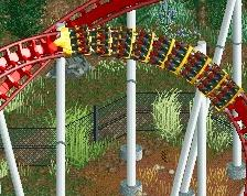
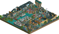
Park / Thundering Sierra
-
 17-February 18
-
Thundering Sierra
- Views 5,075
- Downloads 805
- Fans 4
- Comments 19
-
 67.50%(required: 65%) Design
Xeccah 80% bigshootergill 75% trav 75% Liampie 70% Louis! 70% Coasterbill 65% CoasterCreator9 65% Cocoa 65% G Force 65% Poke 65% nin 60% SSSammy 60% 67.50% -
Description
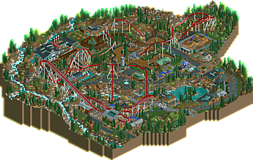
California's scenic Sierra Nevada mountain range awaits. Hear its booming voice call out to you from above the horizon as if to say, "Welcome home."
-
4 fans Fans of this park
-
Full-Size Map
-
Download Park
805
-
Objects
1
-
Tags
![park_2810 [PT4 R1] Los Sueños Gardens](https://www.nedesigns.com/uploads/parks/2810/aerialt2474.png)
![park_4114 [H2H8 R3] Forum Caeleste](https://www.nedesigns.com/uploads/parks/4114/aerialt3853.png)
Great park overall. Just awesome stuff everywhere. The foliage and landscaping is masterful, the archy is great, and there's awesome interaction everywhere. That playground!
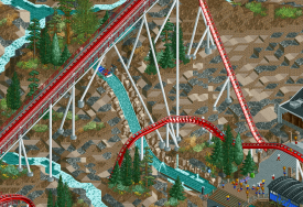
The coaster is a little fast in the first half, and a little slow after the MCBR, but still looks good.
Awesome job with this, definitely a design in my eyes.
i think my previous analogy between this and vulture stands up well, now seeing this in-game. both are maximalist masterpieces that focus on landscaping and ride design integrating itself with its environment.
that being said while his hyper layout isn't the best ever done on NE, its far better than average. my only real complaint about the layout is the awkward mcbr section, especially coming out of it. i dont think the interaction was as shoehorned as some parts of vulture were, although 1-2 less tunnels would have sufficed the integration feeling more natural and less of a trope.
your architecture was a little short on the detailing aspect, but i cant really complain about that. you made all of the structures throughout the park feel unique with their forms while still feeling cohesive. overall, that quality is a lot stronger to have than detailing everything to death. the trackitecture surprisingly did not feel out of place a single time.
your atmosphere is super strong here, thanks to the earthy tones, excellent foliage, and solid composition choices. i think the 2 things you could have done differently to have boosted this even more would have been to change the coasters colors -particularly the white supports contrast too much with the environment- and to make less of your (metal) rooves black.
the landscaping and foliage are fucking brilliant and the best i've seen of this style, including coors and skylands. the wildflower colors, and your usage of negative space is sooo lovely. the voilere object to make the grass blocks feel more dull was also a fantastic touch.
your supporting rides were very unique and added that much necessary charm and spatial context that this design needed to shine. the splash boats were great aside from the overdone 1k ruins at the end; would have liked to seen something more subtle done there. the go-karts were also excellent.
you should be really fucking proud of this even if it doesn't, for some reason, hit 80.
I agree with essentially everything shogo said, but would like to mention that while quarter tile landscaping often looks over-detailed, unnecessary or outside of the game's aesthetic, you really pulled it off well and showed how it should be done.
Congrats on the great release Terry, it's so amazing to see you and so many other TP players building like this now, completely outpacing my own improvement lmao
The landscaping is fantastic. I love the little waterways across the map, and the quarter tile landscaping is masterfully done. The interaction of the main attraction with both the landscape and the supporting rides is fabulous. You have a distinct and developing style; the architecture was a fun and fresh style. The pacing of the hyper was significantly better this time around compared to your previous Design. Really well done here, it's lovely.
Really cool release. The coaster layout had lots of awkward shapes but it's sprawling nature and wild interactions reminded me (positively) of theflowdiscord. Architecture was nearly all excellent (the clock tower being the main exception) all the wooden 'lodge' structures gave a great atmosphere. Great foliage palette, the wild flowers were a particularly nice touch.
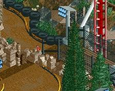
Now onto the landscape, which seemed a big focus of the release and something you put significant effort into. For me it didn't work so well. There was a missed opportunity to create some real drama with the elevation changes and create contrast between slopes and cliffs. For example here:
The supports are excellent in defining the space, but with the landscaping you've softened out the vertical's too much with the stepped slopes. Here is a very rough mockup of how I would've approached it instead:
Also a tip with landscape texturing - 1/4 tile blocks only reduce the appearance of the games grid structure if you use them in clumped forms to create more natural, smooth shapes. if you have a scattering of individual tiles, you only see the grid more.
Hope this is helpful! Overall it was very impressive, well done!
Amazing release !
I understand what alex pointed out but for me it wasn't a real problem, it's what differentiate you with others, it's your style. Landscape and foliage were overall wonderfuly done.
Just be careful with the 1k rocks, for me there was a bit too much of them around the splash boats ride.
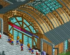
It was nice to see you improved your archi. The sequoia lodges around the "lake" were amazing. I must say I wasn't a fan of the other buildings, except for the coaster's station which was very tasty.
The little bad point for me was the roller coaster. I need it to be perfect in at least one angle to really enjoy it in terms of aesthetics. I always had to rotate to see the good parts of it and that was problematic for me. (I'm probably an exception for that lol ).
).
The go karts were awesome.
If I should have only rated the landscape, it could have been something like 80-85% but I'm not too sure of the rest so I would say something like 70% instead.
Can't wait to see what you're preparing next. I love how you always innovate.
PS: why is there a corner with blocked and fake peeps? just curious.
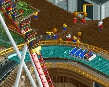
ive opened this up a few times to look at it. i agree with most of the positives people are giving, but god damn do i have major gripes with the coaster. in alex's screens alone we see one of the most glaring problems. that turn is just criminal.
i feel like im bringing up the concept of drafting every day. i feel like the problem truly is with patience with most people. you absolutely nail a lot of the fundamentals of parkmaking in this release, but you really need to take more time and consideration when building coasters. I am truly flabbergasted to see people floating 80/85 scores on this, what i presume is a DESIGN accolade.
the thought that the turn after the brakerun appears in the same vicinity as that stupidly wide hill shows the overall problem with scale and flow in this coaster. this is a skill that simply comes with experience. you just have to go through the best rides on the site and see what tricks and techniques they use to achieve their beauty. you must REFINE what you're building. what i think happened, though, is that you built the ride, and then you got carried away building the surroundings almost immediately and by that point the ride was already set in stone. the little bridge also shown in the screen is very disneylhand and i love it great job.
take for example: which one do you think looks better? yours?
or mine?
in a ride which includes massive massive turns as shown in the above screenshot, you need to show a level of consistency in scale. you need to look at the ride as a whole and try and avoid moments like that. it even looks to me like you originally had it the way i have it! the space is there! the other way is just too awkward for it not to have been the result of being too slow or something. my turn isnt the result of unachievable mastery of the craft, you could have done too.
Terry, this is a great release. there are several moments of greatness in this. sadly, from a design, i need more from a rollercoaster.
anyone on this site is welcome to PM me and ask for feedback on ride design, because i feel like some pointers in the early stages of building could make all the difference in cases like this.
Agree with SSSammy. I really liked the landscaping (although I'm not sure if there was too much sand in there for my taste), liked the architecture but didn't like the coaster at all. Both how you built it and how it just appears to be everywhere.
My main gripe was the landscaping, it's more personal cause i cannot stand quarter tile landscaping but also it seems texturally, yours was far too random having a tile of rock, sand and dirt in such small vicinities honestly just made it look ugly and nonsensical.
And you didn't use any full tile landscaping at all which could have been effective in places as alex has said.
Plus as others have said, yes the coaster was far too stretched and not paticualrly aestheically pleasing. However, there was obviously a lot of skill displayed here in other areas such as archy and the go karts track - which is my favourite thing on the map.
But for a design, where the coaster and the landscaping (which ultimately framed the coaster) appear to be the two biggest weaknesses - in my eyes - does make judging this difficult.
I'm torn on this.
I really like the lanscaping and the supporting rides, but the coaster itself is really holding it back for me. While it blends in nicely and the support work is fantastic (seriously... awesome support work), the layout and pacing are pretty borderline.
65% from me.
I'm probably on the same page as most commenters so far. I think the park is pretty great- landscaping is exciting and well done, theres plenty of great buildings, path features, interactions, supporting rides, etc. The go karts and splash boats are very well done, and I love the splash boats station. You have a very good handle on that sort of park infrastructure it seems. So theres a lot to like in the park. The layout is definitely a slight let-down, I think. the first half is a good overall vibe but a bit rough everywhere, and everything after the mcbr doesnt really work- it gets stretched out in a very strange way. it didn't need to loop back around in such a wide path, there were probably dozens of ways to handle that better. And the transitions were often a bit jarring throughout. Anyway, we don't have so many hyper designs so it is nice to see that anyway.
Is it design? probably close to borderline. for me, a design should be a gold or spotlight level piece, with a lot of refinement and care to make a pristine package. With just a bit more love for the coaster, this could maybe fall in that category, but I think this doesn't quite give me the feeling of quality or 'prestige' that I would expect from an NE design. Its sort of hard to describe maybe that feeling. I think I'll give it a 65, on the border, and see how the votes fall- it wouldn't upset me at all if it won, and it is a good park overall. Theres some really great work here, and I'd love to see you in h2h...
I think this is very nice. As pointed out the layout had some flaws, but that didn't bothered me that much, since it was still great to watch and had some interesting elements of interaction. The queue and the exit of the coaster have been kind of a left opportunity for me, i think you could have done a lot more with that.
I really loved the landscaping, i just thought it worked very weirdly together with the foliage, since the foliage felt more like a gap filler than something natural. The river and the water ride were really solid, especially the drop placement is awesome.
The architecture is simple but it works, the water ride station was definitely my favorite, you could have done also more with the queue overhere though, felt weird that the exit was Kind of presented better than it.
All in all i really enjoyed this and this is definitely something you can be proud of. Also a definite design for me, although i can see why people are not voting this very high since there is still a lot of room for improvement in some aspects. 70%.
Well there ya go, I was the final vote! Congrats on the Design, well deserved!
Reading through the other comments, I don't have much more to add. In fact, I'm always trying to figure out how to build a decent coaster. Love to see you taking on different styles of projects RWE, it'll keep you building in diverse ways in the future. Great release!
EDIT: Maybe Terry could teach RWE a thing or two about designs . Congrats Terry, sorry for the typo.
This is not my design lmao
Congrats, Terry!
Congrats on the design, Terry!
God I was apparently really off on this one. My whole thought process was that "if Vulture scored a 90 with pretty much the same flaws and strengths as this has, this should be an 80%"... I guess people are back to actually caring about ride layouts?
Congrats, man! Great stuff, can't wait to see what you cook up next!
You did a fantastic job on the landscaping, great stuff. However, I think you could pull it off without 1K landscaping objects too. The strong landscape and the foliage really enforce the whole park.
Some archy was rather OK, some buildings were really great. I really liked the station of the splash boats & the shop building near the midbrakes. You have a great sense for composition, the interaction between the coaster and other surrounding rides/paths is neat!
The coaster itself doesn't make me that enthusiastic, I prefer hypers less spread it out. However, in real life it would be a blast to ride it, for sure.
Congrats with finishing this and the design accolade! I think you're a great prospect and a possible H2H revelation.