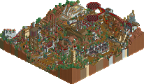
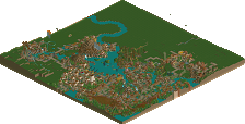
Park / [H2H8 R3] Port Disney Hong Kong
-
 16-May 18
- Views 14,127
- Downloads 770
- Fans 0
- Comments 48
![Park_4108 [H2H8 R3] Port Disney Hong Kong](https://www.nedesigns.com/uploads/parks/4108/aerialm3852.png)
-
![Park_4108_[H2H8 R3] Port Disney Hong Kong](https://www.nedesigns.com/uploads/parks/4108/logot.png)
-
 70.50%(required: 70%) Gold
Fisch 75% G Force 75% geewhzz 75% Kumba 75% chorkiel 70% Cocoa 70% Poke 70% trav 70% Xeccah 70% bigshootergill 65% Faas 65% Liampie 65% 70.50% -
Description
-strangelove
-
No fans of this park
-
Full-Size Map
-
Download Park
770
-
Objects
457
-
Tags
Similar Parks
-
Slime Meridian
-
[H2H8 R2] Forgotten Mekong
![park_4093 [H2H8 R2] Forgotten Mekong](https://www.nedesigns.com/uploads/parks/4093/aerialt3831.png)
-
The Seige at Castle Grijs
-
Mamba Kilima
-
Villerouge sur Mer
-
Ouest
Round 3 | Match 2
--- POLL CLOSED ---
Port Disney Hong Kong (RCT2)
VS
Arendelle (RCT2)
Voting Rules
- You should only vote if you have viewed both parks in game.
- Everyone but players belonging to either team in the match may vote.
- Voting will be monitored to improve fairness, and anyone found to be abusing votes in any way will be punished.
gingers have souls?
/\/\/\OLD MEME ALERT/\/\/\/
Holy shit that cruise ship.
I love that the only two Disney parks we've seen so far are competing. For Arendelle, I think there is just not really enough content to fill the park completely. The side with the castle and water coaster would have been a perfect half or third to a larger park with other ideas on display. The town architecture is wonderful. Some of the icy spots on Let It Go seem a little too high... the park rides a line between realism and fantasy and doesn't fully succeed at either. Some of the animatronic objects look great (namely the characters) but some really don't (the snow, the abominable snowman). The freezing and unfreezing fountains are a nice touch.
Port Disney feels more fully realized to me; obviously feels like a straight mash-up of Downtown Disney from Anaheim and a real port. My primary criticism is that there aren't really any rides. Yes the midway carousel is cute and the photo op with the Tie Fighter is a great idea, but there's nothing to really watch. I spent a lot of time perusing the details and the architecture, especially as it relates to the individual buildings (loved the National Geographic shop), is all lovely, but beyond that there's nothing exciting about this entry. The technical quality is lovely and it certainly doesn't feel unfinished, and also by its very nature probably should not have any large rides... but that makes it relatively ill-suited for H2H, I think.
Still undecided on this one. Each park is at least fully realized and very pleasant to look at. I do not think we will quite see the fervor here that we are seeing over R3 M3.
mictlan was also disney I think.
Another crazy matchup! I've enjoyed my brief looks at both parks, but I need to spend a lot more time with these.
I however must say thanks to Strangelove for making me a good enough sax player to make it as a performer at Disney. This park must be realized in an alternate universe...
Port Disney:
The concept was mediocre at best to me. The execution was good. Lacked something to knock me off my feet or to interest me for a long time. The circus was pretty cool and the cruise looked really good. Your color palette made for a really ugly staff menu btw, but I guess I do like the water color.
Arendelle:
Concept was great, but I think it'd look cooler if it either ditched the realism-details or go much more realistic. Elsa's Journey looks like a really cool ride, though. The part where she's building walls was very neat. What did you do with Bill though that he got so mad with the object names? Lonely Island Reference is +1.
More coherent review: I didn't really like this park. The Elsa ride was great. Other than that it felt either unoriginal or simply not good enough. The cursing felt really inappropriate, especially considering the theme.
This is my least favourite matchup so far, and not only because i hate Disney (except Mulan).
Strangelove's park has a great ship, but for the rest it's just a bunch of buildings. The buildings aren't done badly, but they don't make me scream in excitement either, quite on the contrary.
Icons' park had much more of the fun factor, but 50% of this park was unfortunately incredibly ugly if you ask me. The "bottom part" with the villages, and especially the area around the kiddy coaster was really pleasant, but wtf is the other stuff. I tried to watch Frozen once but got incrediblly annoyed with the movie and I turned it off, so I might miss a lot of references. Still the water coaster's surroundings were not my cup of tea at all. All the flashy animated, weird stuff made me think I was playing WW/TT, which is never a good sign.
Still doubtful what I would vote for, since I didn't particularly enjoy both parks.
Poll is now open, it will remain open for 72 hours.
Easiest vote for me. That ship was incredible and the architecture of the port was very impressive and varied. Definitely a bit dead but showed a lot of technical skill.
Arendelle did not do much for me I'm afraid. The village was cute and I do like Frozen, but visually it was a mess. Landscaping was poor and the thematic transitions were incredibly abrupt and jarring.
The castle was actually quite well done but did not look good in its surroundings. This park definitely had its charms but found it not particularly strong in micro or macro.
Port Disney gets my vote.
Port Disney has a great sense of realism and believability to it but Arendelle has its own unique character and I love the nods to Epcot it has. Some fantastic object creation as mentioned, and some terrible ones as well. The humor was a bit lost on me and overdone, and the park itself certainly wasn’t as pretty as Port, but for some reason I couldn’t take my eyes off it. Port Disney simply felt real though, and I loved the obvious planning that took place really sold it for me. The ship, while cool and seemingly accurate as can be, still feels off but I think that’s a RCT thing versus anything else.
Rambling, but I really like both parks. I spent a whole screaming at how awesome the moving walls and freezing floor were, and how neat the Spider-Man murals and DCL bus was too. I’ve gotta think these over for a bit.
Originally I wasn't going to vote, having not seen Frozen, but I understood most of the references just from pop culture exposure that I felt like I could judge it as a park objectively enough. I didn't like either entry this matchup. They both had really good areas (the town in Arendelle, the boat in Hong Kong), but to me the former park looked like it came out of RCT2.com or RCT Mart in 2007, and the latter just didn't feel Disney enough, and needed something to keep me viewing longer, despite all the technical skill in the building.
Now don't get me wrong, I didn't hate these releases. I think I would have given Arendelle a high bronze or low silver in an accolade vote, and Port Disney a mid/high silver. They are definitely displays of great skill and creativity, but they both let me down.
People have praised all the custom objects in Arendelle, but to me they were an eyesore that didn't fit in with the game's art style much, and the texture work in the back half of the park really put me off. I think it had some scale issues too, it didn't feel very consistent with itself. The town was the strongest part of the park for me. I really feel like it would have benefited way more with non-square map, like Mekong, with the water coaster at the back. The backstage areas and facades were a nice touch, but they felt forced a little, and needed more room to breath.
Port Disney had the unfortunate trouble of feeling like it was missing content. There wasn't enough to draw my focus and keep me looking. I can appreciate the non-park, and the lack of coasters, but it just needed something to hold my attention. I was disappointed to find all that effort into making such a lovely cruise ship only to realise it had no interior. Same goes for the hotel. Otherwise, I felt like the Mos Eisley area and the adorable Spider Man were the only areas that made it feel all magical and Disney-like, the rest had a very upfront RCTNW feel. And hey, maybe this is exactly what Disney would do irl and its super realistic, who am I to know? But I don't think, in that case, it was conceptually a good release idea for H2H. It really did feel like it was meant for a huge multi map project spanning a massive Disney complex, rather than a self contained release.
My vote goes to Port Disney. Perhaps the more disappointing of the two for me, but I feel it was technically superior.
rip the future of this game
I was unnecessarily harsh there. I Wasn't specifically bummed about the boat, but it would have been nice to see some interiors even if this was H2H7. Perhaps a no-roof save, or the hotels against the map edge etc.
This was a really tough vote for me to make. Planning and composition were not great from either team, but both carried some great ideas and had fantastic moments.
The village area and base castle in Arendelle were fantastic, but they were overshadowed by obscenely large rides that were quite distractingly executed. Flashing lights and animated objects are cool, but they're used so much here, so haphazardly that it's difficult to look past them. I did quite like the swooping forms of the water coaster as well, and i think the track layering worked well for it. I really get the feeling from object names and such, that the people involved in this park built it as an inverse-passion project. Their hatred fueled construction.
PDHK suffered from a lack of life, and a bit from a scale issue. The boat itself was obviously fantastic, but it actually felt a bit small to me given how large a lot of the actual port buildings were. There's some brilliant details here that won me over though, like spiderman, the avengers building, and cirque du soleil. I do think this map could have been more "h2h" if the hotel had been replaced with a coaster, but I can see why you didn't do that as well. Missed opportunity for a "standing there" joke on the mushroom. This also seemed like a passion project, but one with a much more positive fuel.
Ouch thats harsh