Park / Wonderland Hotels and Resort
-
 10-October 18
- Views 2,528
- Downloads 595
- Fans 1
- Comments 10
-
-
 59.00%(required: 50%) Bronze
Cocoa 70% G Force 65% Jaguar 65% posix 65% Coasterbill 60% RWE 60% Scoop 60% csw 55% Liampie 55% Ling 55% CedarPoint6 50% Xeccah 45% 59.00% -
Description
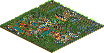
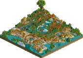
I'm very excited to post my first OpenRCT park! The park is semi-realistic and loosely based on artwork for a 'Disney-like' themepark near Moscow. The park also contains some attractions that I've based on some incredible work from NE-members. Some might recognize the work of Fisch's Riverlands in El Dorado Drop, Rene's Mystic Manor in Magician's Mansion and In:Cities take on Tangled in Greenflower Town. I have tried to combine this inspirational input with my own style of creating. Thanks to olddtfan51 who helped me with the final pointers. I am very interested in what you guys think of it. Feedback is welcome! Hope you guys enjoy
-
1 fan Fans of this park
-
Full-Size Map
-
Download Park
595
-
Objects
505
-
Tags
Similar Parks
-
The Good Earth
-
Seaquarium Curaçao
-
Blue Lagoon Bay
-
Eastfields Mall
-
Age of Sail
-
Obeah and the Cursed River
02) the bridges over the street and their details were very good
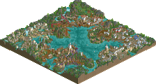
03) MT.ULYSSES I liked the waterfall and stones
04) I was delighted with the panels where you used the map objects
05) The palace looked beautiful, nice architecture, and the glass cover then arriving on the carousel was wonderful
06) DARKTOWN the buildings combined with the color of the ride, very good, several small houses I loved
07) MEDITERRANEA-STAMPED the building in return I liked the colors and the design/details
08) I observed all the corners, details, fence, paths, small beach, vegetation, flowers, umbrella, small and large bridges, arches, used colors, squares, fountains, fire, odyssey, for me it's perfect
Congratulations on your comments in the presentation, very well said.
Honestly there are some things that I will do similar in my park, because I found it very well done and cool
Wonderful work
Man, this is one of the fresher releases I've looked at this year, H2H aside. I enjoyed looking at this and it held my attention for much longer than I'd expected.
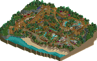
The architecture was the main pull for me here. I really loved the Boardwalk, the Caribbean and Greenflower Town, as well as the non-forested surroundings. Some very visible inspiration in all of those areas, though I don't know how much of that is a good thing. The composition, colours and architecture come together pretty nicely.
Then there are also smaller pieces of work I really thought were really cool, like the stylised 'W' at the entrance, the Magician's Mansion and the theming for El Dorado Drop.
Overall, I think this is a really great debut park and shows you have a lot of potential.
With that said, here's the main things that I think could have elevated this park:
-The foliage. It's the main thing holding back the park's appeal, in my opinion, and also makes some areas of the map weaker just from sheer incorporation of foliage in that area. This was most prominent around the Darktown Express ride. I'd consider trying different textures and inclusion of more smaller trees into the mix for a more natural appeal. Still, that is something I'm sure you'd improve upon with time regardless!
-The primary choice of path and the abundance of it got old after a while. The orange brick needed something else to keep it from being overpowering in a lot of places. When it isn't overpowering, like in the Caribbean area with just single-tile usage along the beach, it looks pretty nice and compliments the aesthetic of the theme. Just needed some different paths to play with and perhaps come to a different path choice for the park.
-Steampunk and Africa (such a missed opportunity to name a ride Toto so that it says "Africa - Toto" ) weren't quite as fully realised in their theming as the other areas and make me wonder if you just didn't have a source of RCT-inspiration for those like the rest. Seemed too empty or hard to associate with an idea, and not as polished in their architecture.
As a minor issue, I wasn't a fan of the park's layout but I wouldn't be able to come up with a better one either so ¯\_(ツ)_/¯
Still had a great time looking at this, can't wait to see what you have in store for us in the future!
wow, this park is pretty awesome and sort of came out of nowhere. with just a bit more refinement, you could be a real force! the outskirts and entrance/s are both great. very well done and exciting. most of the archy and themeing is pretty great too- good atmosphere (a bit dark, just how i like it- reminds me of turtle etc) and some really nice buildings around the map. the new orleans bit in particular is lovely, and the carousel plaza. but plenty of good facades and bits around the park.
I think you may have copied a little bit too much for what I'd find acceptable. Its good and helpful to learn from other's atmospheres and detailing work etc. but some of your things are just a tad verging on too much- the el dorado ride from fisch and the mystery mansion. not a big deal, just remember that copying something is just never as good as the original. so take their best ideas and use them to inspire yourself to build something new!
other than that, great stuff. ride design is clearly not your forte, so maybe a bit of playing around and studying smooth coasters could help next time.
If you haven't checked this out yet, I'd recommend it. Definitely some good things to be found here.
I like the different themes you've used here and the transitions between them are nicely done. Each zone has its own identity and that's a good thing. I also like some rides are a bit different to what we usually see on this site. It's a bit more daring, not always realistic but plausible. It's good to see a bit more experimenting with that.
There are however some issues with this park. Ziscor has summed it up pretty well already though. The brick path is very visually striking and not that nice to look at in big quantities. Also the foliage wasn't really that great. It was very monotonous and a few different or lighter shades of green might have made it feel less dark and gloomy.
Overall, this is still a great first release. You have potential and if you keep building, taking advice and tips from us oldtimers you can get very far. You have a certain style in your object and colour choice that I haven't seen for a long time and it's nice to see it back again.
This was a great experience, a great unique submission with some interesting object choices some potential that can be seen here and there. I agree with Jappy that you especially managed quite well to work out the different themes and the transition between them, also i've definitely seen much worse composition over here. My favorite area on the map is definitely the entrance!
Going more into the individual aspects of this there are definitely also some flaws, that are putting this down a bit. Foliage and landscaping looked really rushed, boring and unrealistic and the archy didn't managed to appeal me very much. Still a solid first release tho, nice to have you on the site! Looking forward to see your future projects!
This is a really cool release. It's certainly different which is refreshing and there's a lot of skill here.
I definitely feel like you should work on your coasters as the map would have honestly been better without them, but as for everything else... keep on keeping on and please, please, please don't fall into the cookie cutter NE style.
Really enjoyed the boardwalk/park entrance area and the hotel. But, I wasn't a fan of the coaster layouts though. The wing rider was odd and wasn't fully supported. And the steampunk coaster seemed like filler.
Regardless of those comments, I really enjoyed the park. It was a fresh submission that had great colors.. good foliage, and a lot of the archy was original and unique. Great park!
Congrats on your debute park! According to the screenshots you showed before this is really great and you defenitely break my expectations here. The name is really attracting me, don't know why Where does MK stand for in this park?
I highly agree with the things that are already said. I think you used the wrong path texture because this one is too overwhelming at some places.
Foliage is something to improve on. That's one of the hardest parts of the game but still very important. It needs more variation in color and underbush like grass shouldn't be evenly spread out over the park. Make it a bit clumped.
Great archy here and there! You can be proud of that. Looking good at others works is one of the best ways to improve your skills. So keep it up! A well deserved 65% from me.
Wow thnx guys for all your great comments and advice! I felt quite a threshold to post this park since everyone is so talented here, but I´m glad I did it. I had a lot of fun building this park and it´s nice to hear people appreciate it. Copying work form others has learned me a lot, but I agree that it's better to make your own work. I recognize the feedback you´ve given me (the monotonous path, foliage and the coasters) and will try to improve in my next project.
Having the grand entrance to the park through the hotel is weird but ends up working out super well. Others have already commented on pretty much everything else. Great work.