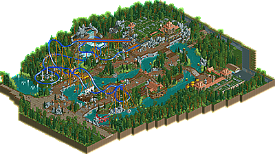
Park / Hy-Breasil
-
 31-December 18
- Views 4,107
- Downloads 623
- Fans 0
- Comments 14
-
 73.50%(required: 65%) Design
Ling 80% Xeccah 80% Poke 75% posix 75% saxman1089 75% Scoop 75% WhosLeon 75% bigshootergill 70% CoasterCreator9 70% Faas 70% Fisch 70% RWE 70% 73.50% -
Description
Seven years have passed... the mist cloaking the island disappear... But only for one day! Even if you do the unpossible and reach Hy-Breasil, be warned for the vengeance of King Breasal!
-
No fans of this park
-
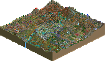
Full-Size Map
-
Download Park
623
-
Objects
346
-
Tags
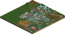
![park_4121 [H2H8 R4] North Fork Mountain Park](https://www.nedesigns.com/uploads/parks/4121/aerialt3862.png)
I guess the disadvantage of a New Year's Eve release is that nobody is able or willing to give feedback. Let me be the first:
+The overall layout of the design was very strong
+Buildings are magnificient
+NE Meet-up group photo
+Cool dark ride
+I really like the atmosphere
+/- Good layout with some pace issues
-Foliage outside the park a bit repetitive
Fazit: Overall liked it a lot. I would give 75%. It's this weird situation where nothing is really negative, but it just feels like a 75% for me. Should easily give you a design accolade.
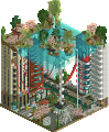
This was a very nice effort with in places 80% material near the station entrance. I liked how you focused on theming a lot, as that's usually hard to do technically, conceptually, and aesthetically, but you clearly tried to tackle all these aspects. You have to good success. I'm also impressed by your tiresome conviction to add something underground, only to be seen with the cutaway-view. I guess it's applaudable to flesh out, but personally I'm not so interested in all recreationalist aspects such as indoor content, and for my taste you could've left it out, and instead done something outside - "afloat" as it were.
I'm very curious to see what you'll do after this, because to me it smells like an epiphany is near.
Indeed, after getting into this land, strangers should be on their guard. Watch out for "the anger of the king."
Good RCT, original containing several (!) Good ideas. I like the exit directly behind the winch.
Indeed, the "village" - it brings to the wall, a densely themed, refined architecture. A sophisticated water attraction. The power of fun.
For ornaments, overgrown roofs and fountains cannons (75%). Regards.
Overall a solid coaster with some really cool elements. It's clear where the inspiration comes from.
You gave the area a really quiant and pleasant feeling. I liked the grass rooves although the air ventilation on the flat rooves was really a bit excessive in the way that it dominated all the flat rooves.
The stranded ship and the planewreck were great as was the cutaway view. I especially enjoyed the magical objects that became visible in the cutaway view section. Well done and a great new year's release. Congrats Fredd!
A good release to start the year for me, i definitely see this as a design, it's a very different feeling to look on this than with your previous releases. From style and quality one can definitely see that this is the Fred that has built Arevik! I think it could be very well compared with that release of yours, since it's quite similar concept-wise. The architecture around the station is awesome and i also really liked the other buildings.
This also has some good stuff going more in detail with the plainwreck and the cutaway stuff you did. The ship also is a good addition, although it blocks the most prominent view of the coaster a bit. I also liked the way you ended up doing these rooves, although a bit more variation could have been a bit better like Fisch mentioned.
The foliage worried me a bit and it might be a point you could improve on a bit. I think you missed some potential over here to enhance this with more thoughtful and less repetitive foliage, in most places it felt a bit too much like a gap filler and in some places i would also composition-wise disagree with your foliage choices, since some important views got blocked by it.
To conclude i would say that this is a solid release from you though, and as always i'm looking forward to your next one! I hope you will hit the design mark this time!
Nice work Fred! I'm kinda surprised by the quality of this, its better than I expected.
Some things that I liked:
- The half submerged plane. Very well executed imo.
- The archy with the green roofs is something I really liked, quite unique and fits the theme well. Actually, all things considered I thought the archy in general was quite stellar.
- The coaster going through the sail was quite cool.
- Cut away view for the rafts was awesome.
Things that I thought could have been better:
- The Cutaway view was a nice extra although I did think that some aspects could have been executed better. For example in the cutaway view where you see the queue of the coaster, the station for the coaster is cut off really weirdly while that is also part of the same building. I feel like if you make a cutaway view of a building you have to make it work for the whole building, and not just a part of it. So I either would have made sure that the coaster station would have been cut-off, or I would have included it in the cutaway view.
- While the half submerged ship looks pretty cool and the method you used is one that is commonly used on NE, I always feel like this method using the woody coaster track looks kinda ugly. It always make the ships look very "fat". However I do think it fits the story well and with the limitations of RCT I guess it is hard to get around, so I feel like its acceptable.
Overall I still think this is a very solid release, and to me it is definitely design worthy. Goodluck with the vote!
Edit: Forgot one thing: ROTATE YOUR TREES. Still good work though
in a lot of ways this feels like both a spiritual successor and an overall improvement on arevik. it's nice to see you stick what you're good at, and absolutely improve on stuff such as foliage (feels liampie-recreating-efteling-esque). the object and texture use was ballsy but i think it paid off, and you're definitely getting better in the ride design and composition department. this felt incredibly believable and did something really interesting at the same time.
the only thing lacking in quality is the ride itself. it had two arguably nice setpieces, but the rest of it felt like "how can i complete this track" and loses focus on the ride itself.
Congrats Fred!
Congrats on the design Fred, it was well-deserved. I really don't have much to say as far as a review goes, others have all said the same things I would (both compliments and criticism). I think my favorite part of the whole thing was that half-sunken ship and its interaction with the coaster. Looking forward to your next project!
Congrats FredD - finally the design accolade is yours again.
Loved the boxes, are they boxes of bees? was the best.
The colors very good harmony
I really liked everything
Having been there with all you wonderful people, this looks so much like Fenix. It's great!
The cutaway view is used brilliantly over here with the queue, the interior and the darkride. It can't be a FredD park without at least one strange object. in others, it were the trees, here, it's the skeleton monster.
On the subject of trees, you know that little weird red cirlce shaped button in your object menu? Yeah, use that next time please.
The rest is all very atmospheric. I first was doubtful of the plane net to all the medieval looking archy and boat but it seems to work better now with the story and everything.
I know designs realy heavily upon the layout of the coaster but I haven't got much to say about that. it seemed to work and flow and next to looking good, that's the most important thing for me.
Overall a very nice piece of work. Let's hope we can see another solo park soon!
very nice work here. the architecture is really incredible and atmospheric, and I haven't seen anything like it before. In fact, I've barely seen a good irish theme anywhere else (kumba's weird design notwithstanding). the layout doesn't do a whole lot of justice to the design I think- its fine but I wish it did a bit more swooping under paths and landscape interactions with nice flow, it just feels a bit janky. Also the map is super long but not with a whole lot filling out the paths, which makes the whole composition feel a bit awkward. But those are minor complaints and getting that right is the stuff of the best rct players only- i still really enjoy what you've done here. congrats!