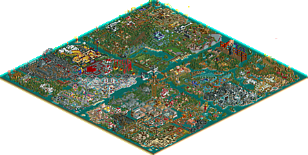
Park / The Masters Palette
-
 04-October 19
- Views 3,142
- Downloads 647
- Fans 2
- Comments 17
-

-
 66.50%(required: 60%) Silver
Jaguar 75% Coasterbill 70% Liampie 70% robbie92 70% RWE 70% ][ntamin22 70% Camcorder22 65% posix 65% saxman1089 65% Cocoa 60% G Force 60% Scoop 60% 66.50% -
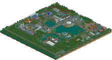
Description
The Masters Palette is a collaborative effort by many of the members in the former RCT Masters Club.
An idea originated by Mama Bear, the project consists of four canvases showcasing artistic impressions of famous artwork, RCT 2 style.
Dedicated to Marjan de Goede aka Mama Bear, who passed March 2, 2019 before this was finished.
Thanks for viewing!
KaiBueno -
2 fans Fans of this park
-
Full-Size Map
-
Download Park
647
-
Objects
651
-
Tags
Park Tools
Similar Parks
-
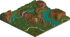
[H2H7 R5] Area 52
![park_3376 [H2H7 R5] Area 52](https://www.nedesigns.com/uploads/parks/3376/aerialt3839.png)
-
Easkerton Towers
-
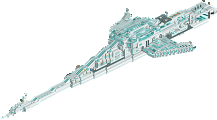
SS Infinity
-
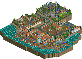
Parenzo
-
Cosmo Science Center
-
Relaxembourg National Park
This is great. "The Scream" is my new favorite thing.
So much here to digest. Miss the days of multi map parks. Amazing work and dedication to the game to get this done. I'm not an art historian, so some of the impressions were lost on me, but the commitment to replicating actual artwork should be applauded. Great stuff to everyone involved. Congrats on finishing this KaiBueno.
I think there's two ways to review this park- one as the historical piece that it is, and one as a pure rct park.
For the former, I'm immensely happy to see this out here. I never really knew RCTM but I love having old members and work return to the surface. Really fills me with nostalgia and a sense of the immensely long timeline of this community. There's a lot of care and love in this park. Congrats on getting it done kai!
For the latter as rct-park, well, its a mixed bag. Obviously its going to be inconsistent- its a sprawling 4-map group park. And obviously its old and dated too- but thats no problem with me, I reckon I'm pretty well acquainted and into old rct shit. So if I come across a bit critical, its not just because I'm some modern new-fangled-realism-guy (which I'm not really anyway)- I think you can find me as the high vote on tons of historic rct.
As a park which is intending to have areas representative of artists and their respective styles, I think it often misses its mark. I'm very thankful for the gallery included, because I wouldn't have known most of the references, and I like to think I'm not terrible at my art history. It's not always the case- there are a few fantastic areas which really nail the theme. Ones that stuck out to me- picasso, frank lloyd wright (really impressive actually, one of my fave- solid area and good buildings), carr, van gogh, monet, and obviously escher. Those areas appealed to me either in the rct-parkmaking sense as nice areas or as particularly representing their artist.
Other areas did one or neither of those- particularly egregious to me is, for example, the mondrian section which is an awful mess of colors, neither representing the actual aesthetic intent of the artist nor comprising a decent area in rct. Much of the areas were just sloppy, squared-out rct with a haphazard 'art' theme thrown on top of them in the ride names. The classic map really felt like this to me. On the other hand, the IFS map was probably my favorite- really some great composure here. Although I hate just giant sculptures/pictures in flower beds to embody the art- that seems like a "lazy" way to represent an artist to me- recreationalism in its least inspired form IMO. Of course there is place for this, particularly in art where the location is of extreme importance, like Dali or Monet, and those areas shone through as really evoking the artist in some way.
Anyway- its a ridiculous expansive park with a lot to see. Some good, a tiny bit great, and much mediocre. But, thats not really what its about at the end of the day. Wrapping up a decades old park in honour of old members is beautiful and important and a really lovely contribution to the community. My criticism above should be taken with the attitude of "this is a legitimate, important piece of rct, and it would be unfair to not take it seriously in our rct-commentary of it". And of course you probably know much of what I said anyway- you're not going to go and fix a decades old area by someone else! Its way better in its raw and strange form, even if it doesn't always work.
but yeah kai- your FLW area was great and I'm looking forward to more 'controlled'/intentional parkmaking from you in the future!
Cool to see such a massive project be released!
Good things first -
Loved many of the coaster layouts - not based on how they pulled of the theme, but just the flow and the look of the layout itself, together with it's immediate surroundings. Some of my favourites were:
Raven
American Gothic
The Scream (you get a whole new perspective on the painting when you consider the possibility that it was just simply a good kick to the groin that resulted in the famous grimace... I both love and also can't quite believe you went ahead and made the layout go between his legs, haha)
Day & Night
Separation of Light-Darkness
The Escher area was awesome, and the illusion pulled off to perfection.
Frank Lloyd Wright area was nice, clear likeness with most of the buildings, although they looked just a little bit plain at times. I just so happen to live in FLW's hometown of Phoenix right now - moved here with my American wife in March
Less good (or I'm too ignorant to know) -
As far as the actual representations of the various artists, I just don't have enough art knowledge to make specific comments. Obviously I know some works by the big names like Dali, Picasso, Van Gogh, monet, and so on, but even then, I think it's hard to comment on the execution - probably because there is nothing really RCT-wise to compare it to. I did look through the images, and in certain cases you could see the likeness, or more rarely a nice impressionistic take on the artist or their work. Often though, it felt like it would be possible to recreate many of these images more accurately. In general, the archy was quite boxy, and the areas didn't transition in the best way, but it is obviously hard when the themes are more subtle than classic, easy-to-discern themes (such as medieval/aztec/swiss/steampunk etc).
Considering that this is an old project, with old objects, with a ton of builders, 4 maps, and with an ambitious and difficult concept with little or no precedent, I really commend everyone involved on a very cool release, which I enjoyed looking around in and comparing parts to the pictures provided. It kept me more hooked and engaged than many of the ubiquitous uber-realistic-style parks.
Congrats on finishing it!
Crazy to see a park finished after a decade and a half, and I'm glad to have viewed it. Clearly a lot of effort and soul went into this project and thus I think I'll give this a pretty long review to run down each section:
Classical Canvas - My first impression of this was that there were some parts that were nice and recognizable, and others that aren't. I'll run down the different sections:
Raphael - Charming but dated of course... it doesn't seem too reminiscent of his work and the rapids ride just doesn't look pleasant. Not bad though, and I like the station.
Bosch - Very pretty and chaotic... I quickly recognized this one and I love all those statues made of random objects. The hellish part isn't quite as strong though but this section was beautiful and arguably the best part of this map.
Titian - It's nice and does provide a Venetian vibe. Doesn't feel quite as ambitious as a few of the other sections imo.
Rembrandt - This one is subtle but the landscaping is actually great. the area around the canals is quite nice and it uses a similar color scheme to his paintings.
Michelangelo - Another plot that I feel could just be a generic Italian theme without the names and dark section. What's there isn't bad though
Da Vinci - This obviously would be more ambitiously executed if it were made today. It's grey and feels vaguely futuristic and abstract, although maybe that was the intention?
IFS Canvas - Finally lots of color and contrast! This part is stronger than the classical one imo.
Van Gogh - Something about the blue woodie and flowers looks really nice. This part has a good use of colors and definitely seems cleaner than the previous section
Edvard Munch - Mixed feelings about this one tbh... mainly because that statue stands out more than anything else. I'm glad there's more representations than the other plots though and the water colors are a good idea that admittedly should be used more.
Cezanne - Landscaping and surroundings are old school but nice. As a still-life artist section, this area actually could've used giant sculptures. Pretty though.
Salvador Dali - Definitely feels more abstract than the others... the flowers representing the melted clocks was cool and that white house is nice.
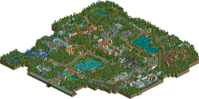
M.C. Escher - The only section that was released and truly a classic... that rapids ride is brilliant and for its time, this was fantastic.
Modern Canvas - In some ways, this is arguably the strongest canvas. I love the cubist layout of the map.
Keith Haring - This is a cool little section and a nice idea... feels kinda shoehorned in though but I don't care because it divides the map very nicely.
Mondriaan - I love this section, very basic but nice execution of de stijl, and despite its age, it's pretty to look at.
Warhol - This part is clean and refined but outside the checkerboard and color scheme, it doesn't really expand on the warhol theme.
Frank Lloyd Wright - Another strong section... the Fallingwater house is very scenic and nicely done. The James B. Christie house is also a good piece of architecture.
Giger - I initially felt Giger, a sci-fi illustrator, was a bit out of place when compared to the abstract early modernist artists. The alien section is cool, especially with the red windows. Hell's angels... not so much, grey terrain almost always looks ugly in flat swathes,
Joan Miro - That woodie has terrible colors lol, but it fits the theme. This section is more representative of the artist's work than some others and I like that. Definitely a really cool section.
August Macke - A small section but a good execution of expressionism... I love the buildings. The coaster has a decent layout for such a hard ride type to design.
Misc Canvas - A stronger section as well, although it doesn't seem to have a consistent theme as the name implies. Maybe Giger would've fit better on this map?
Seurat - I like the la grande jatte flower art, and the surrounding garden landscape is great.
Masters Mountain - Not much to say other than blue is a theme?
Emily Carr - An interesting choice and the pacific northwest theme (something we don't see enough of) was executed decently well... I don't like those giant totem poles though.
Charles Neal - I feel more could've been done with this section, what's there is decent but the generic-ness is weaker than the rest
Picasso - Another section that could have been more ambitious instead of a generic Mediterranean village imo. I would've liked to see collages and other crazy stuff.
Grant Wood - Definitely sets that midwestern American vibe that it was going for, the wooden coaster is a good fit and as a whole, the section is unpretentious.
In conclusion I think there's a common theme with a lot of these plots, the best, most noteworthy ones are more representative of the artists' work, rather than shoehorning rides and names. I think you have a particular skill for 'controlled chaos,' which shows in the pastel colors and surreal sculptures of the Garden of Earthly Delights. Other particularly strong areas are the FLW section, the Macke section, the De Stijl section, and obviously the MC Escher section because they look like the art they represent.
All in all, a beautiful and nostalgic park with sections of varying quality. Is it outdated and rough compared to newer stuff? Yes, but there's a lot of character and charm in this reminiscent of a group park format we no longer see. Congrats on finishing this, I'm a fan.
Thanks for the submission Kai, always good to see these grand older projects get finished. Lot of interesting stuff here for sure, almost too much to take in for me. Almost don't know how to react or rate something like this without looking into all the source material first.
My favorite area was definitely the Frank Lloyd Wright section, felt the most fleshed out and unique to me. Maybe it was the architecture style, terrain and coaster, but I liked how it sorta felt more natural I guess. Having an archy style to use in the section definitely helped a lot, especially one that's relatively translatable to older rct objects.
So yeah, great job finishing this, not really sure how to score it, like I said almost feel like I need to do some research to have an opinion on the thing. Hope to see you stick around after this.
I had a really hard time scoring this also. it's a tremendous achievement and incredibly enjoyable but I also feel like by it's very nature it's tough to call it a Spotlight either. Gold felt right to me, though it's one of the most enjoyable parks to view I've seen in a long time. Everyone that worked on this should be proud of it.
I really, truly wanted to like this series of parks...
... but I just couldn't. I'm sorry
I don't want to go on about it too much because I realise how much work this must have taken, and of course as a tribute to Mama Bear, but it just lacked even the most basic aesthetic elements; consistent scale, congurent colour schemes, a definivitive object selection etc.
Furthermore, I don't think any area, not one, sufficiently captured the work or moods of the artists they intended to recreate.
For a park called 'Master's Pallette' it ironically lacked a sense of composition.
Sorry for the harsh commentary. I know how hard people worked on this and how much it means to members here.
Thanks, we worked on it eons ago, but had fun with the challenge. I am quite relieved to be done and have it released.
Thanks for humoring what I can understand is a mixed bag, especially these days, where some of will show its age or not be trendy, just like the art we based it on. The classics live on and the 80s weren't then but almost are back now?
I am glad to have this out there, even if it and I are relics from the olden times. Regardless of how it is rated, conceptually this was importantly bold and different in 2003 to 2005, we just never delivered it until now when we are all forgotten. Time, funny thing that. Does and doesn't feel that long.
Split - Thanks for getting it (conceptually), even if you only like those parts that appeal to you. I get it. While I love all four maps, I can see where some are weak in spots, or for the artists themselves, which I prefer and which I don't based upon my research and review for the doc and galleries I put together. I'm happy you enjoyed visiting the 4 maps and related galleries. Thanks!
Jag - no reply here during a coffee break at work will adequately thank you for the full blown review. I will likely post more thanks later tonite, but thank you also, like Split, for getting it.
G Force - thanks for looking at it and congrats on Southwinds, which released same announcement as Palette and just went Spot. Thanks for the comments on FLW, it was hard work and I am happy with that section how it turned out, especially after shaking off yrs of rust and 10 yrs of fearing doing FLW.
AR - I am ok with harsh commentary, but I don't see how none of the areas worked with the mood of the artists. Some better than others, sure. Some personal taste hoping for more that wasnt done, fine.
Seurat had a garden of flowers set to pointilism.
Hate the Scream statue maybe, but the other areas in Munch were somber and autumnal.
Toon's Carr is very B.C. Canada.
Bosch IS the triptych.
and FLW...woodsy, muted colors (especially red)...single paths like a hike in woods or lawn.
Just a few examples...
Maybe you didn't think of these as art?
I'm sorry for my earlier comment I haven't been in a good place recently, and I feel like I saw your park in a bad light.
Feeling better now, looked over the park again in a much better mood, and I can't believe what I missed
Will write a full (and fair) review as soon as I can
This project is a piece of history. And i can respect that very well when looking at it. Some areas do feel a bit out of time but some are having that nostalgic feeling to it that i exactly expected to see here. I'm glad you managed to finish this! Definitely a very great addition to the database!
This is one of my favorite releases in a long time. I love the nostalgia it brings upon viewing.
The surrealist areas were the definite highlight for me. I love the Dali section quite a bit. And Escher is always a classic.
Huge congratulations in finishing this massive project up. You really did it justice.
Hey AR, hope whatever you need to work thru eases up - the Palette is secondary to any personal issues. Take your time with it and yourself.
RWE - thank you very much. It like art is entwined with history, so is this park with art, rct and time. Trust me I am very happy it is available to the public and complete.
Josh - Glad you liked it and it makes you happy to view. Here's a bonus image of one of my favorite little details in an area you liked. Burning Giraffes FTW!
Attached Thumbnails
It's here! And good lord is there a lot to take in..... wow. Just wow. Of course I recognize cBass' Escher section since it was pre-released. Brought a smile to my face seeing it again, like seeing an old friend. Almost felt like it was saying "this is where I came from and am meant to be, and these are my other friends," if that makes sense. It's not coming across right but I think you get the idea. And I really like the way it's black and white and surrounded by color, makes me appreciate the b/w color scheme even more.
The rest of the maps..... oh gosh. I need time to digest it. The only artists I instantly recognized were Frank Loyd Wright and Picaso (I think? I hope. The square shapes with bold colors, instantly recognizable). But that's because I almost failed my college art appreciation class so...... yeah, time to do some research lol. I also noticed upon opening all four maps that the views were properly rotated around the center piece such the viewer is truly viewing them all from the same angle. Nice little touch that brought some continuity to the map set.
Congrats again on finishing this!
What a truly a refreshing park to see. In some moments bringing back the strength RCT can have visually if people let go and dive into their imagination.
It would be an understatement to call this concept driven. It's nature is simply all concept. The choice of art and architecture is a beautiful one, and it's so rare we see this happen, much less at such big scale. There's Escher Island (had he built it in this park first?), Taboo, and then what else? Not much comes to mind that is devoted to art itself, so I'm glad you've made a contribution here.
The translation of your motives to RCT is admirable because truthful. RCT is played here without any conventions whatsoever, and it's wonderful to see. It must be such a liberating feeling. The park shows definite moments of great creativity, yet the one thing holding it back for me is the desire to translate from existing, which per definition can ultimately only result in recreation, in mimicry. Personally I enjoy RCT best, and in fact any "craft" for that matter, when it's based on your own visions instead, realised visually by displaying superior taste in design and stylisation. I don't think this latter aspect is something the park necessarily excels at, and would be my one main point of criticism.
Really though Kai, I am so happy for you to have completed this, and to have your voice in the community, in general. Thank you.
Thanks Sephiroth - enjoy your art history refresher, and also nice catch, I did position those that way on purpose so that each map would match "real positioning" compared to each other, and also so that you only see the entrance paint brush hub at first, leaving the rest to be discovered upon scrolling away from it!
posix - thanks for your comments - it means a lot to hear what people think, especially with your long view of the community. I think I see where you are going here. I can agree that it is a rare art-driven concept, potentially overblown in its sheer scope. As for your other comments, I think what I'm reading is that you like the idea but also prefer that the ideas come from within and aren't just recreating. I'd like to think the hit or miss nature of the park does a bit of it all (considering it is at least inspired by other art), from serious recreations like Frank Lloyd Wright, absurd ones like the Screamer to casually inspired tonal areas like Rembrandt or Carr. That's how I see it anyway, but we all see things differently and I respect that. Makes like more interesting that we all have different tastes.
I'm curious which areas you favored?
Also, I am enjoying my time back, thanks for welcoming my voice back!
A landmark project come to a conclusion! In brief - the Bosch area is suitably mind-bending, the Wright houses are meticulous and a real pleasure, and of course the Escher area is a classic. Outside of these, things get a little messier.
It's difficult to judge this project overall because of the mix of approaches and styles - not just in RCT, but in how the artist was represented. Either an abstracted sense of their signature motifs, or a clear RCt depiction of a seminal work, or other looser theme-parkizations of art. I will say the effort put in is outstanding, and the readme is very helpful, but it almost has to be to catch everything the builders were hoping us to see. Some of the work - architecture and ride design particularly - is clearly very dated and the effect is lost. Some of the work is so striking and outside of "theme park" presentation entirely, like the Haring stuff or De Stijl zone, that none of the effect is lost and it's a suitable thing to explore without any preface of what's "good NE style" RCT. That's what works best here for me.
I really appreciated the areas that were almost more about the environments of the artist than their work. Venice, the dutch village and tulip fields, the Blue House surroundings, and the pacific northwest area were all atmospheric in RCT because they were attempting to build a sense of place instead of purely capturing the style of the artist.
It's truly a fascinating and well-deserved adventure to sig into art history for the purposes of RCT, and I would really love to see how this could be tackled now with contemporary NE scenery, custom palettes, and multiplayer. In the many years since the Master's palette kicked off we've seen a ton of heavily-stylized RCT; that energy is still going.
Overall I couldn't rate this as highly as I liked, because frankly there were significant parts of every map that didn't do much for me. It is a little sad it didn't at least pick up a Gold for the ambition and dedication to the concept.