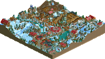
Park / Heckengäupark
-
 03-May 20
-
Heckengäupark (Finished)
- Views 7,467
- Downloads 722
- Fans 2
- Comments 17
-

-
 71.50%(required: 70%) Gold
][ntamin22 85% Cocoa 75% RWE 75% saxman1089 75% bigshootergill 70% Camcorder22 70% CoasterCreator9 70% G Force 70% posix 70% Scoop 70% WhosLeon 70% csw 65% 71.50% -
Description
OpenRCT Only!
I recommend OpenGL rendering for the ideal experience. Also remember to activate "disable all breakdowns" for an enjoyable experience.
If you want to set yourself up in a suitable mood use this great youtube video of Asian music:
https://youtu.be/JuwJfDr36Kc
For further information and the classical "Readme" visit this page:
https://sites.google.com/view/heckengaeuparkde/ -
2 fans Fans of this park
-
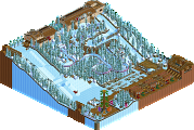
Full-Size Map
-
Download Park
722
-
Objects
504
-
Tags
Congrats V1, a brilliant park and such an improvement on any work you have done before.
A huge step up from your previous work, and the little tweaks you've made towards the end of this have massively helped it as well. Backstage areas are massively improved and the foliage has added a lot to it as well.
Also hope people take a look at the webpage you created!
Glad to see this released. Definitely your best work yet. I will leave a full review somewhere this week!
Congrats on this release, V1! Glad to see how much your work has improved, and hopefully others see it as well.
I'll leave a more comprehensive review after voting, but just wanted to say that you took your "readme" to an amazing level. Awesome job with that!
Congrats V1, I think you surprised us by getting it finished more sooner than we expected. It's definitely a work to be proud of, a big solo park and I think we all agree on the fact that you stepped your game up.
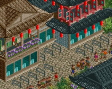
Starting with the entrance and the main street: this is on a very high technical level. It proves you are a good rct'er so please, don't pity your skills anymore I like the fact you went for a full Asian park in Europe, it's bold to do a big theme park in 1 theme. You pulled it off well.
It's an overall very likable park to view. I think the part between the log flume is my favorite piece. Really nice foliage around, just some path. It seems like a really cosy place to stroll trough as a guest and a great place to rest. Kudos.
The whole plaza with the queue of Akima going around it is also very well done! The coasters were all pretty good, with Akuma as my clear favorite. Still disappointed Fenghuang didn't use it's terrain and drop out of the station TimeTraveler style...
You really progressed a lot as a builder. I think your next step is thinking more about composition, as some stuff and choices in this park feels a bit odd on this part. I'm glad I got to test the park and that you listen to the feedback. Like Trav said, the little adjustments you did really helped a lot.
I also want to encourage you to make your own layouts, even though you're unsure about them. I know the feeling, I also thought I had an advantage on lay-outing as a coaster enthusiast but oh well... But practice makes art! Maybe you won't build the best layouts in the beginning but you'll learn and they will get better and better. Thrust me
I definitely encourage anyone here on NE to make their own coasters and not relying on anyone else. I rather prefer weak layouts someone made their selves than seeing layouts from the same builders over and over again. Don't want to offend anyone here, or to bring your park down V1. Just needed to get it off my chest. Looking forward to see more V1 in the future, it's promising!
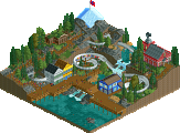
I really enjoyed this park. My favorite part is the plaza with the bobsled coaster. That plaza is really well laid out, and has the right density. The theming around the coaster adds a ton of atmosphere, like how the first turn wraps around the ice. Himalayan-esk prayer flags add alot for me. Love that the second story restaurant patio overlooks the whole layout. Great area.
I loved the show towards the back of the park. I wish there was more to look at on the outside as all we can really see was just a roof basically. But the inside is really atmospheric. The peeps and actual show is really well done.
The back of house areas are also really well done. The first major building to the left of the entrance is cool. I really like the security guards walking around in there what a great idea. The training area for the show blew me away too, stuff like that adds alot of character to the park.
The little shuttle coaster is really well done too, I like how the queue interacts so closely with the ride.
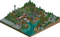
I think each area where the archy is more dense is where the park shines. Its too sparse in spots. Its like you had trouble stringing the coasters together. I think this park could have fit on a smaller map and had a better result. For example if you make a left and then a right off of main street its a long long time before you run into any sign of life.
Solid park, Some great layouts, I enjoyed it.
heck yeah, this is really solid and a huge step up from you. i didn't realize it was so far along at all!
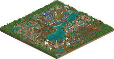
on the whole the park is very well composed. some areas feel older than others (in the theme park chronology sense) which is great, and I love the foliage and landscaping and especially how it interacts with paths. really good stuff. the themeing is pretty good on the whole- theres some lovely little spots all over which really keep it fresh, like the yellow-roofed palace and the tibetan area, among others. layouts are on the whole strong- theres a fuckton of intamin and a real crew of great layout-builders supporting you on this. I didn't love the woodie tbh but the rest were pretty interesting and unique, especially cp6's. I think the maverick style fluch drop overlooking the entrance is a real stand-out piece of parkmaking too.
overall- clean, crispy, slightly samey all over but more or less solid themeing, and great park development. good stuff my dude
First of all i like how much you've improved from the first test version i've seen from this. You will probably hate that statement, but the new backstage area to the left of the entrance is my favorite part of this. So well done! And i really like how the monorail is driving through there.
As pointed out by others the layout in this are - obviously - fantastic. But i also do think the theming in this is quite great. I especially liked the admiral coaster facade on a technical level and on a more compositional atmosphere-considering level the inverted coaster area. But all in all the bobsled area probably is my favorite of the park. Shows that flags can be a theme.
I also do think that foliage and landscaping are a huge step up from your previous releases. But i think it's also the point where your next step up might be. I mean with that, that you can emphasize your structures and attractions more with your foliage. At some places in this park it felt like your trees would just be placed so they are uniformly distributed on a certain area, while i do think that your style would work much more with a more compositional approach. In my opinion the foliage in this park is also a bit too long grass heavy, especially for the fact that it's supposed to be in Germany.
For going on with a good point again: I really love the stadiums in this. I think they are really elevating this park a bit, since it's otherwise just our normal well known - and also well done, don't get me wrong - asian architecture. I also do think that you learned with the years how to distribute those small things we enjoy into your parks. That's something i'm very happy to see, because i think it's something you lacked a few years ago.
Another flaw i want to speak about is the overall connection of the park. I second what Mattk48 said about that. I think it feels like your approach was to first place all the coasters and then find a way how to connect them into park, while in the planning progress you actually need to think about both those things simultaneously. But that's a thing you can easily fix for your next 'serious' - as you phrase it - project: Think more about which elements of your rides and theming you want to be prominent and try to figure out the general layout of your park while doing.
You're definitely on the right path at the moment. I think considering the great coasters combined with solid theming and looking at the readme as the cherry on the cake this deserves a gold. Well done!
Cool work, V1!
You really did something neat.
Some of the layouts were a bit weird, others were pretty good. Looking at the archy I really see you made big steps. The composition is quite good too.
Congrats with the relase and progress!
Congrats on finishing this! It's a fantastic improvement and a fun park to explore!
Obviously, it's full of fantastic layouts, as can be expected from the guest builders who provided them. I think it's interesting that only one coaster has inversions. I get the sense that you're being more thoughtful about including interaction and really integrating your coasters into the rest of the park. Some it feels a little "plopped" still, however, with a coaster just hovering over path as a way to interact. It's still good interaction, but I see some opportunities for more graceful or intentional moments that were missed with the way some of the coasters fit into the park. This is less of an issue with the coasters and rides you've built yourself, and I feel that Teituko and the Yangtzee flume both have some of the best interaction and coolest moments of the park, such as the vertical drop facing the main street.
I appreciate the contrast between the dense, busy main street and the open, natural-feeling park landscape. The breathing room between rides gives the park a certain atmosphere that's refreshing and unique. I'd have liked to see a little more intentional, man-made gardens though, as opposed to the dense, rough, natural, foliage that's ubiquitous here, because I feel like a park with this much natural beauty to it would try and capitalize on gardens and landscape as a unique, attractive feature. The natural foliage is pretty well done, i'd just like a few more nicer, manicured gardens in the spaces between rides.
The architecture is solid and i like that areas have their own identity, and room to achieve that through all the space you've given them.
This park clearly shows growth over everything you've made previously. I definitely think it falls within the 70-75 range, if not higher. Good work!
Good creativity with buildings and roofs.
Well balanced vegetation, pleasant to look at.
I had a lot of fun in your work.
Congratulations even to the other participants.
Congrats on getting this finished and released V1 (even if the timing wasn't great haha), it shows a great deal of improvement and your skill is really hitting a new peak here. It's quite a bold move to make an entire park in one 'theme' and not have individually themed areas, but you've got a decent amount of variety in the park. I do wish you had made a more conscious decision to do separate country themes instead of a generic 'asian' theme which sort of clumps a lot of distinct cultures together.
 It rounds out the coaster lineup nicely however (but I sort of question how the maintenance gets there with the queue wrapping all the way around...). The hotel is a great addition here too.
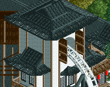
The entrance has some very nice architecture, probably amongst the best in the park. The monorail station over the entrance gate is a great touch, as is the little garden at the top that it passes through. Opening out onto the river facing the first coaster is an excellent sight line and a really great way of enticing guests in as well, and the ship is a fantastic there as well. Proceeding clockwise, you get a good view of Teituko, a short and sweet layout (with perhaps too many supports).
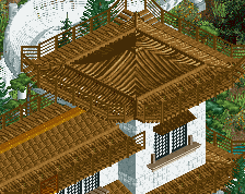
Another nice layout with the wooden coaster Hejji Shiro, and the more rustic wooden themed buildings are a great complement. The Samurai show is very well themed and has some cool backstage details as well. Further on, the Tibet area with the Himalayan bobsled coaster is excellent. Probably my favourite part of the park, with your best work in my opinion. I would have liked to see a bit more snow on the ground perhaps but the architecture and theming are really strong.
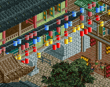
Akuma is really one of the highlights of the map. Great layout and the 'Forbidden City' style theming for the station area is superb. I love the queue wrapping around the wall, and the structure stands out nicely from the rest of the park but doesn't feel out of place necessarily. Fenghuang is another great layout but I feel the theming on this is a bit generic and just having it mostly over the grass does it a disservice somewhat. The tub ride I'm not a huge fan of either. There's some hints of a theme here such as with the tiny bit of rice paddy but it feels like you held yourself back a bit and this would have been a great opportunity for a fully immersively themed ride. You've definitely got the skill to go there as evidenced by several other areas in the park. Lastly before I move on from this area, the second stage show is really nice. The building itself is a little generic but the show set is very good.
Wrapping around to the log flume, you've done such a nice job setting the scene with this. The foliage is excellent, sort of getting G Force vibes. Xi Feng is the last coaster and it's a bit cheeky nicking this from SFSF
Overall this is a lovely piece of work V1. You've clearly improved a deal throughout the building process and it reflects with some areas standing out in quality. Looking forward to your next park and I think with more planning and cohesion you'll excel.
Congrats in the gold, mate!
Surprised I'm the low vote here - I thought mid-high silver was appropriate. Here are my thoughts.
The bobsled area was definitely my favorite - the colors were great and the buildings weren't stacked all on top of each other. I think your architecure style is good, but it suffers a bit from some of the color choices (bright yellow roofs with red walls mainly). I also liked the area by XiFeng alot too.
My main complaints are that everything is drowned in trees - that's probably a solid representation of southern Germany but it makes the park hard to read. For example, the circus ride is completely isolated from the path by thick trees - I didn't even notice it was there the first time I looked at the park. There were also a lot of empty areas with just path through trees - lots of space went to waste. I also think there were some questionable park layout choices. For example, the monorail not being a full circuit and peeps having to walk half a mile to get from the entrance area to any other attraction.
It feels like you're so very close to a true breakthrough - you've proven that you can build nice buildings and do the little things like foliage, supports, and backstage areas well. I think focusing on stronger ride design and theming as well as tying various areas together better will help a lot.
V1, congrats on the gold. I know you get down on yourself and your building sometimes and thought this would end up as a silver, but I think you've done your best work in this park. Gold is the perfect accolade imo.
You've assembled a great park here. I'm impressed by the architecture whenever I open it, and the park layout leaves plenty of space for everything to work. While upon first viewing I thought this was a negative, it's grown on me a lot in the days since. The park as a whole seems like a great place to spend a day or two, taking in all the rides and scenery, which is another way to say that the park has a good atmosphere.
For your next work, I'd try to focus on the macro arrangement of everything. While you've got some elements of that sort of thing here (like the front of the park), more focus on having all the individual regions of the park work better as a whole picture would be a good challenge for the future.
Nice park, V1. Really surprised me in places. The overall theme and aesthetic was very well done.
Airtime Offline
Some great great park making here V1. Be proud of a good solid park and a gold!
I feel like you’ve developed so much from what I remember seeing your work ages ago.
2 awesome Intamins, I love. Is the white coaster meant to be Intamin? It’s quirky, I like it too. Bobsled is cute as well as the Junior Boomerang.
Some great large pieces of architecture including the hotel, the stadiums and the palace type area. Some great use of colour and that really adds.
I feel this park is too spaced out. Maybe that’s the intention but for RCT I’m not sure there’s enough to hold the attention in between the attractions and it almost feels bare in places. This would be the biggest thing that holds this back from being on a higher level.
BUT the biggest annoyance as with any RCT park, always put a custom top on the roto drop. Sometimes the observation tower needs it but not always. For this reason it’s only a bronze park...