Park / Wake Skimmer
-
 29-October 21
- Views 2,754
- Downloads 413
- Fans 3
- Comments 9
-
 70.50%(required: 65%) Design
Jappy 75% RWE 75% saxman1089 75% Scoop 75% CoasterCreator9 70% G Force 70% posix 70% Terry Inferno 70% Xtreme97 70% bigshootergill 65% Louis! 65% ottersalad 65% 70.50% -
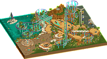
Description
Made for RCT Club's Arrow Suspended contest, I wanted to have some fun and try some new things from H2H. It's a bit rushed in the end and I told myself I'd make some fixes/edits before submitting to NE... but if I don't upload now I probably never will!
-
3 fans Fans of this park
-
Full-Size Map
-
Download Park
413
-
Objects
302
-
Tags
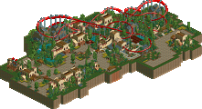

This is a great little design and I'm glad you decided to upload it here. The architecture is great and uses the half-diagonals in a pleasing way. The layout of the coaster is great, too. Nice interaction with the rock formations. I also really liked how it had a pre-lift section. Nice work!
such good curves, shapes and colors. great work
Awesome layout. Really enjoyed the coaster interaction here.. the pre lift interaction with a windy queue, weaving in and out of the mountain, and then the curvy drop over the water and around those islands look a ton of fun.
Great colors and vibrancy here, but a couple of nitpicks.. the station building was quite large, and a tad underdetailed for me. Wasn't a huge fan of the large tan terrace left of the queue entrance. The awnings along it are cool, but I think there is a lot of brown there. Lastly, the wave swinger looks like it's gonna break everyone's legs in half!
Lastly, the foliage was really well done. It seems perhaps G Force inspired, if he used more palm trees, but I'm a fan of that. I think a lot of people focus on your sculpture work, and rightfully so, but twice now you've made great suspended coaster parks/designs with great foliage and atmosphere. Keep it up!
Epic little design! Great use of shapes and cool coaster. I also really enjoyed the foliage and the colors, although the palette was a tad to special for me to understand. There are some rough spots when looking a little bit more in detail, but they dont make my viewing experience less fun. Good job, mamarillas!
This isn't getting enough attention. Great warm colors and it seems simplistic but there's actually a lot of very nice design here. Your canopy work is also pretty ace.
Honestly I wish this was a full park in this style... it's great!
Oh man, this was so fucking cool. Reminded me of E.V.I.L. from last H2H in all the best ways. Great colors here too. Definitely design worthy imo, and glad to see you building after our end of H2H craziness!
Also, the boat is killer.
This is one of the stronger suspended coaster layouts I've seen in RCT in terms of both aesthetic and kinetic flow. The care you've taken in placing each element is evident, and the bold purple-and-lightwater color scheme allow the fluid layout and its excellent support work to pop gracefully against the natural brown, green and white surroundings. Even as brown utterly dominates the architecture, you've kept the textures consistent enough so that it doesn't appear monochromatic; each building is perfectly readable, and no wall, roof or crown molding seems out of place. Curves and half-diagonals punctuate the architecture nicely, and I look forward to seeing more projects like this that break further away from the grid.
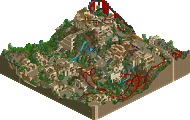
If the terraforming--both natural and constructed (fake rocks)--had been on the same level as everything else on this map, I likely would have voted 75 or even potentially 80. However, the mountain was something of a geometric and textural oddity that seemed out of place on a map where everything else is placed so attentively. Fisch rocks are an extremely difficult object to master, especially considering how little time anyone has had to master them, and the emphasis on texture these objects provide often cause the overall shape of a formation to get lost in the building process. The mountain on this map is consequently riddled with corners, right angles, and questionable transitions.
In the example above, the rockwork on the left side of the screen curves naturally, while that on the right side produces an oddly square shape. In the example below, straight edges seem to bring the mountain to an abrupt halt.
The key to bringing this new rock set to life is to vary the shapes and textures while avoiding the pieces with higher potential to detract. Corner pieces should be used sparingly, as corners largely do not exist in rock formations; use the sloped diagonals instead whenever possible. The vertical face pieces are also critical to giving a mountain a more natural look, even if you're building an artificial formation (which are built with natural shapes in mind). Villerouge's landscape looks as realistic as it does because it includes vertical faces as well as sloped sections, smooth textures as well as jagged, few to no repeating patterns, and very few corners. This mountain, in contrast, is composed largely of jagged 6h pieces (many of which are corner pieces), so both its shape and texture remain largely homogeneous and somewhat amorphous in certain places. I believe that, with your keen eye for composition, studying natural landscape formations will take your development as a builder to the next level.
When I zoom out and look at how peacefully the layout, the buildings, the foliage and the open grass fit together, I find myself drawing comparisons to Kumba itself. With this in mind, I definitely see high-scoring Designs and Spotlight level parks in your future. If you can put a mid-70s Design together in just 26 years, I can only imagine what you will do with a larger map and several centuries!
Very nice this. I loved how it had a classic NE Design submission feeling to it. Conceptually clean which really helps for me. I enjoyed the lighthearted and bright vibe you created, and the technical finessing was offset nicely against good open spaces. Something H2H9 sometimes missed by nature (understandably). Hope you'll win with this.
Only just had the chance to look at this in game. Lovely work mama! I'll echo the others: beautiful colours, lovely minimalistic architecture (good use of half diagonals; consistent), and the coaster layout also has good flow to it. Needs more swing though, it's rather tame. Terry offers good feedback regarding the rocks, although I'd like to counter it by saying that the artificial/unnatural look of the rocks can also be a feature instead of a bug. I'd say it's fitting, here.
The flat rides were the only part I outright disliked. The swinger because it's glitchy, and the bumper cars because the roof pattern seems like a random thing born out of being uninspired. Big deal, huh?
Congrats on design! Would love a full park like this.