Park / Time's Arrow
-
 16-January 23
- Views 13,591
- Downloads 386
- Fans 2
- Comments 45
-
2 fans Fans of this park
-
Full-Size Map
-
Download Park
386
-
Objects
1
-
Tags
Similar Parks
-
Temple of Tangled Tempests
-
Mordecai's Mechanical Marvels
-
Cape Canaveral's Galaxy Tower
-
The Koi Pond

-
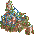
[MM2014 R1] Vertigo
![park_3118 [MM2014 R1] Vertigo](https://www.nedesigns.com/uploads/parks/3118/aerialt2765.png)
-
Botanical Tower
nin - Off the bat I am all here for the tols rock and roman balustrade usage. This coaster is definitely one of the strongest we've seen so far. It's like a wild mouse or a bob coaster but feels so domineering with this landscape and the theming. Love the station as the centerpiece with that trojan horse and how loud the coaster colors are
barnnid - These set pieces are epic. Giant stone archer man, on paper is one of those rct hurdles like how can I rct this and you killed that. I appreciate the strong commitment to the concept and theme, taking on hurdles like that and pushing through and clearing them. The ruins bounce to the clock and to the international style - large leaps but all done respectfully well and clearly delineated.
Gustav Goblin - Architecture and landscaping are so sharp and the whimsical, fantasy elements are executed in a cool way to spice up the composition. All the lanterns and lighting are so great and your hacking really made the park full of life. I like the gradients you have throughout like the cloud and the burn gradient, always so great to see in RCT. I also always enjoy peep scenes like you have here.
Ziscor - Man the more I look at this one the more I like it. Just so many great fine thematic details that really amp the atmosphere. The backdrop as a general concept is often prone to sort of forcing a composition to work from fewer angles but it is placed in such a way that all four angles are great to look at and explore the nooks and crannies. Just so many great subtle details and execution of the reflection effect is so sharp. The billboard is also another highlight. All these pieces have such a subtle beauty to it which I feel like is so fitting for the (presumably) Japanese theme. Like this pop of color/life on a drab/blank canvas.
Ziscor: The idea of the wet street and the reflection is just brilliantly (It looked that we had raytracing effects into rct2... ) implemented and really seems as if you are in a 3d city. For me the highlight of this map. It looks a bit like a part from Cyberpunk
War & Courage (1): Immediately so interested upon opening this park. Truly a lot going on but never in a way that made it feel too busy or overwhelming. Obviously from the start I'm looking at the horse. It's awesome, I love it. So impressed you were able to do that with ride parts. An actual insane talent. The rollercoasters weaving through each other with colliding ride parts was super cool, thought it was great symbolism for war. Clearly a lot of beige and similar tones happening with the roman architecture but the park as a whole has great contrast with the colors you do incorporate (red in the tracks, landscaping, etc.). Overall a stunning park and great to look through. Really excited to see more entries from you!
Home Away From Home (2): So cool!!!! Firstly, I was looking at the burning buildings and was impressed with how you actually made it look like burning buildings and not just black buildings with fire on top, clearly took a lot of skill. The visuals overall are stunning. The clouds in particular are a really cool element, and how they get lighter as they get further away from the burning. I was ready to give this park a vote from the lower part of the park already but the floating sky lantern buildings are also amazing. Contrary to your comment above I think you did translate it well. It wasn't immediately recognizable to me since I'd never seen them before but once I saw the picture you included it made perfect sense and I understood that the buildings were being carried by these lanterns. Overall, a spectacular park.
Can't decide on my third place park for this group so these reviews are void of placement!!
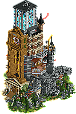
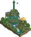
Time's Arrow: I must of course mention the bow and arrow statue. Wow! Such skill to create such a visually interesting anatomical piece in rollercoaster tycoon. So many elements in this park and they are all done really well. Really cool concept to show a progression of time architecturally and especially in the unique way to display it vertically. I imagine it must have been quite the challenge to intertwine the different styles together, but it came out great! Very cool park!
80s Anemoia: Such a cool park with such a cool vibe. So many tiny details in this park that make it amazing. The reflections you create are stunning and with such great precision. The billboards, the buildings: fantastic. And the neon backdrop you create for this city is soo amazing. Great work overall!
1) War & Courage by nin
-Concept:++
-Content:++
-Quality:+++
Overall; Everything is just very high quality here; The rides, the architecture, the concept, the crunch... It all blends so well, which creates a nice atmosphere in all 4 views.
2) Time's Arrow by barnNID
-Concept:+
-Content:++
-Quality:+++
Overall; Some excellent vertical construction here, and you kept the quality and cleanness up all the way. Sometimes these vertical builds can get messy, but this was so composed. Don't really get the concept though, I googled Time Arrow and get it's a book using time as a narrative (during WW2)? Anyway, the piece just looks awesome.
3) Home Away From Home by Gustav Goblin
-Concept:++
-Content:+++
-Quality:++
Overall; Too bad you're in this group man. Really awesome micro, love the sky stuff, and the quality of it all. The others were just a bit more unique imo, as we have seen the Chinese stuff a million times already.
4) 80s Anemoia by Ziscor
-Concept:++

-Content:+/-
-Quality:+++
Overall; What is there is awesome, just wish there was more of it
1. barnNID - Excellent excecution of a park based on time. Highlight for me is definitly the sculpture!
2. nin - How you fitted a dueling coaster in here is phenomenal. Theming is also on point, great job man!
3. Gustav Goblin - Very cool idea and excecuted really well. Like almost everyone else is saying in every other group this could have easily won the round, but now, i dont know its really hard to vote on this.
4 Ziscor - If I have to pick a favorite for this round then its gotta be this. I am a sucker for this kind of vibe in a entry. Very well done sir!
1. nin, loved the duel and the double helix was amazing. Funny how you went track for the Trojan horse, but I liked it a lot.
2. barnNID, if this had a decent coaster, it would have been my #1 yesterday. Loved the archer, bow and arrow.
3. Gustav, so much great work here. You had some great details, but the coaster layout didn't do much for me. Tough luck on this draw.
4. Ziscor, great facades and atmosphere, just no idea what was going on with the neon stuff and that line CRT was unnamed, so idk...
Barnnid: The clock was great. The bowman was great. The archi was great. The total composition was great. I just wished there was more than just objects though. Rides, peeps and smaller scenes could have added a lot to the storytelling. But it's a really impressive entry nonetheless.
nin: The coasters are awesome. Amazing that you were able to fit them on the map. I loved the funky first drops and the colosseum spiral part. The texturing was quite refreshing. The horse could have been better, I think, with the possibilities we have these days and I think you could have done more with the queues too to add some more peep interaction.
Gustav: I'm not the biggest fan of multilevel maps, but this one works well. The propeller and balloon stuff is cliche, but the execution is good. The architecture throughout the map was simple but looked great and I especially liked how you did the pagoda. I'm not completely sold by the coaster layout. The burning buildings were cool though. One minor detail: I think you could have find a better solution for the peeps that walk through the air to enter the top part of the map. It takes away the immersion a little bit in this case.
Ziscor: The reflections are sick, absolutely love that and they help creating the gritty atmosphere. The buildings and the street in general are great. I especially love that store in the middle. That one feels so real. I love the neon backdrop, but it's kind of shame it takes up so much space and basically prevents us to explore two angles. Therefore, there is not enough content to hold my attention for very long unfortunately.
1. Nin’s entry was the most complete for me, checks all the boxes and was impressive in composition, layout, and aesthetics. The layout especially was so well done, I can’t overlook the skill it took to make that happen.
2. BarnNID’s entry was impressive in concept, composition and execution, but the lack of music and movement brought it down for me. Also unnamed rides also point to slightly less polish. That sculpture still remains the star of the round though.
3. Ziscor’s was the most atmospheric and with the music was amazing in the vibe and concept, but it also was unfinished and lacked the movement / liveliness I value in micros. The reflections were beautiful, but it is something we’ve seen in Stardust Circuit as well, so the novelty doesn’t pack the same punch. I think verticality and polish (unnamed rides, time issue) would’ve easily brought this to #1 for me.
4. Gustav’s coaster left something to be desired, and while the concept is great, I’d love to see it developed more in terms of the architecture and overall shapes for the pagodas. Rounding off some of the forms would’ve elevated this even further, as would integrating the coaster layout into the archy / landscape similarly to what Nin’s entry was able to achieve.
Normally I try to not penalize so much for unfinishedness / polish, but when the competition is sooooo close between four fantastic entries, it came down to the small things. Still, great work to all four of you, and good luck on the remaining days of voting!
oh boy....
nin: i think these coasters are some of the sexiest i've seen in rct. the dueling helix element, the funky and smooth curves overhanging the cliff, the makeshift and complex wooden support work. just fantastic and my favourite coaster of the contest so far. The archi was great too with super nice texturing. it is quite literally a little bit rough around the edges, but i dont think that takes away from the experience.
barnid: very cool concept and also ballsy to mix styles and era's like this on such a small plot of land. the sculpture is incredible, but i wish the composition of the map gave it a bit more attention. it took a while before i noticed it, while i think something as great and important for the narrative should grab all the attention from the get go! i think it might be because of the grey castle structure behind it, which might've been better to color differently to make the sculpture stand out
Ziscor: lovely translation of the vaporwave aesthetic in RCT with some pretty amazing micro detailing as well. i found it a bit unfortunate that the map was so divided into two, and would've loved to see the architecture interact a bit more with the vaporwave grid-like pattern. great to see you back though, it looks like you're better than ever.
Gustav: really nice storytelling and world-building, resulting in probably your best work yet. i really love the temple and the gushing flames of the burning town. i think i would've liked to see even more destruction and fire on the bottom half to convey the necessity of going upward even more. i dig this story-driven approach that you have incorporated in your parkmaking here and i am hoping to see more of it regardless of if you move on or not
Ziscor: Very creative and well done scene. Might be my favorite micro from round 1 so far, loving all the details.
barNID: Very unique entry with a cool and well executed gimmick. I really like the mixture of different building styles shown here. Also nice clock!
nin: I really appreciate how you managed to put such a coaster on such a small map. Also some nice architecture and a nice sculpture. Didnt like the glitching track.
Gustav Goblin: Enjoyed the fire and the clouds. Coaster is well executed. Although not enough to make it out of this group of death, probably your best work yet.
I'm a little overwhelmed. I'll just say that I although I did not vote for it I love Time's Arrow. The way the giant clock, the archer sculpture and the "timeline" tower of buildings all fit together is out of this world.
Just going to say my thoughts here and not say the two parks who I've voted for because I want to be respectful to the other two builders, in potentially the strongest round that MM has ever seen.
Gustav – You didn't hold back, the lanterns, the Chinese dragon, the burning building, the custom propellers... you went for it buddy and it left a huge impression on me. I'm seriously proud how your parkmaking has come on, but just trying to grab those big ideas by the balls is really commendable. You'd be through on most other rounds.
Ziscor – Pure art, you know when you're looking at a top tier parkmaker when you start to delete objects just to see how the maker built what they did. My mind was blown. Small details, you executed were just so on the money and what we have is a very small map. This isn't a bad thing btw, but I'm shocked at the effect you've had on this round, building something at this scale when we've seen verticality ramped up across other players entries. Smart building, artful execution, a game changer in the history of MM!
Nin – I've already gushed over this entry to you on discord but wow, wow, wow. To execute duellers in MM is a feat in itself, building a trackitecture trojan horse is another and then dropping that huge excitement attribute of the Colosseum helix... mind blown.
barNID – Beautiful entry, the stone archer was great and the architecture on all four views was some of the best we've seen in this bracket. You've already presented a 10/10 entry btw but Iretont and Jens have shown this bracket that they can load their entries with very small micro moments across their maps that are well considered and tell a story. I think if you can do that as well—in and around your godly architecture and verticality, it'll give users more reason to stick around for longer. Basically your Macro was mind blowing, just work on some micro moments within you maps and you could win the whole thing. This was also my first introduction to who you are as a park maker. Thank you.
I love every submission here!
BarnNID: A spectacle to behold. The concept is so cool and the way the different styles are portrayed with the clock as the binding factor is just very clever. Also, this is one of the best sculptures Ive ever seen.
Nin: Super fun to watch this coaster. The whole thing being elevated brings a lot of depth to this map. There are some disabled clearance spots in here that are questionable, but the overall aesthetic and power that is in this map make well up for that.
Gustav: Very intriguing piece of RCT here. Sets a very dreamy mood, and I am here for it. Some of the edges at the bottom could have been a bit more refined perhaps.
Ziscor: Awesome stuff. The reflections, the backdrop, the details on the buildings. Everything works wonderfully well together here.
I am going to null vote on this matchup, as I can't really see any entry above another.
So unfair that two of these have to go out in the first round.
Time's Arrow is such a wonderful concept. Wonderfully executed too, but I imagine the lack of a proper coaster will hold it back for some. I've wanted to do a micro concept like this for ever.
Home Away From Home, I don't even know what to say. It's insane, I love it. Surprisingly uncluttered for three full layers of visual splendor.
80s Anemoia feels like a point-and-click adventure game I've never played; love the aesthetic. I think this one, too, may suffer from a clear central ride. The colors are great and I hope to see more cyberpunk-y goodness as the contest goes on.
War & Courage, the structure, the complexity, the duelling, good centerpiece icon, all solid. Not as crazy on the layers, which I actually appreciate. The pop of color of the canvas over the station is nice - I think the map could actually have done with that peppered in ever so slightly more, same with greenery. It's just SO beige/brown/brown-beige.
Gustav Goblin: first impression: is this Magnus’ Xuan Pu? Reminds me of it! I like everything you’ve done here. Good architecture, great landscaping, good coaster, and great relationship between lower and upper level. The smoke to cloud transition was a good idea. I enjoyed the frozen staff references; the map could’ve done with a few more details along those lines. Most of the houses were just empty houses. Ideally, there’s something to see everywhere you look, from every angle. Saving the best for last: the burned village.
barnNID: based on the overview I expected something with more movement, and perhaps a ride or two. The clock is incredibly well done, but it’s entirely static! Loving the concept here. Kind of like that Kumba micro from MM1, but with a different metaphor: an arrow, rather than waterfall. OOH it’s held by a giant stone dude! He’s buff as fuck. Amazing. Shit. Architecture is also great. Is this inspired by Brueghel’s Tower of Babel?
Nin: I can’t blame you for the glitches and intersecting, because sometimes a layout of composition is just too good to resist. I love this! I didn’t expect such a dense modern looking micro from you, so I’m pleasantly surprised. Lovely colours, lovely horse. Pretty impressive sculpting. I would’ve liked it if there was more space for peeps, and maybe some micro details. The coaster alone can hold my attention for a while, though. Great job.
Ziscor: Your micro detailing is as good as it gets. The reflections in the street are executed perfectly. The wire frame landscape and the stylised sunset are beautiful. I wish there was more content though. It’s pretty much three amazing little shacks. Btw, is that saxman square tile quarter block new? Never noticed it before, nice texture. Happy to have you on board, and happy to hopefully get another release from you.
Ziscor: One of, if not the best vaporwave builds I've seen in RCT, it Nails the atmosphere perfectly. (Also, those reflections, wow)
Gustav Goblin: I like the concept, and the amount of action. Landscaping is well done and of course, the burning village is really well done, great use of all those animated flame objects.
Nin: A well timed dueling coaster in a micro, that moment where the cars spiral around eachother is especially cool. The trackitecture horse is a nice centerpiece also.
barnNID: A great concept with a great centerpiece in that clock (Also that impressive statue). A cool way to have so many different styles of building in one map and make it all work together.
Match
Conclusion
The poll is now closed. The formula to derive the results is:
As replacement, barnNID is invited to submit a park for Round 2 (QF). If there is a drop-out their micro will be chosen at random as replacement.
Damn, this was a crazy group! It kind of sucks to be eliminated by 0.5 points haha but I had been sitting on the idea for "Time's Arrow" for like 2 years so it was still nice to be able to finally build it! I am pretty proud of the way it turned out although I wish I had a bit more time to flesh out the concept a bit more and add some more significant movement to the park.
No matter, I'm not upset to lose this one as Nin, Ziscor, and Gustav all had incredible entries this round. Best of luck to those advancing!