Park / SolarWing Skyway
-
 10-September 23
- Views 3,999
- Downloads 244
- Fans 13
- Comments 27
-

-
 91.50%(required: 65%)
 Design

Liampie 95% Mulpje 95% Recurious 95% RWE 95% SSSammy 95% Babar Tapie 90% Camcorder22 90% CoasterCreator9 90% Faas 90% G Force 90% posix 85% Scoop 85% 91.50% -
 Description
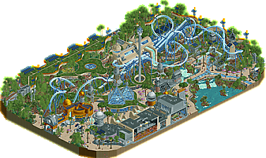
A reimagined version of my ill-fated MM round 3 entry. Hope you all enjoy!
-
13 fans
 Fans of this park
-
 Full-Size Map
-
 Download Park
244
-
 Objects
1
-
 Tags
Tags


this is extremely good and i wish it was part of a park in a weird way, like for me slap this next to something like lemuria as part of a lagoon park and i'm going even more head over heels than i am already... like legitimately this is the first time I'm truly jealous for lack of a better word of a release, it's so elegant, so well crafted and just the way it's still extremely realistic in it's take without losing immersion or the grandeur of it's theming is so so difficult to pull off, i can truly see this irl with a big enough budget...
please finish westcot ;-;
On a serious note, this is obviously sublime. Hard to overstate how good it is, incredibly well realised environment design and world building with an excellent (and unique!) focal coaster. Probably some of the best use of grid-breaking curvature in the game too.
Fantastic map-- really enjoyed it!
I've done a video review here:
https://www.youtube....h?v=h7kEhMJxQXU
Jeez, thanks CP6! Absolutely honoured by the review.
I'm a little late to the party, but I just wanted to mention how much I enjoy this design! Lately, every time I go to work on one of my own projects, I end up opening this instead, just to admire it. It's so utterly lovely in every respect, with a trove of things to enjoy in each section, that I just enjoy being with the space. It's become one of my favorite RCT works. So well done!
Calling San Avaiki one of my favorite releases this year reminded me that I haven't commented on this, another of my favs. Honestly, there isn't a lot to be said that hasn't already. This is top tier rct and some of the most inspiring work we've seen this year. The execution is flawless, the concept is amazing, the vision is so well crafted and executed that it's shocking. I always know that something is special when I get frustrated that I can't build things like it and inspired to still try, and this gave me that feeling. More than anything, I found the forms and the innovative approach to construction of space and playing with architecture so inspiring. In recent years I've become really obsessed with modern architecture and how we can bring less traditional forms into rct (which has generally veered toward a more traditional approach). This feels like that to the nth degree, and makes me very hopeful we'll get a chance to collaborate in the near future. A major congrats on a landmark design, really inspiring and exciting stuff!
I've been looking at this for months on end, and I am in total agreement with those who say that this is one of the greatest works of RCT art ever created (in its size bracket and otherwise), which seems to be everyone. But even if everyone had somehow overlooked what a glorious creation this is, I would love it simply because it combines so many of my favorite aesthetic choices: retrofuturistic architecture, curvy walls and paths, multi-story layering, buildings built into landscapes (and vice-versa), numerous dominant waterfalls, powerful coaster interaction, interior cutaways that don't actually require cutaway view, long queues that become part of the experience, generous amounts of blue, punchy flower gardens, strong emphasis on foliage with grass taking center stage, and no adherence to the grid whatsoever. Everything I would love to see built in RCT2, you've masterfully woven it together into a digital space-age tapestry at which I could gaze all day.
The interpretation of the theme is truly imaginative, particularly in the multitude of styles that come together in this scene. It is not simply a retooling of the version of "solarpunk" you see in a basic Google image search... it is a mix of various influences--older and contemporary--that come together into one completely original style. Even though solarpunk is a relatively recent movement, the architectural style primarily reflects visions of the future from the middle of the 20th century, going as far as to include a few touches from mid-century modern architecture such as the square fieldstone columns. The coaster station and Horizons building both look like they could be right at home on a 1930s Worlds Fair posters, and the restricted entrance even resembles a medieval castle. Frank R. Paul would love the architectural concepts, Michael E. Reynolds would love the mission statement, and Joseph Eichler would momentarily point at the screen a la DiCaprio. Amazingly, it looks like the past, the present and the future all at once!
Object usage is masterful as always, and the use of space, shape and color is among the most harmonious I've seen on a map of any size. Easily 90+ Spotlight grade, but that already goes without saying in one of only three Designs to break the 90 barrier (and the first in over a decade). Some of my favorite subtle object choices are the inner-curve crown moldings for sunken planters, the round half-windows for solar accouterments, and everything about those path lamps. I love also that there are vanilla scenery pieces featured prominently here, most notably the glass base and the steel wall. I try to throw at least one into every CS map I build, but you've taken that a step further and actually used that glass base as a defining feature of an area.
And then there's the coaster itself. How you pulled off a launched flying coaster with two parallel launched 45-degree lift hills in such a fluid manner is beyond me, but I cannot argue with the end result... the layout looks iconic, and its swoopy flair fits right in on a map where curves are king. The queue weaves around it so beautifully, giving the guests a tour of the garden in the process. You've chosen the best aerial angle for the layout, and when we open the map and rotate it 180 degrees, we get to see the building facades in all of their glory. A win at every viewing angle, but especially those two, which are some of my favorite on any map.
Is there anything that could be improved about this? I cannot see a single aspect that I would change or improve upon, though sometimes I enjoy going (just the right amount of) overboard with grass texturing by adding volieres, water objects, and a little "secret sauce"; however, this map certainly does not need any of those. Whatever silly complaints I may have had about the Spotlight map regarding things blending together from far away have been resolved entirely... I can see this thing from space and still be amazed with its melodic design. Truly inspiring me to build something retrofuturistic again, which I've done only once but never with custom scenery. In addition to all of the concept art from which I can borrow shamelessly, now I have a lovely RCT reference as well!
(hopefully I've earned my 25 cents)
Absolutely special stuff!!