Park / Glow Worm
-
 06-November 23
- Views 3,573
- Downloads 318
- Fans 8
- Comments 20
-

-
 89.50%(required: 65%) Design
pants 95% RWE 95% G Force 90% In:Cities 90% ottersalad 90% Recurious 90% Scoop 90% SSSammy 90% Terry Inferno 90% CoasterCreator9 85% Mulpje 85% posix 85% 89.50% -
Description
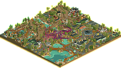
NEW for the 2023 Season - Ride the TOUCAN ROLL! Our classic, in-house looping coaster has not only received a third inversion… but has been fitted with brand-new custom trains! Not to mention a fresh coat of paint, to boot.
Don’t forget to visit last year’s addition to the park - CROSSROADS USA! Years in the making, the 2022 Season brought a massive new area featuring Geyser Gulch Rapids, the Haunted Manor, and a refresh of the park’s drop tower Escape Hatch! Plus, several new locations for shopping and dining.
An extra special thanks to the park’s design consulants, alex and dr dirt. They are recognized for their valuable input and organization in the early stages that made this park possible, respectively. -
8 fans Fans of this park
-
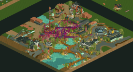
Full-Size Map
-
Download Park
318
-
Objects
1
-
Tags
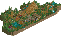
![park_4090 [H2H8 R2] Feira do Flamengo](https://www.nedesigns.com/uploads/parks/4090/aerialt3829.png)

Park is fantastic, but I feel like the theme of the coaster doesn't fit the vibe of the rest of your sections. It sticks out. And maybe that was the point? Bold colors a choice or maybe to keep the theme of the original pre-made.
That said...
My god, all the technique in this entry is just stellar. I couldn't stop looking at the river rapids area! That queue is one of the best I've seen. Such an enthralling midway, and what a charming mansion!
Nothing is exaggerated. Nothing feels overdone. There is plenty of room to breathe, and all the little peep scenes just add that extra bit of pizazz.
Excellent work to the both of you! (and alex)
Insert the Spongebob saying WOW gif here
The parkmaking is off. the. charts. here. Absolutely in love with all the buildings here. They all looks so detailed yet not too much at the same time. Pathing looks incredible as well, I could literally see myself walking through the incredibly immersive river rapids queue. The Haunted Manor building in particular is one of my favorite pieces of RCT ever. I hope to one day reach this level of architectural skill.
The main coaster is pretty slick as well. Lovely support work and great color choices. I do wish the trains went a teeny tiny bit faster through the last two high-up turns near the end but I guess the interaction with Escape Hatch makes up for it. The accompanying ride selection is great as well. I really don't have much more to say other than fantastic work from the three of you! Lemme end of with the probably underrated but fabulous waterbanks which are so pleasant to look at imo:
Damn this is pretty good are we sure A n d r e w didn't build it?
I'm sure you guys don't need me to tell you this is wonderful! So many small moments of joy here. I love the street performers and the mill, the roaming flamingos, all those extra little moments just happening around the park. They add so much to the atmosphere.
The coaster does feel a little separate from everything else yet right in the middle. There aren't a ton of places from the paths where you'd be able to see the best parts of the ride. But I'm sure this is deliberate and I'm missing some aspect of its placement.
A special shout out the the rapids station and the queue. Really neatly done and great mix of half diagonals into that area.
Just really enjoyed this and learning alot about building from dissecting the park!
Just one of those areas you could totally immerse yourself in. All the little details, signs, planters and different textures without becoming overwhelming. Inspirational!
Wow, amazing work guys. This slice of a park oozes with atmosphere and charm. I think the number of vingnettes and the overall density/crunch makes the park feel very lived in. There's so much signage, small details like planters, seating areas, shop stalls, etc. And nothing feels out of place!
In terms of the layout, great adaptation of the original layout. Simple, but has great moments of airtime hills, headchop moments, and overall flow. Also, big shout out to the rapids ride - amazing queue.
This makes me even more jealous of how well you two mesh in terms of style!
Really awesome park I can see where everyone contributed. I really liked the format layout with the coaster centered and all the good stuff smothered around it. Detailing is rather insane, best object usage I've seen. The big dumb purple coaster I think is bad for how focused it is despite being the weakest part and making an antithesis statement for the colors established around the park. This park is very gravy, exceptional work.
Amazing work, the building styles work great together. It all feels so natural and flows so well with great detail and composition everywhere. And the little scenes throughout are great, they really make it lively and ton of fun to explore.
I know why i always draft you two in mock draft. Its incredible to see how well your styles work together. The composition of this left me quite speechless in some parts of the design. The architecture we see here is one of the best around. The rapids might be the best ive ever seen.
All in all a truely magnificent design. One of the best ever made.
who's scenery managering this onto lemuria and starting the full scale?
I have two criticisms: 1) The coaster is probably the weakest thing on the map. Not anything specific to the coaster, which is incredibly well crafted, but just that it feels confusingly out of place amongst the surroundings. It felt odd, and yet, I kinda love it. Gives this a fun quirk and lightheartedness (turns out my criticism was also a strength?) 2) I don't love that the line for the Haunted manor was 1 tile over the side. It just felt like extending everything one that way would have been an easy fix, or there would be other options. At the same time I didn't mind it for the rapids, so *shrug*
Ok, with that said, this is pretty much a masterpiece. The level to detail, the textures, the crunch, the compositions, it's all at a truly superior level. I'm kinda floored by how much I love this. There is so much to explore, so much care put into how things are crafted and arranged, it's astounding. This is more of that frustrating kinda work, cause I am unsure I can match up to this level of parkmaking, but I'll die trying. If I were on the panel I'd probably have given this a 95% cause of the coaster, but I'd have spent a long time thinking about 100%. Congrats.
Wow, great job guys, pretty much loved everything in there. Especially liked that invisible color trick on the hybrid track to create the trellis, definitely gonna steal that
Everything is composed so beautifully and it really just feels effortless. The architecture is gorgeous and all the little details everywhere are fun to look through and make the park feel very alive. I think it's funny how kept and even kind of decorative the backstage parts are but that's not a criticism it looks nice. My only criticism in fact is that you didn't let me help build this.
i usually dont like projects from xtreme, steve, or alex but this one was okay
Probably long post incoming, but I'll preface with this: this is mostly going to be my thoughts and ramblings and not a reflection or comment on behalf of Steve/Xtreme/alex. I encourage you both to weigh on anything I missed or anything you'd like to add!
Anywhoozle. First things first, gang - I can't thank you guys enough for the kind words (for this, I know Xtreme and alex feel the same so maybe I will speak for them this *one* time!). This project was a labor of love, but honestly not laborious at all; I had so much fun building this. Maybe it felt laborious in the sense that, as FK mentioned, was meticulous. And at times it definitely was, which I'll get into in a second. I also want to thank the entire admin team for the release, and also alex himself for providing a logo for us, too. Overall, I do feel pretty overwhelmed with the score and reception the park has received. Personally, for my submissions never quite cracking the 85% mark, it feels great to see I can keep up a little with you guys in 2023. After H2H9 and now the Grand Tour, I would be kidding to myself if I thought I wasn't washed up. But hey, maybe I still am. Either way, I'm grateful.
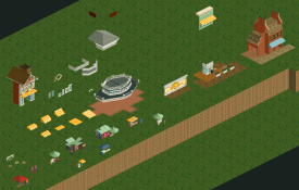
Let's talk about the map a little, if you're still with me! The origins of this project are grounded in the Building Challenges while dr dirt was managing them. One of the challenges was a series: one user builds a layout based on a vanilla pre-made coaster, next user did some macro planning, next user does some coaster detailing and theming, last user wraps up the map. Xtreme's Smooch Hour is also a result of this challenge, and there were several of us very optimistic of this series yielding quite a few submissions. I'm stoked that this one can continue the trend, and there is another one of these I intend to finish, too. For Glow Worm, Xtreme did the layout, alex did some macro planning for the area, and then I stepped in to do some coaster details and a little theming. Here's the play-by-play in screens:
I probably went overboard in my portion of the challenge, but I was pretty happy with what I had done and was interested to see the next builder wrap it up... but the day never came. I can't recall how the series ended or fizzled but it kind of just sat around. Keep in mind, Xtreme first posted the bare layout in April of 2022 (!).
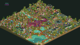
Fast forward to March of 2023 where I was bored one day and came across the save of what I did. No one had done anything with the map after asking alex, Otter, and others who were in the challenges. Played around a bit with the file and asked Xtreme if he wanted to tag along given he did the layout, and then we were off. It took a little time to settle into our dynamic that we found successful in Lemuria maybe, but that in part because we wanted to find that same vibe but bring it into the new meta and ground it a bit more in realism and a sense of place. We were free of the constraints from contests and able to take our time and go outside of the usual limits we found ourselves in. Speaking of limits, this is where the park was around the 200th saved game (out of just over 300 .park files):
As the park continued to develop, I felt trapped in some places. We didn't have to abide by a tile limit, and I am endless well of patience, so I expanded the map a few tiles. And then again. And I think one more time. Was Xtreme happy about this in the moment? Eh, maybe not. But the first thing other than the immediate coaster plot was the Boardwalk strip, and I was enamored with how much space it had to flourish. The parts where the now-rapids sits and the Haunted Manor didn't have similar luxuries. I knew the Haunted Manor needed to be pushed back, and if it's getting pushed back, it should be elevated. This meant adding a lot of real estate and in a way that was going to keep the map a nice square shape. As we made the expansions we found that with each and every time we were given the chance to let things breathe and have their own place while attempting to maintain a cohesion of such different areas. For me, it was incredibly liberating but yeah, meticulous. Throughout this project I have had the epiphany that patience is a parkmaker's greatest resource. You can have solid fundamentals and be good at architecture or be great at coasters, but you won't find your true potential in those skills if you don't have the patience to explore them. For all the times I joked about making the map bigger but then actually doing it, I know I was a pain to work with but I am beyond grateful for Xtreme and his patience with not only the project, but me. As time went on we knew more and more we had something cool here and wanted to do it right, so it became more and more obvious what changes we had to implement to find a successful vision anyway. So, thank you dude, for putting up with my bullshit from when it was 50x50 to now nearly like 68x68 or some shit, haha.
For everything else in the park at current, I myself am stoked to see you guys digging the little things. We poured ourselves into sightlines and macro of each area and adding fun scenes and making sure the architecture was showcased but felt settled and providing infrastructure to give the area a sense of place in a larger park and even just taking two literal days of adding the tiniest details like red/green lights for rapids boat dispatches or just a handyman unloading a box truck. There were hard days and easy days and days where we build a shit load or days we didn't do anything. There were days where a new object dropped like ACE's tables or ACE's signs where we spent sessions replacing old tables or old signs. Again, the patience. We didn't mind though because we had the time and found the fun in doing it because the end result was just so satisfying. And speaking of having time, I think I rambled enough and certainly want to let Xtreme share some things so here's some outtakes we had on the park's outskirts for quite awhile:
And lastly, here's a rough dot map of who did what. We each had a hand in basically everything. Even the stuff I did as part of the challenge Xtreme had gone in and made changes and vice versa. When we build we definitely build together on nearly everything, down to wrapping up someone's architecture or adding bushes to a planter they started in a previous session. alex's contribution was the overall initial planning, and we did set out to make sure it stayed so it's kind of cool to see the consistencies with his path layout and raised land "buildings" still being "there." So here's our best attempt:
Phew. *heavy breathing*
Good builders notes Steve, loved reading through that. As I've said before you guys should be seriously proud, it was the small touches for me that just hammered home how successful this park is.
Great work and awesome job to one of the sites best partnerships!
I haven't stopped looking at this park since it came out. It's everything I want out of this game.
That write-up is wonderful, Steve. Those meticulous decisions more than paid off as everything feels like it's been given the exact right amount of space and those slight elevation changes help to subtly highlight the attractions even more.
I get that the coaster is a slightly odd choice to anchor such a highly themed map, but with those colours and the addition of the new inversion it's clear you've considered that and made moves to elevate it. If anything, it makes me appreciate the map even more to see so much care given to a ride type that usually isn't made the star. It kind of reminds me of San Avaiki in that way. Even though the rest of the rides are big-budget beauties, they're built at the perfect scale so that they never dominate the map.
The rapids are so intricately designed that the map cutoff hardly bothers me (the track layering on the turnaround before the drop is so good ahhh). The path details are perfect and add so much life. The backstage areas are nestled into the map so neatly while being expertly hidden from peep view. I do wonder what the larger park layout would look like with the number of backstage areas surrounded by path on multiple sides. Seems like you'd have to do a lot of tricks to obscure so many access roads from park view. That hardly takes away from my enjoyment though, if my high vote didn't already make that clear.
You two are such a dream-duo, I'm so thankful you found each other xoxo