Park / 2 8 1 4 - Birth of a New Day
-
 18-February 24
- Views 1,939
- Downloads 82
- Fans 6
- Comments 13
-

-
 78.50%(required: 65%) Design
In:Cities 90% Terry Inferno 90% ottersalad 85% Mulpje 80% pants 80% RWE 80% chorkiel 75% CoasterCreator9 75% G Force 75% Xtreme97 75% posix 70% Recurious 70% 78.50% -
Description
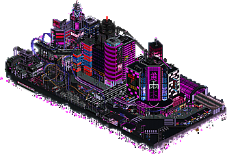
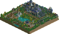
Inspired by the album cover, we hope you enjoy this interpretation of a futuristic cityscape.
-
6 fans Fans of this park
-
Full-Size Map
-
Download Park
82
-
Objects
3
-
Tags
This is one of my favorite pieces of rct ever, right up there with Belle Isle. Obviously so different, so there's zero comparison. But man, this style and vibe is just so great.
Incredible aesthetics, beautiful colors, great composition, and fun humor throughout. The tricks throughout this map are so impressive. No clue how to do it at all haha. The half diagonal building, the gradient lights, the skyscrapers only visible from one angle, the wild coaster layout, liam jacking off in a box, the slums, neon signage. Just insanity throughout.
The fact that you guys managed to pack this much content into a map like this is insane. Especially since it's not using custom scenery.
This would crush in a H2H round, no doubt.
Love you
Very unique - palette is very cool. The dueling coaster was a real treat. Certain parts left me wanting more - I feel like you could've gone even farther with the custom neon signs.. they were all so cool! Congrats on an amazing little park, guys.
what an atmosphere, amazing work. I do agree with Otter in that some areas felt incredibly detailed, yet others could have used a bit more sauce, like the area around and including the train tracks in my opinion.
I was totally surprised with this. As said by Josh the aesthetics are amazing, really appreciating how you did all the colors. I also really enjoyed all the little details throughout, something we don't see that often on this level at DKSO maps.
Also technically this elevated DKSO on a completely different level. I've looked at it for quite some time now and i still couldn't figure out all of the neat tricks you did. The coaster layout was a true gem too.
To conclude i feel like definitely looking at parkmaker level stuff here. You can be really proud of this. Definitely looking forward what you'll come up next. Please sign up for H2H if it happens, i would be really curious to see what amazing stuff you guys would do in there.
Atmosphere and architecture are great, some amazing use of DKSO. Tons of stuff to explore and hidden stuff around the map, also like the overall map presentation with the color background and the way the map edges are done.
And the main coaster has great timing and is a ton of fun to watch.
@Josh - thanks for the lovely review good sir! I'm glad you enjoyed it so much, you certainly summed up a lot of the reasons we had fun building it.
@otter - appreciate it! I think signage was a big part of what we wanted to accomplish, but may have shot ourselves in the foot using a different language haha. That being said I think we were happy with the ones we were able to come up with
@suormot - appreciate the feedback! I think the section of the map you mentioned was one of the last to be filled in, so maybe we were running on fumes haha. That being said I think the BMX park was one of the coolest details of the whole thing.
@RWE - thanks for the kind words! I think some of us are definitely considering signing up, and it's good for us to know that we are producing quality work under a time constraint.
@posix - very interesting feedback; a lot of things I haven't considered. I think it's interesting to see the different mindset people have when playing the game. While it may be gimmicky, the premise of the contest (create your own ride) lead us to really lean into it, although I know what you mean otherwise. I think it can be a fun way to play, and in NCSO (or adjacent) playstyles, it can be really important to progress the overall standard of the genre. Oddly enough, visual noise and light pollution were some of the themes we were trying to incorporate, but I think a lot of the other points are good food for thought on parks purpose built for NE.
Wanted to leave a comment on this park considering how much debate this park stirred on discord. Especially regarding accusations of bias against the dkmp build style (not by the authors of this park mind you, which didn't mind the score). I personally find these accusations a bit hilarious considering I was one of the low votes on this park and usually I vote relatively high on DKMP style parks.
So let me explain my vote. First of all I want to say that my vote of 70% is not a bad score at all. 70% is pretty good, it means I actually quite liked this park. Because I actually did quite like this park. It's pretty good. I just don't think it is quite on the level of 80%+ work. Why is that?
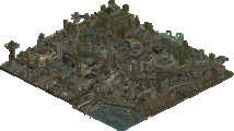
I very much agree with Posix's sentiment of many hot and cold moments being present in this park. While the park is quite good, there is not a lot of consistency. Some buildings look quite nice while others are relatively bland. I also think that this park relies quite heavily on its palette and gimmicks to achieve a wow effect. However, when you look at the park a bit longer and you are over the initial wow moment and really look critically at what is there it doesn't quite come together for me.
A perfect example of this would be that half diagonal building. When you see it initially you are like: "wow that is cool!" And it is, it's a super clever trick. But if you stare at it for a while you realise it's just a box that has no detailling whatsoever that completely relies on the gimmick of being half diagonal. That is fine for 70% work, but if you want 80% work or higher, I expect more.
A similar thing also happens for other buildings, some of them are just boxes that are kind of carried by the cyberpunk palette. This is a gripe which I have with a lot of cyberpunk parks (not just this one). The palette is used as an excuse to hide sloppy parkmaking; the palette makes things looks colorful and nice, but if you really analyse what you are looking at you realise that there is not a lot of substance to it.
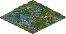
Furthermore, others praised this park for the great composition, but I disagree. This is a design submission, but from half the angles you can barely even see the coaster. I think this is something where this park is actually hurt a bit by the NE categories, as it doesn't really fit well in either. So this is not really the builders fault, but it is just something I noticed.
Okay, enough negativity. Like I said in the beginning of my post, I mostly really liked this park so lets end on a positive note. What were the things that I liked:
- Even though I was complaining about this park leaning on gimmicks too much earlier, I did really enjoy the gimmicks. The half diagonal building trick is very clever. I also loved the signage and thought the way you guys made the larger letters was pretty clever (although we have seen this in other parks also), the coasters on both side of the track, all are pretty neat!
- The street level archy had many moments of brilliance, especially the smaller buildings and the shops are really well done. A personal highlight for me.
- The coaster layout, while I am not completely sold on it, has some cool moments too. I especially like the final moment where the two tracks go over the water and you have the zero G roll through the corkscrew.
- The trick with the trees to make the map edge fade is pretty clever. I liked that.
- The octopus statue was cleverly made.
So yea, I hope I wasn't too negative in this review. Like I said, overall I really liked this park and I would love to see more from you guys. In this particular instance I just thought that the park relied a bit too much on gimmicks and I thought the quality wasn't consistent enough to really make it elite.
Sephiroth Fan Offline
A number of years ago, a user by the name of RMM said something along the lines of:
"... the community keeps asking for people to create and submit something different than the styles we've seen over and over at NE. And then when they do submit something different, the community finds they'd prefer that the submission was actually more like what they've seen before..."
That's not an exact quote because quite honestly I couldn't find it. Details. The point still stands.
This park just oozes atmosphere. It's different. It's bold. It's in-your-face and unrelenting, as well as completely unapologetic about it's style and conventions. It's a shared-track dueling/racing rollercoaster that also sometimes doesn't share the track but also is packed into a bustling downtown and damn does this place feel alive.
This submission has style in spades. It's a bit of an adjustment when I open it on my machine but I was just smiling like an idiot the whole time. I some people saying the architecture felt repetitive or not really individual from the pieces next to them. I guess I just disagree.
Over in Discord Josh said that this park delivered on what it tried to achieve, and I'd agree.
Stick to you principles and build more stuff like this please. Preferably on a bigger map.
This park is definitely unique, in a very cool way. Josh was right when he said the aesthetics were great. I also loved the coasters sharing pieces of their track with eachother.
733737 Offline
In a parallel timeline where Chris Sawyer's masterpiece did not include the option to import new scenery objects into the game, but someone eventually found a way to make all of the existing ones colorable, RCT would look much different. What we refer to as "DKSO" would be the dominant way of building, and for maps of this particular size, this would be the equivalent of a Tubiao or a Stardust Jubilee.
In this particular timeline where limiting scenery to recolorable vanilla and expansion objects is a niche building approach, this could very well be the most impressive map ever created within that stylistic approach. What is most impressive to me about it is that it does not ever feel as though it is limited in its construction, nor does the object usage ever feel like a compromise. You created a lifelike cityscape--one of my favorites ever built in RCT--and you did it all without using quarter-tile CS but in a way where you don't even notice that unless you're actually looking for it. It has treadmills and weight bars. It has animated billboards. It even has a humble octopus enjoying the company of a pleasant dildo. All of these details are executed with immaculate clarity, and at no point does the object usage feel limited either on the micro or the macro scale. I've seen glimpses of such object mastery in previous DKSO releases, but this is the first of such maps where it is apparent throughout.
Asian urban crunch is certainly not new to RCT2, but a rendition using these objects pulled off so successfully is revolutionary in its own regard. Bangkok Dynamo is clearly influential from the ride nomenclature, but certain scenes like the marketplace in the corner also could draw comparisons to Fujin or Tubiao. You've fit Antarctica pipes into a context where they just fit. You've used a bunch of different wall types from completely different world styles that are normally too specific for most buildings and stuck them all together into one corner in a way that feels relatable without feeling like a compromise. Ultimately, you've created a work of art where the limitations no longer feel like constraints, and this is a fundamental quality of a master builder.
What could you have taken further here? Not much in the overall construction, but there could have been a few extra touches to make the scene feel even more alive. For a bustling city where everything is moving, the empty streets are just a little bit strange. The pirate named Fuzz might have the world's easiest job if there are never any vehicles on the road. The elevated highways would have especially benefited from more motion, as the middle of the map from the back angle feels unusually static in the areas where guests do not walk. Only other suggestion I have is to put a few more items on the lighter gray path areas to offset the rectangularity, but a light touch would have been best here anyway since these sections provide necessary negative space as well.
This is one of those maps that, as Recurious noted, doesn't quite fit into either existing accolade category. As a Design, it is unusual in the sense that the coaster is not really the focal point of the map but rather plays a very strong supporting role much like the single rail gambling coasters do in Stardust Jubilee. Often I take this into consideration when I vote, as Designs typically place more emphasis on the coaster, but I made an exception this time because I would have given it 90 as a Gold anyway. I'm not sure if it would have ultimately scored higher as a Gold, but to me it is up there with some of the best H2H maps in recent years in its ingenuity, crunch, thematic execution, and overall cohesiveness.
I don't have anything special to say but I'll give my two cents. I like the shared track duelers, an idea I'm guessing you got from FK. If someone did it before him, enlighten me because I'd be glad to see it. Neat colors and I really liked the coaster layout in general and the architecture is ambitious. Congrats on getting a design!