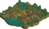
Park / [NEDC6] Wellspring Gardener
-
 28-April 25
- Views 0
- Downloads 70
- Fans 1
- Comments 29
![Park_6128 [NEDC6] Wellspring Gardener](https://www.nedesigns.com/uploads/parks/6128/aerialm6379.png)
-
![Park_6128_[NEDC6] Wellspring Gardener](https://www.nedesigns.com/uploads/parks/6128/logot.png)
-
 68.50%(required: 65%) Design
SSSammy 80% CoasterCreator9 75% pants 75% RWE 75% Recurious 70% RobDedede 70% chorkiel 65% deanosrs 65% posix 65% Turtle 65% J K 60% Terry Inferno 60% 68.50% -
Description
In an otherwise harsh landscape, an ancient unfailing spring allows plant life and a fortified settlement to thrive.
The residents have built a steel thrill machine to attract even more trade and tourism from other distant towns and settlements. -
1 fan Fans of this park
-
Full-Size Map
-
Download Park
70
-
Objects
1
-
Tags
![park_6122 [NEDC6] Farewell, For Worse Until Someday - 2025](https://www.nedesigns.com/uploads/parks/6122/aerialt6377.png)
![park_6136 [NEDC6] Gaudi Gardens](https://www.nedesigns.com/uploads/parks/6136/aerialt6370.png)
![park_6135 [NEDC6] Unfriendly Invader](https://www.nedesigns.com/uploads/parks/6135/aerialt6375.png)
![park_6118 [NEDC6] Valley of Huanglong](https://www.nedesigns.com/uploads/parks/6118/aerialt6364.png)
Wellspring Gardener is yet another fantastic submission that captures the timeless charm of classic RCT style—arguably one of your strongest maps to date Lurker! The medieval theme and architecture are beautifully executed, with a cohesive color scheme that works well thanks to the thoughtful placement of colorful buildings and foliage throughout. The custom support work, especially the arched supports on the lift hill, adds an extra layer of polish and creativity to an already impressive map. Nice job!
Lovely entry that has charming written all over it. You keep elevating your own style and we're all up for it! I like the chosen coaster colors, green-yellow is such a good combo and always works. Lovely supporting also.
I like the emphasis on the rich city and poor outside.
This is nice lurker! Your denseness and style translated well with the use of CSO objects here - its like your sense of building never translates far away from LL which is a strength of how you build that I thoroughly enjoy.
Enjoyed this entry a lot. Charm factor to the max and the classic Lurker warm-fuzzy of embracing the game's OG aesthetic. I like all the little details you managed to get in and some of the design elements like the Ferris wheel. There is also a unique blend between an LL style of architecture with elements of PT2 quarter tile detailing, gave this it's own bit of flavor. Congrats on the release, always a treat.
wouldn't be an NE contest in the 2020's without a lurker entry! i don't have rct1 textures so my viewing is slightly compromised, i do have to say i prefer the brown castle texture to the grey one tho. at first i thought this was basically an LL in open build but i started catching all the custom scenery uses. with open making true LL less and less viable this style seems to do a good job of capturing the feel of LL with the base land heavy archy. also feels like you're taking cues from more pt2 era rct2 builders with some of the path detailing/landscaping. the arch wall flower overhangs feel particularly tasteful. supports are very much aki approved, quartered capped pipe 4 life. kinda wish you'd used the square base blocks for footers too but i am willing to overlook this with how pretty everything else is.
-Concept: **
Interesting concept, just wished the spring component was elaborated a bit more upon. Now it's just a tiny fountain which is empowering a whole civilisation.
-Content: **
Quite a lot of content with the little town setting, the rides scattered throughout the park and all the landscaping.
-Quality: **
I think this is the highest quality LL content I've seen from you Lurker. Love all the little details on the buildings and the lush foliage job combined with some newer cso objects to give it some nice subtle detailing here and there. (even some new ZT animal entertainers )
)
Overall;
I love how you combined traditional LL parkmaking and injected some fresh fitting CSO objects here and there to spice it up. The coaster sits beautifully centred in the middle of the spring/river bit as well.
Also shout-out to the little peep scenes scattered throughout the map, that stuck well with you from past H2H
What to say except he's a machine? Lurker doing what he does best. Congrats on your highest accolade score so far!
+ Hard to hate a retro-style Lurker park. Even with some newer CSO popping up here and there, it definitely has a really nice classic vibe.
+ Middle section is my favorite. Gorgeous landscaping and a very nice lesser-traveled path tying it together. The wooden building with the lookout area next to it is so nice.
+ Also a fan of the grungy entrance area. Really great way to set the narrative with the coaster watering an otherwise barren and dry area.
+ Support work was neat! Relieving seeing Pro Tour-style supports still being done in the big 25.
+ I like the little farm area with the flat rides and the animals. ZT entertainers putting in work.
+ The Ferris Wheel looking like part of the coaster from the main view is a really neat optical illusion.
- Coaster doesn't feel crazy integrated into its surroundings.
- Some parts like the main village do feel a little cluttered and noisy. Reducing the variety of building colors (especially those that get mushed up with the path) and adding some more open space and plazas could help with this.
Nice entry and enjoyed my time looking around. The style (for me) is not one that I would try to emulate as I prefer are more open feel to it and this seems a bit cramped for my tastes. That's not to say its bad, its just not for me. That said, I really like the water area under the corkscrew and the color of the water. I may have to look at that palate for my project. I also like your take on the support work especially around the lift hill. Overall, nice entry and congrats on completing it.
Big fan of this entry, Lurker! I'm such a sucker for your style, and this map feels like a real elevation.
Though the scale of your work is pretty tight, the detailing feels perfectly calibrated, giving it a diorama feel rather than an overstuffed-RCT feel. The difference between what's within the fortress walls and what's outside is so distinct. The land outside gives such a nice (and well observed!) border to the map.
The colours are so tastefully chosen and the landscape is so subtly complex. In particular, the reds and greens in the town square really add character and help break up the uniformity of style.
I still can't believe how you're able to pump these submissions out with such consistency. A part of me longs to see how you could apply your technique to the new meta, but for now, your style has really cast a spell on me.