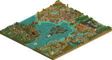
Park / [NEDC6] Cerulean Breeze
-
 27-April 25
- Views 810
- Downloads 174
- Fans 1
- Comments 31
![Park_6138 [NEDC6] Cerulean Breeze](https://www.nedesigns.com/uploads/parks/6138/aerialm6374.png)
-
![Park_6138_[NEDC6] Cerulean Breeze](https://www.nedesigns.com/uploads/parks/6138/logot.png)
-
 67.00%(required: 65%) Design
Recurious 80% deanosrs 75% SSSammy 75% CoasterCreator9 70% J K 70% RWE 70% posix 65% Terry Inferno 65% chorkiel 60% pants 60% RobDedede 60% Turtle 60% 67.00% -
1 fan Fans of this park
-
Full-Size Map
-
Download Park
174
-
Objects
2
-
Tags
Similar Parks
-
Lake of Lost Worlds
-
Violet Gardens
-
Scream
-
[NEDC6] Unfriendly Invader
![park_6135 [NEDC6] Unfriendly Invader](https://www.nedesigns.com/uploads/parks/6135/aerialt6375.png)
-
[NEDC6] Farewell, For Worse Until Someday - 2025
![park_6122 [NEDC6] Farewell, For Worse Until Someday - 2025](https://www.nedesigns.com/uploads/parks/6122/aerialt6377.png)
-
[NEDC6] Paint the Town Blue
![park_6139 [NEDC6] Paint the Town Blue](https://www.nedesigns.com/uploads/parks/6139/aerialt6373.png)
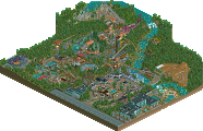
The first Design Winner of the contest, and your first solo accolade in 14 years, since the well remembered Tempest that won you NE Parkmaker status back then Milo. Congratulations.
Was very excited to see RCT2 work from you, Milo! I really loved the coaster color choices and the old-school vibe running through the map. The theming is simple but very effective, and I really appreciated how the empty spaces were used intentionally to give the map room to breathe. While Cerulean Breeze definitely struggles to keep up with the standards of the modern meta in some aspects, it’s still a solid and charming release that absolutely deserved its design win. Great work!
Oh jeez another PT2 style park! Bringing the classic back and in style!
+ Coaster colours were great, support work was stellar
+ Gif Posters beware was pretty funny and probably a new meme about to happen
+ The tarmac section under the cobra roll was great! So simple but I really appreciated it breaking things up.
+ Landscaping and foliage were on the money, elements of this whole design reminded me of Titans work at times.
+ The queue through the heart of the coaster was great, a lot to like and would be so exciting for the guests.
+ Coaster station was great, classic in approach but a few newer tweaks like the void area on the chain return
-I just wanted a bit more archy around the map, and some more supporting rides to take that score much higher. Still a park of this style but bigger would be great to see! Just crack that archy and we'd be seeing a PT2 style spotlight imo.
70%
Charming, classic feel about this one. It’s fun seeing the use of older objects and building styles merged with newer techniques. Landscaping and foliage really popped for me with this one. I really appreciate the coaster being the focal point; more of a traditional Design feel. 70%
Really cool stuff here. Love the colors first off - bold and bright. The workbench was a fun choice too. The coaster is really well done... cool station, big chunky supports.. and an AMAZING queue! Love it.
I think where this map shines is with the unique architecture.. really fun style.
Only thing that perhaps I would've liked to have seen done differently was the big hillside with the waterfalls. It provides a wonderful scene from the queue, but then the coaster doesn't interact with anything similar. Rather would've seen more landscaping as opposed to the grass field with Lawnmower Man 1.
Nitpick aside, this is a very tasteful design. Well done sir!
Milo my dude. So glad to see you submit something. I'm a huge fan of your recent RCT2 work and this is no different.
+ Landscaping takes the cake for me. Love the top section with the rockwork. PT2 foliage mixed with invisible flowers and CHE swaying trees and grass looks really good. Palm trees extending through holes in the paths and down onto the sand is such a cool idea.
+ Archi feels very classic. I'm gonna have to steal the back-to-back canvas awnings.
+ Coaster has some great interactions, especially with the diagonal zero-G roll and the cobra roll.
- Back section near the end of the layout feels a little empty, especially the fenced-in area where the lawnmower man is. I really appreciated your use of negative space in The Lily Temple, but this feels a bit too much at times. Some frozen mowed grass land may have helped.
- Some objects must have glitched out before you saved. The towers with the House - MT objects at the top are made of glitchy grass objects with unfinished-looking black supports peeking through.
- Dark brown footpath isn't exactly singing to me. I think the vanilla dirt path may have blended in a little more naturally instead of creating a lot of extra contrast.
? Where the hell is that waterfall at the top coming from?!
It's funny that your last design was 14 years ago... this submission is definitely emblematic of the past but with some modern scenery choices.
Compositionally, this is great. I love how there are messy, detailed areas like the haunted house and spider's nest, as well as extremely clean areas like the open grass fields. The placement of the foliage and rockwork is perfect.
If I had to nitpick... I wasn't a fan of the zig-zag fences, I know this is going for a classic look but diagonals would've looked a lot better. The wind-swaying foliage was also a good fit for the theme but seeing moving plants next to static plants looked a little jarring.
As for the coaster itself, it has some amazing interactions with the queue line and the dodgems. I also might be in the minority here but I much prefer those old-school, capped pipe supports over the much thinner newer ones. They look very nice here.
Overall, this is a great entry, the architecture and object choices are all very nice, this has a perfect blend of detail and negative space, and I love the pastel color scheme. This is the quintessential "classic" design.
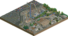
Excited to see a Milo entry on the list, and as expected there is a tasteful classic approach. In a confusing moment, the park opens up in a pretty unappealing way which accents the low moments of this entry. Broadly, I would encourage builders not to split their paths longways. There’s really never a good reason to do it as it robs you of the opportunity to properly contextualise the vivisected path. Including the other side of the path and allowing the peeps to walk on it would have done wonders.
Additionally the random fences in the otherwise serene field do little to contribute to the atmosphere, especially when not a few paces around the corner you have context-specific fences which nail what you need them to do. The concrete texture, as well, does more harm than good. I think replacing all of it with dirt path would have done wonders for its integration while still allowing you that realistic note you were going for. The concrete beneath the cobra roll should be a capital offence. In my initial viewing of the park I replaced it with sand and it looked fifty bajillion times better, and required far less contrivance. Truly a baffling moment.
I’m glad I can get the roasts out of the way quickly, as the rest of this entry was so appealing for me. The moment we hit the steps out of the vivisected path the quality goes from “why” to “of course”. I believe the main viewing angle of this entry is “Inside L”, where we look into the turn of the predrop over the cobra roll. There is, of course, a queue over the top of the cobra roll entrance and exit track. The layout is really well staged within the landscape which gives the ride a great sense of “inevitability” - the ride has no choice to dip in this moment and leap in another, as the landscaping has provided no other option.
I think the greatest moment of this particular interpretation for me was the queue which out-and-backs beneath the loop, framed alongside the waterfall and dive loop. That would be such an outstanding experience for the guest to enter into this secluded moment and look up at the loop. The diveloop over the sand is a great moment of framing and contrast.
The choices of colours and textures in this entry are outstanding. They contribute to the strength of the simplicity of the 2005 era design decisions. There are no real stand-out moments of architecture etc, but a very strong pattern of decisions which make for a delightful experience.
I think the biggest remaining roast of this park is a broad macro decision. You simply don’t need the lower path, the one which has the “gif posters beware” sign (lol). In my initial reaction video I delete that entire patch of footpath and the balance of the map immediately goes through the roof. I think if you had had another ride down there to balance it out, or perhaps another entry to the map, the footpath would be less of an issue, but as it stands replacing that footpath with some of the excellent landscaping exemplified on the top of the park would have done you a world of favours.
Which I suppose leads me into the landscaping. Who on earth needs modern landscaping innovations when we can have this. Outstanding work Milo, that top edge around to where the “unnecessary” bottom path begins is chef's kiss.
I think the simplest thing that would have heightened this entry would have been more significant supporting rides. Imagine this entry, except with a splash boats that interacts with the coaster. Need I say more?
All in all, a very appealing submission. I very much want to see you build more in this style, as you will always have an audience member in me.
Score: 75%, with great expectation
Watch my initial reactions here!
I've always liked the PT2 look so I love seeing it enhanced with modern objects like this. Support work is nice, really like how the PT objects are used there, very heavy and solid looking.
I really like how the rockwork is done here, the mix of base land and the 1/4 pieces works really well, especially with how they transition smoothly from fulltile to the 1/4 work around the waterfalls, the foliage also complements it well.
Also, love how the base game haunted house is decorated. Definitely hope we see more work in this style in the future, especially a full sized park.
Great to see another oldskool inspired entry. Bold color choice for the coaster but I do like it. Really love the landscaping and the foliage.
Cool open-air station and overall lovely nostalgic archy. Really love the interaction with the queue entrance next to the cobra roll and the queue swirling beneath the coaster.
This entry was amazingly charming and really well constructed overall. You really integrated the coaster into the map well. I love all of the interaction that you achieved with the landscape, buildings, paths, and the supporting ride. The macro is also pretty well done. I also love the atmosphere and colours.
Foliage and Landscaping: The foliage is done very well in most areas of the park. The foliage by the rocky river area of the map is fantastic. I also really like your use of the swaying foliage objects to add movement to the map even in more dry areas. The foliage does look a bit rushed in some areas, especially around the map edges. I also really liked the lack of foliage in some areas. This area right here is an absolutely amazing scene and I love that you gave everything a chance to breath with the open space.
This strategy didn't work everywhere on the map for me though. I think this area by the park entrance/end of the coaster queue is a little bit too open and looks a tad unfinished.
The rockwork was pretty well done throughout the park. I love how the rocks span over top of the pathways in certain spots. The entire river area is just really well done full through. I really like the use of the default land texture and the 1/4 tile land blocks. really gives this entire project that classic feel.
Architecture: High point for me on this entry. Everything was really well built and felt so classic. I absolutely love your choice to have the station being open. This scene is wonderful
I also love how you have so many little roofs jetting out from buildings and going over top of pathways. I was really impressed by all of the structures on this map.
Everything Else: I love the use of default paths, again makes this map feel very classic and shows that you don't need to go with the meta to make a quality release. The colours throughout are fantastic. I love the support work on the coaster and the vibrant coaster colours add a lot to the atmosphere.
Overall: I'm glad that this park was awarded design. I really enjoyed checking out this release and I hope that you release more work like this in the future! I rated this 65%.
It is certainly cool to see an old-school PT2-style entry, and always nice to see CHE’s swaying grass and tree objects. Despite some misplaced waterfall objects, the landscaping toward the back half of the map is superb in how understated it is, which I love. Generally, the old-fashioned NE style, minimalist architecture is interesting in spots, but also felt underbaked in others. That factor, along with the majority of the paths being extraordinarily wide, as well as the landscaping toward the “built-up” side of the map being clearly quite hastily completed, made me land on a score just below the design threshold. Frankly, for a style and park layout this minimal and dated, I would have needed to see it executed to perfection to award it a design score. That is not to say the “cap” was 65 just because this map was PT2. Rather, the PT2 element of it, combined with the overall minimalist nature of this particular map, just didn’t hold my attention as long as some of the other entries, despite the fact that it was pretty good and very relaxing.
Really liked the old school aesthetic. I reckon this is also somewhat of a speedbuild? It's quite good. One of the bigger downsides of the map for me was that the coaster didn't really feel like an integral part of the map. It's pretty much put in the backdrop with only some landscaping behind it and mostly only visible by guests in the queues of the coaster and Offspring. The spring cleaning ride was one of my favorite things on the map. Clever take on the haunted house ride
I liked this entry, it felt like a great theme with nice colors. The bright tropical theme was excellent, foliage and landscaping too. Felt like a callback to PT2 vibes, slightly simplistic when compared to a couple of the other entries but good stuff. My initial notes were: X250 could have made this.
Great to see new Milo work! Enjoyed this a lot, really appreciate the choice to go with a classic PT2 style that you've emulated beautifully, yet with the occasional anachronistic choice that produces a more modern blend - swaying tree objects, pennants flapping in the wind, invisible gardens creating a faint "crunch" effect. Together they speak to a choice for a more laid back building approach, less motivated by a desire for era-specific authenticity so much as by the efficiency and familiarity it brings.
The atmosphere could appropriately be described as "breezy" with the Gentle Style music and spirited coaster colours. You've made good use of the layout with nice framing for the first elements against the superb landscaping and interwoven queue, and sinking the cobra roll into a valley hemmed in by the surrounding pathways and rides (though I must agree with Sam about the grey tarmac use here feeling out of place). I'm also fond of the wedge-pattern found in the dotted umbrellas, and similarly in the directional signs.
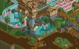
Love this moment of tranquil landscaping besides the coaster station:
This was my favourite of the submissions released so far (14-10). Great use of "normal" landscaping, and nice blend of old school and newer objects. Great job!