Park / [NEDC6] The Cartographer
-
 10-May 25
- Views 0
- Downloads 89
- Fans 12
- Comments 26
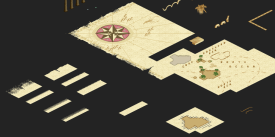
![Park_6140 [NEDC6] The Cartographer](https://www.nedesigns.com/uploads/parks/6140/aerialm6372.png)
-
![Park_6140_[NEDC6] The Cartographer](https://www.nedesigns.com/uploads/parks/6140/logot.png)
-
 90.50%(required: 65%) Design
chorkiel 100% CoasterCreator9 95% Terry Inferno 95% Turtle 95% J K 90% pants 90% RobDedede 90% RWE 90% SSSammy 90% deanosrs 85% posix 85% Recurious 85% 90.50% -
12 fans Fans of this park
-
Full-Size Map
-
Download Park
89
-
Objects
1
-
Tags
![park_6118 [NEDC6] Valley of Huanglong](https://www.nedesigns.com/uploads/parks/6118/aerialt6364.png)
![park_6119 [NEDC6] Hydrocelestis - The Ocean of the Stars](https://www.nedesigns.com/uploads/parks/6119/aerialt6365.png)
![park_6135 [NEDC6] Unfriendly Invader](https://www.nedesigns.com/uploads/parks/6135/aerialt6375.png)
![park_6122 [NEDC6] Farewell, For Worse Until Someday - 2025](https://www.nedesigns.com/uploads/parks/6122/aerialt6377.png)
![park_6136 [NEDC6] Gaudi Gardens](https://www.nedesigns.com/uploads/parks/6136/aerialt6370.png)
From 2011 to now, you just might be NE's greatest success story. No other parkmaker has gone from 10% accolade scores and the dreaded atrocious work tag to shattering the 90% barrier and winning Elite Parkmaker while being an admin! Your style has recently been defined by crunchy photorealism juxtaposed with game-breaking artistic concepts. It couldn't be more true here, as this ancient treasure map explodes into lively tropical locales. I die for these kind of concepts executed to this level. I think this is my favorite design of the contest, just by a hair over barnNID's.
+ The treasure map is insane. Such a clever usage of so many different objects that lend to a seamless aesthetic. The cel-shaded islands, mini sea serpent, compasses, and sextant really take it over the top. I also love how the edge is tattered and torn, lending to its authenticity. Reminds me a lot of that coaster brochure I did for that building challenge almost four years ago now.
+ Unbelievable archi. Absolutely love the fades on the fortress. La Baia is such a cozy little cove with all the colorful Colonial buildings.
+ Best coaster integration of the entire contest. Whether snaking over wooden paths or diving under rock arches, it really does feel like it's supposed to be there.
+ Supporting rides all play their part and have a unique identity. The Dancing Dragon is one of the more inventive flat rides I've seen in recent times. Incredible use of CTRs.
+ Landscaping is insane on all fronts. Highlight is absolutely the towering cliffs and waterfalls that form a dramatic backdrop for the first drop and loop. Zooming in, black lilypads as rocks is such an interesting object choice.
+ I can't get over how the sea serpents have a consistent design throughout. Great little detail that really makes this map feel like its own world.
? For some reason I'm not entirely crazy on the black rocks. I played with a few other colors but nothing else seems to click. I almost feel like it should have been a very dark gray, just a smidgen lighter than the black that made it into the release. Not a huge deal though, and I do appreciate the way the black contrasts against the rest of the map. Almost feels like a blank space dividing the two halves of the map.
- Should've nixed the Summer style music on Espresso Spin. It creates a lot of musical clutter as Mystic Style is still audible from La Baia.
- I kinda wish the log flume's drops were a bit more of a moment! They barely poke out from the back of the map and the splashdowns are completely hidden. It's hard to notice much of the ride outside of the moments where it travels by map.
I'm going to be honest... the name of this reminds me of Halo. But really though, this is an awesome theme and a well-deserved elite parkmaker status.
Of every map in the contest, this has the best map edge; possibly of any park ever. The crumbling paper effect is really cool and provides some nice negative space, but seeing all the details in it, like that faint drawing of a squid in the paper... it's just so nice and convincing. And the transition to the actual park is almost seamless. Then I rotated the map and there's a caliper on the other side. It's all just so cool.
I also think this may have some of the best uses of half diagonals that I have ever seen; oftentimes they look flat but they make the castle walls look round here. There's honestly a lot here that catches my attention: the usage of custom cars like the dragon head and sailboat on the swing ride is really cool. There's some very creative scenery use, like the argonath bird being used as dragon wings.
On the macro level, I think this is composed almost perfectly, as there are very few blocked angles or cluttered spots. Overall, it's easy to see why this has placed as high as it has. If I could, I would nominate the map border of this as 'best idea' in the NE awards.
This map is fantastic, i absolutely love the composition here. From the zoomed out view this is (to me) by far the most visually appealing map of the contest.
The color choices are superb, everything feels clear and readable and the beige map edge gives an awesome outline to everything while also highlighting the "gimmick" so to speak of the entry. Usually not a fan of "paper thin" (hehe) map edges, but here it works absolutely wonderfully. Easily the best map edge ive ever seen.
I do wish the map gimmick would reach a bit further into the park itself too, since its mostly around the edges minus the symbolism in the center square i suppose, but thats an absolutely tiny nitpick. Also agree with what others have mentioned with the music and the flume drop, but i dont want to dwell on that, since overall this map is nearly perfect for me. Super impressed with what you have created here.
Congratulations on elite parkmaker Xtreme and on a really close top 2 finish too! The top 2 of the contest really was a toss up for me too, i couldve seen it either way. Looking forward to more work from you!
-Concept: ***
I thought I saw the best map border with Jaguar's entry, but this definitely takes the crown! The map border basically sets the whole concept, and you've done it with so much creativity and detail, just wow!
-Content: ***
I think I've spend the most time in this park, checking out all the little intricate details, scenes, rides, architecture and landscaping you've put on the map.
-Quality: ***
Highest quality park of the contest imo; all the gradients, crunch and colours used throughout are immaculate.
Overall;
Wow, what a piece of art again! The way you've done the map border, and integrated all the landscaping around the architecture and coaster are of such high quality.
Best thing I've found was the way you've done all the gradients, both on the landscaping and architecture. Even the underwater parts have gradients or darker bits indicating some lower laying areas.
Also really dig the pathing details, such as the star, the crunch at the beach area, and the variation on the paths in the town area.
The way you've themed all the rides are also amazing to see; the canopies around the Dancing Dragon, the curves used on Espresso Spin, the way Voyage of the Seven Seas travels through the map border and landscape and the diagonal construction of the Banana Boat.
The little town area also is beautifully done with the fountain sitting in the middle and some nice foliage variations/combos in there. Great vibrant colors on the architecture and those blend in well with the brown/sandy colors..
The waterfalls are like chef's kiss here, always love some good waterfalls and these are seamlessly injected into the landscape creating nice splashes of freshness throughout.
Amazing color palette btw, really makes this whole piece pop!
Thanks for creating this for us Xtreme, and although it came in second, it feels like a winner as well to me.
This is such a gorgeous entry/design. Its just so well balanced. The map edge is perfect for this and what really sells the theme concept. Its like a 3 dimensional map.
I loved the castle with the slightly darker bricks at the base. it took me a while to figure out how you did that.
The support work is top notch and amazed how you got it all in and still have all the other detail around them.
The village in the back is so quaint and beautiful/ It has the perfect balance of micro detail that has a purpose yet not overwhelming.
Love the use of the black rock work and really helps define the different areas.
But perhaps my favorite aspect/item is the pathing for the queue. Its just sooooo good. I wish the peeps could handle a sweeping corner better though.
Congrats on the Elite Parkemaker title. Well deserved.
In my eyes, this was the winner of the contest, although it was super close between this and barn's entry.
A lot of that is personal theme preference, this kind of thing (historical, heavy landscaping) is where I'm most happy in RCT.
But it's executed so well. This is perhaps the ideal half diagonal object usage - splashed in so you don't notice it really, but just totally breaking the isometric weirdness that's otherwise present in the game.
I know it feels a strange thing to praise, but in the 10 minutes I spent exploring an NEDC entry, the thing I couldn't get close to solving was how to get interactions between the coaster and the rest of the park. Here the top 3 entries set themselves apart - the walkways between the turnaround after the cobra roll and how that element sits the other side of the castle walls is top tier.
The colors are epic, just really bold yet effortless. Splashes of fun on a great aqua/brick palette, with the dark rocks really setting the theme.
The map edge too is just class. The different look and how it's torn and faded on the edge is just really good.
Finally coming around to a write-up for this. To be fully honest I wasn't expecting such a high score so thank you! I was hoping to beat 5Dave's NEDC high score of 85.77, so to blast past that to 90+ is very rewarding. I'm very grateful for all the feedback and love it's received, will go through a building timeline below for anyone interested in some behind the scenes.


Firstly, my initial ideas for the contest were a bit plain, angling toward a pirate island vibe. But shortly after I opened up the old notes app and started seeing which of my random thoughts from past months might suit the contest. I jumped at the chance to do something cartography related that I had jotted down (which in fact was more focused on Luis Borges' paragraph-short story On Exactitude In Science, which I kept in mind). On top of that, seeing the detailed path work at Epic Universe and having an affinity for the Island of Adventure design motifs led to the idea of a huge cartographic map as the framing device for a tropical island vibe (familiar ground!). The early stages were just testing out how I could achieve the map effect, particularly the compass symbol which kicked everything off. I worked in some of the cel-shaded objects too to represent islands, and had some more ideas about labelling them and charting oceans and seas etc, which didn't materialize in the final product.
Once I had the map base down, I began working on the coaster and the island's contents. DisneySea and the Fortress Explorations castle were the initial inspiration for this, and that park's identity is largely owed for the exploration/discovery setting that drove me toward the Italian theme. The main castle/fort is modelled on Scaligero Castle di Sirmione on Lake Garda, with its open walled bay and integration into the lakeside which I loved. I really wanted to take the gradient possibilities to their max as well, using the Liam Rock Wall texture, with the bay walls creeping up from darker at the water level to the plainer stone colour at the top. The bright teal of the water and the undersea landscaping was very attractive too, and led to the shallow reefs I added. I had a final image in mind for the map but my way is to build in order, working on the castle and docks first and then moving toward the coaster elements and waterfalls before building out the cove town on the other side of the map and filling out the big rock structure.
While this wasn't the layout I had voted for in the poll, I found it super easy to build out interactions for and work into the landscaping with the waterfalls, rock arch and queue area. Fantastic layout, Pac! The coaster interaction and path work here is where my progress slowed down a bit I think, though mostly through my own procrastination and dread at the uplift required for the big rock structure to work.
The little town was initially conceived as a more fantastical lost city with big structures and leaning more into a fantasy setting. However, as I focused more on the Italian architecture of the castle and the more grounded theming, I pivoted to something more believable: a little village built into a naturally sheltered cove in the rocks and themed to a colourful Italian town like those in the Cinque Terre region such as Vernazza, and the film Luca. It ended up a bit more colourful than I first intended but I'm very pleased with the result and the implementation of curves in this area. The log flume was something I had hoped to integrate into the rocks and town nearer the start but ultimately became more of an afterthought than I wanted and it shows, given how hidden the drop is. I'm happy with the way it merges into the map edge however, giving me a nice use for some pieces I had built off map earlier.
The final weekend was definitely the biggest push and was a pretty exhausting stretch but worth it for the result. Easter weekend gave me the Friday off and I managed to build the entire town side and rock in those three days to finish out the map. This is the map as of the Thursday night before the deadline.
All things considered this was among my better building processes. Once the theme and setting for the castle were determined I built that up quite quickly and despite a stretch of low progress I managed to pump out some of my favourite work. I definitely should have chosen a less brash music style, so I understand that complaint looking back on it lol. I do like Mystic Style (one of the OpenRCT2 styles too, so meant less work for me), but probably could have picked something gentler. Thanks also to Steve for providing feedback and keeping me motivated (the station would have been a mess without him convincing me to rework it lol). See if you can spot his cameo.
And lastly, shoutout to nin for the sick logo! Perfect fit for the map. I'm very glad the contest turned out to be such a success with so many great entries, well done everyone.