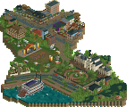
Park / Bronze Coast
-
 16-June 25
- Views 0
- Downloads 34
- Fans 0
- Comments 6
-
 65.00%(required: 60%) Silver
Babar Tapie 70% J K 70% Mulpje 70% CedarPoint6 65% CoasterCreator9 65% Milo 65% RWE 65% chorkiel 60% G Force 60% Scoop 60% 65.00% -
Description
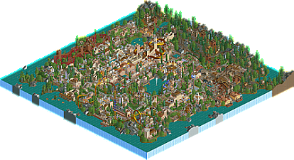
Part industry and part garden resort, this park is built from a place that forges and exports bronze medals.
-
No fans of this park
-
Full-Size Map
-
Download Park
34
-
Tags
Similar Parks
-
[H2H6] R4 - Flying Germans -The Classic
![park_2416 [H2H6] R4 - Flying Germans -The Classic](https://www.nedesigns.com/uploads/parks/2416/aerialt2159.png)
-
Floating Resort
-
Värmland Park
-
Chonky's Wonderland
-
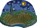
The Starry Night
-
NOLA Jazz and Heritage Festival
This is nice lurker! I always enjoy your releases. My favorite ride is probably the mine train. It reminds me a bit of my scenario play builds where you'd have little funds to make something big, but you still wanted to theme it. It gave me nostalgia. Despite so many rides, they all fit nicely on your map. Great stuff!
Always nice to see parks from you... really love your style and this park was no exception, it's genuinely inspiring to see someone still making pure LL parks in 2025.
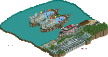
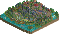
To be honest, the colors, martian scenery, and ride choices did give this a steampunk feel for me. The dinghy slide especially fits this theme as a bronze foundry. That seems to be the highlight of this park, I like how it zips in and out of the buildings and interacts with its surroundings. It's also neat how there's a subtle narrative/progression in this park, with the mine train implying that the copper is mined before being smelted in the foundry and then shipped off on the "uploading docks."
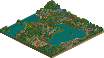
As for the rest of the park, the foliage placement and terraforming is very well done, everything is bunched together properly and there aren't any blocked angles, something that is hard to do on a park with single-wide paths. With that said, my only, very minor critique here would be that while the bronze coloring is nice for the theme, it's missing a highlighting color. There are moments where the blue stands out with the observation tower and train cars and it looks nice. I just wish there were more blue to complement the bronze.
Other than that, I really enjoyed this release and thought it was a nice tribute to the bronze accolade. I hope to see more LL from you.
Nice park with densely packed LL goodness, awesome to see. Big fan of the ride design too, that Dinghy Slide is absolutely awesome. Landscaping is very well done as always, although im not a fan of the cutoff mountains on the map edge. Their placement triggers a bit of pattern recognition in my brain and seems a bit unnatural as a result, but that could just be me.
Also agreed on the dinghy slide bit being the highlight here, that's one of your best creations yet I'll say. The rest of the park was more classic Lurker, though I like how this one has maybe a bit more breathing space than some of your others. Similar but different, and always good to view.
An actual SV4 file - feels like an antique! What a fun little park packed with nostalgia. Loved the mine train and the dinghy slide as others have mentioned. The landscaping is great all around too, as are the little waterfront buildings with the piers/terraces. And the quirky ride names were a bonus (e.g. Swing Vote and Panel Processor). Looking forward to seeing your next one!