Park / Teststrecke Blueprint
-
 02-November 25
- Views 684
- Downloads 36
- Fans 0
- Comments 15
-
-
 67.00%(required: 65%) Design
SSSammy 75% deanosrs 70% J K 70% Milo 70% Scoop 70% Turtle 70% G Force 65% Liampie 65% Recurious 65% RWE 65% chorkiel 60% posix 60% 67.00% -
Description
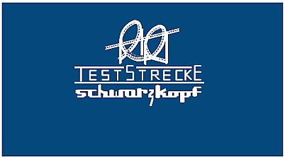
Dear Mr. Andrelczyk,
Please find attached the PDF blueprints for the transportable roller coaster we discussed.
I am confident this design meets your specifications for rapid assembly and durability on the road, without sacrificing ride experience.
The engineering is sound, and the layout is thrilling, compact, and contains two vertical loops.
We are ready to proceed with fabrication upon your approval.
Sincerely,
Anton Schwarzkopf
[DWG-0001-COVER_A.pdf]
[DWG-0002-DIMMENSIONS_A.pdf]
[DWG-0003-BILL_OF_MATERIALS_A.pdf]
[DWG-0004-OVERVIEW_A.pdf] -
No fans of this park
-
Full-Size Map
-
Download Park
36
-
Objects
1
-
Tags
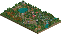

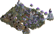
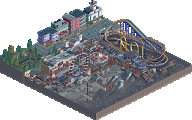
Cool concept and the execution of the idea is great. Good layout, track merging for the loops, shoestringing for the diagonal station and the technical data on the pages as you rotate for such a cool effect.
Great creative concept that I've come to expect from both of you. It's definitely a 'one and done' viewing but what's wrong with that!
So fantastic.
Great concept, had me shook the first time i opened it. Very well done overall, hope more people give this one a look!
I too, hope more people download this after TTA concludes. It's a brilliant concept, and a well-executed one.
Awesome concept, always got something up your sleeve you two.
Next time you do something like this give the engineer a jangle lol
Tough for me to review this without devolving into full-on gushing. Such a cool idea and executed just about as well as it could be. Having each angle be a different page really takes it over the top and the track gauge is just genius
This was really cool, I didn't really realize what it was supposed to be until some discussion on the discord so I didn't download it initially, but I'm glad I did. Honestly a really cool concept and well executed, it shows some real skill and mastery of the game. It's a bit minimalist for sure but I'd give it a design accolade hence by 65% score. The layout was clean too which for a coaster type like this isn't easy to do, combined with realistic supports really made this special!
I think it's fantastic. And not just cause it's addressed to me! A super clever idea and really cleanly put together. And the layout itself is shockingly smooth-- a tough thing with this layout.
Really enjoyed it!
A really neat idea, executed basically perfectly. Only limited by its scope given it's a supported layout. But sometimes minimalism really works and this is a really good example. There's lots of details here that it would be easy to overlook too; having the whole layout on a diagonal including the station is great.
I never even noticed it was adressed to you brian. What a fun little detail haha.
gonna file this under "an idea that i thought wouldn't be possible to pull off in game", and you've yet again proved me wrong. really enjoyable viewing, a completely novel concept, and all 4 views different is brilliant. so technically complex.
The screenshot on the site didn't show much promise, but looking at this in game proved me wrong. Ingenious idea!
Atypical design, as in a design is usually a coaster with its direct surroundings cut out of a park or environment. This is a coaster cut out of its direct surroundings, just a bare coaster. When ranking it against other designs that holds it back a little, but only in a competive way... In an artistic way, this thing is fantastic. Well put together. I love the attention to detail to make this thing resemble an actual blueprint, as opposed to just making it a white coaster on a blue background. Impressive dedication to the concept, and well executed. I have good experiences with Teststrecke, so it's nice to see it getting some love too. Congratulations on winning the design accolade!
Congrats on the design win with such an original idea! I'll echo some things Liam has said. In an artistic way this was mostly great. The map really looked like a blueprint. Although I'd say the peeps were detracting a bit from that vision. On the other hand I think this was too bare for a design win, hence my score.